• 0
  • 0
Andrew Williams's picture

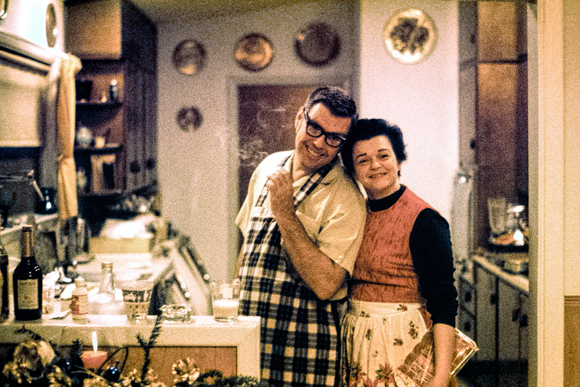
Another Colorization Experiment

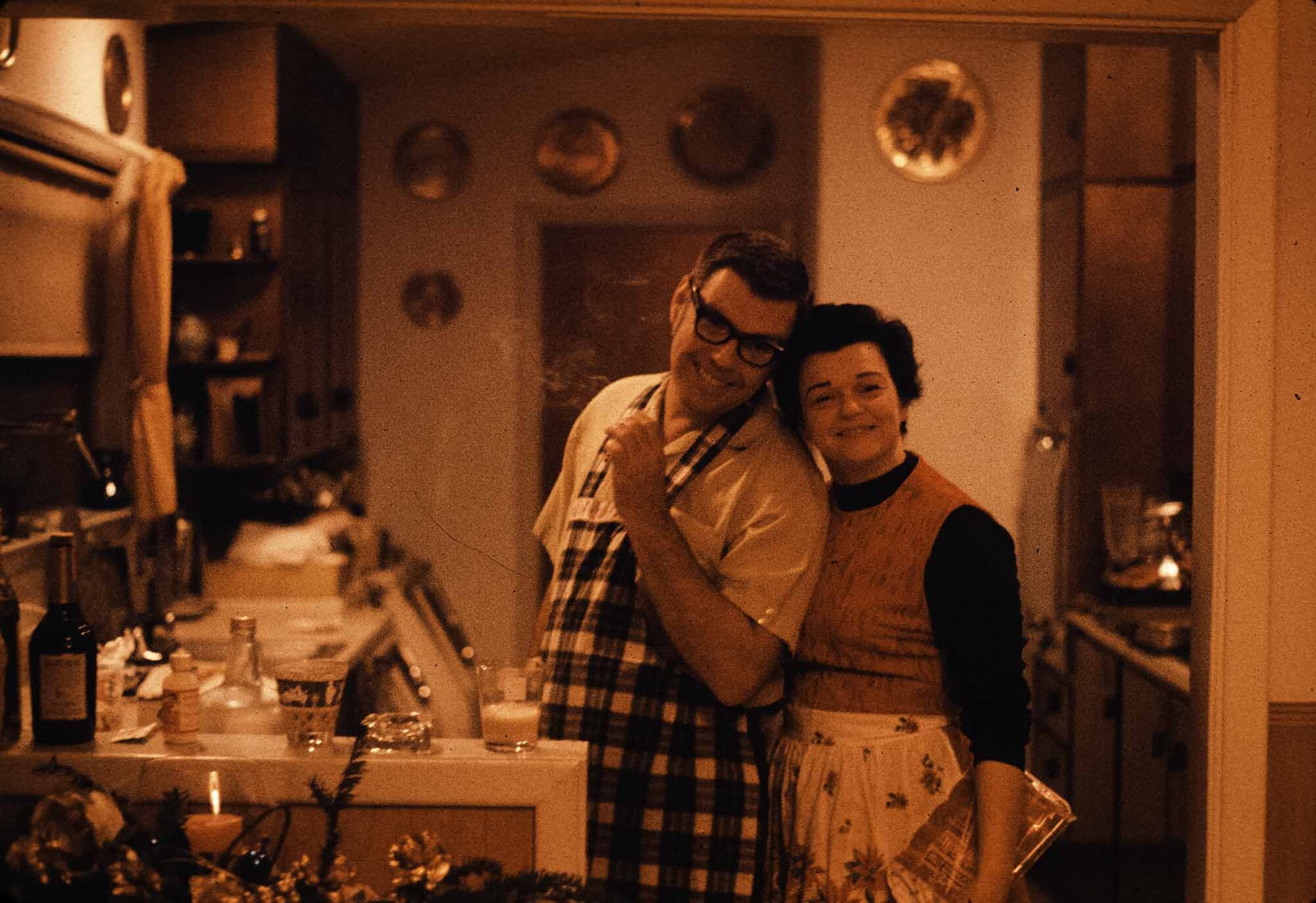
The results of previous experiments having been inconsistent, I thought of another way to test Photoshop's Neural Colorization tool. This is a picture of my parents on Christmas, 1970. I shot this on Anscochrome 400 slide film, which was the only high-speed color film at the time. This was the first time I was ever able to shoot available light indoors. It appeared and disappeared from the market very quickly and this was the only roll of this brand I ever shot.

#1 is a JPG copy of the original DNG scan with no edits. This is basically a monochrome red as it was a daylight film shot under incandescent light.

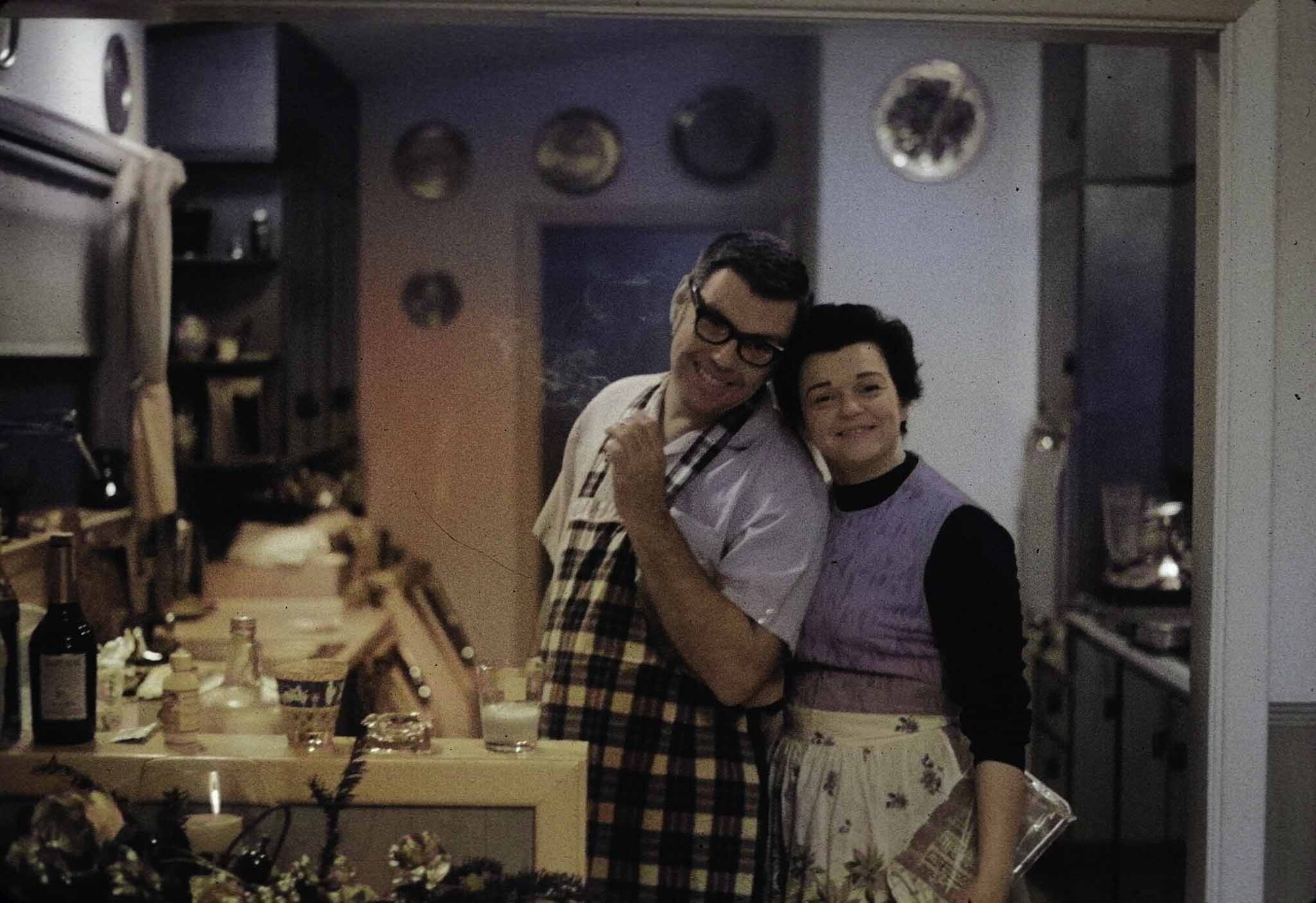
#2 is the auto-colorization of that file (no edits again.) The colors are off, as you will see in #5

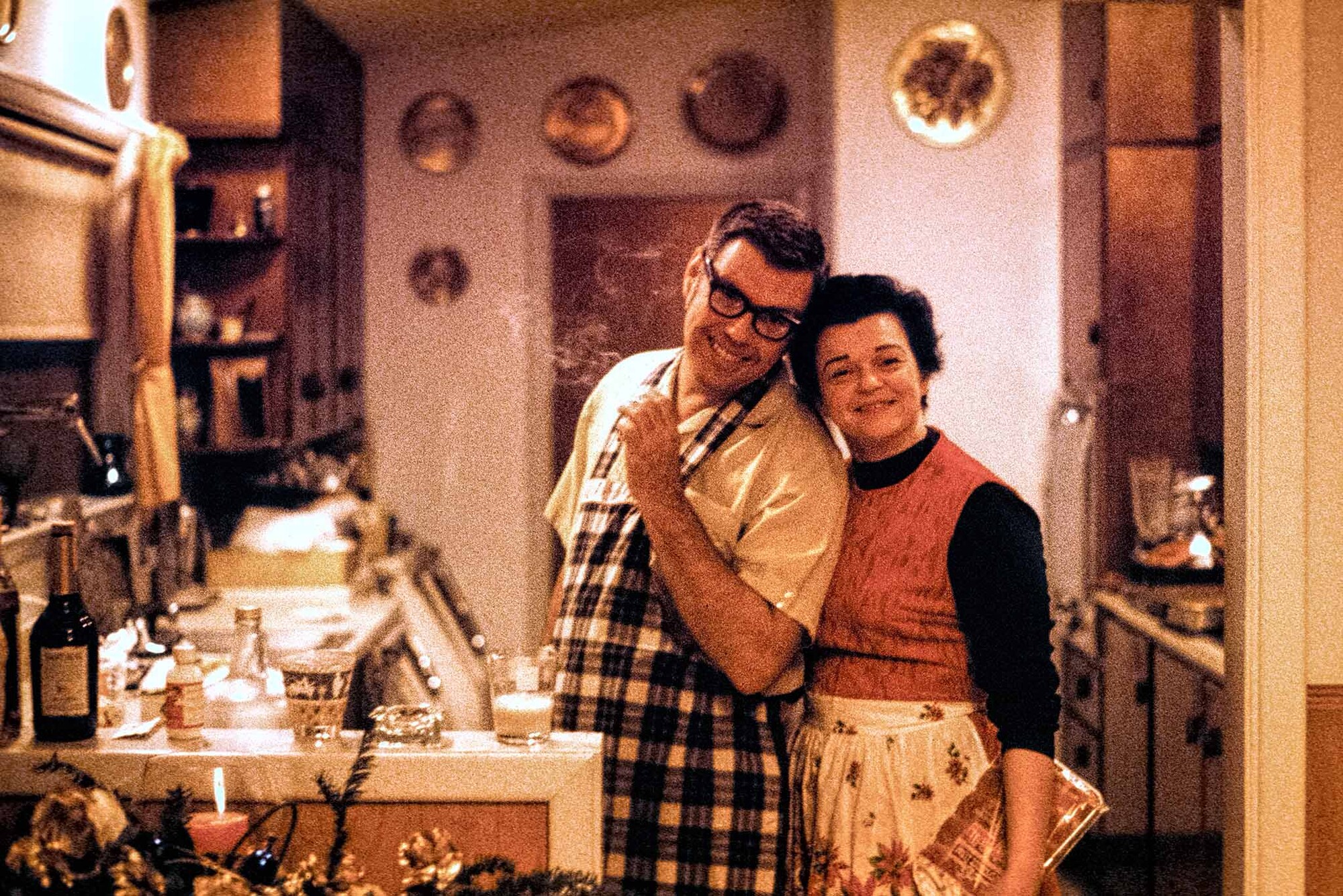
#3 is the best color I could get when I first tried (7-8 years ago) to do something with #1. The color is better, but still not very good.

#4 is the auto-colorization of #3. If this had been someone else's kitchen and parents, I might have been OK with this. But it was my kitchen and my parents so it was not OK.

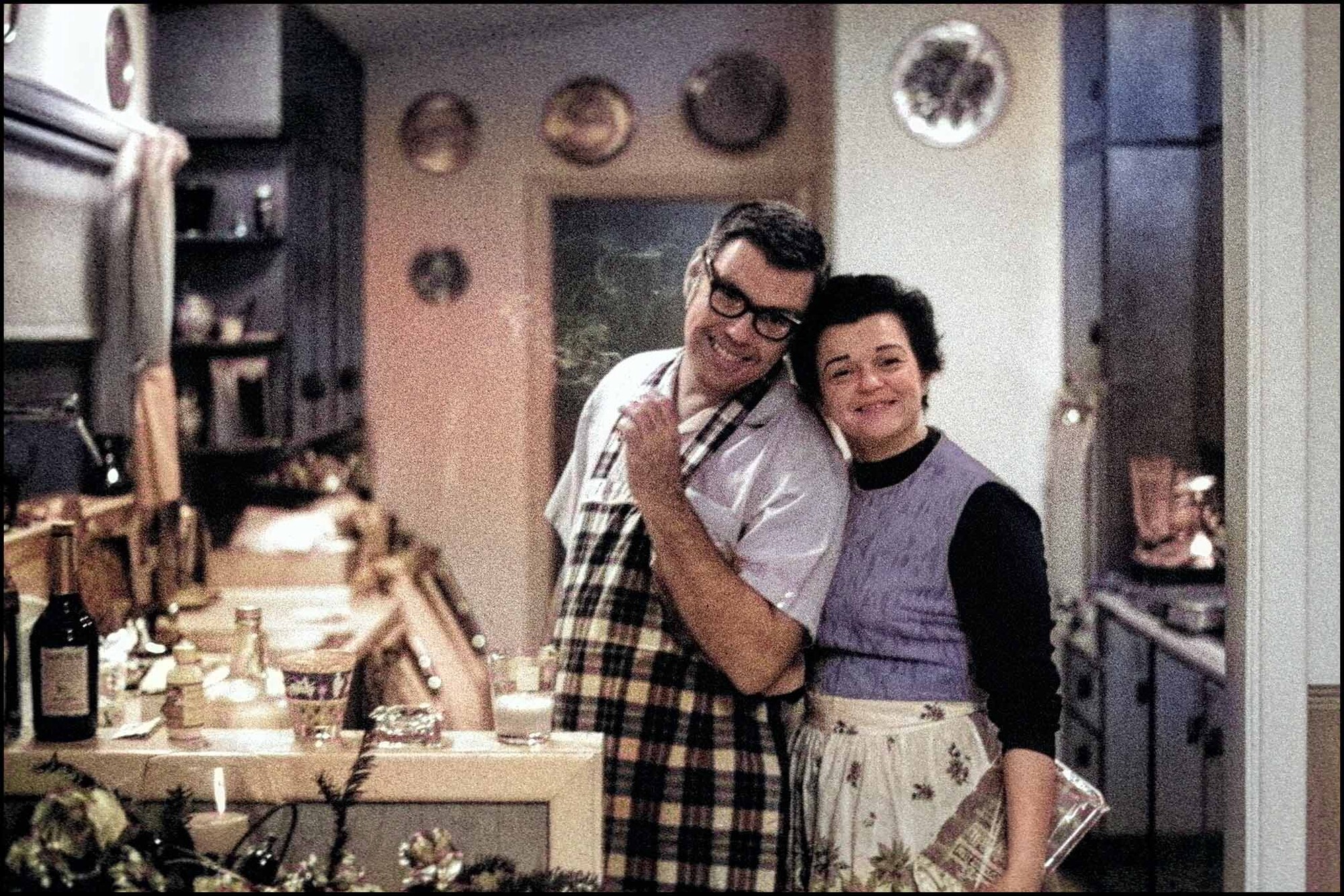
#5 is what I accomplished today using regular Photoshop adjustments and not the colorization tool.

Yes, the color is still not perfect and it never will be because it was a daylight film. It is also very grainy. Kodak's high-speed Ektachrome would be vastly better a few years later.

The point of all this is that this tool can be useful, mostly for B&W images. In color photography, there is no substitute for getting a good white balance.

Log in or register to post comments
7 Comments

I'm not the brightest when it comes to photography as I have only been doing this for 4 years; so could you explain why the color of the JPG of the original DNG scan was so off? Was that what you meant about getting a good white balance? Other than that, the colorization is shocking! No matter what with each one, I am amazed at the results from what you had to use in the beginning. Good job!

I apologize for a bit of a history lesson.

#1 is an accurate rendering of the original DNG. The fact of it being so red is a factor of the film's having been optimized for daylight rather than incandescent light. I'm too old to remember and too lazy to look up the kelvin temperatures, but they are very different. The result is, as in this case, a very red image. If you go the other way around, i.e. shooting indoor film in daylight, you get blue images. An 80A filter mostly fixes this, and most pre-digital color movies shot their outdoor scenes that way because they had standardized indoor film because they were shooting in studios with artificial light. For the rest of us, using the correct film was always better.

Anyone who has ever done color printing knows that neutral colors, shades of gray from black to white, are the most difficult to get right as they show even the smallest tint. So, when color television came along they would set their colors response any way they wanted electronically. Their quick and dirty answer for remote work was to introduce a known color (a white card) and adjust their controls until it showed correctly. This was called adjusting the "white balance." You can see this in action in the Jane Fonda/Jack Lemmon/Michael Douglas movie, "The China Syndrome."

Under studio conditions where they had the time and budget to make more sophisticated adjustments, they used more sophisticated methods, but that is a discussion for another day.

Modern digital cameras have been setting the "white balance" automatically for a long time.

Great information. I entered the photography in the after-film world even though I grew up all during the age of film. Now I wish I had gotten interested long before the digital age. The digital age (and life in general) moves forward so fast that there's no time to go back and learn the previous age. I value posts from experienced people like you; so thank you for taking the time to explain these things.

"Experienced"="Old"

#4 popped out for me as looking the most authentic for the time period, #5 looks a little on the warm side for my taste (perhaps more so when viewed next to #4).

It's amazing what you are achieving with these Andrew, thanks for sharing your experimentation and new-found expertise with the group.

I agree that #5 is still a bit warm, but having grown up in that house, I can tell you that #5 is by far the most accurate color rendition of these images. In reality, the walls and wood trim were actually white. Those are copper plates on the wall. The cabinets look about right. I've forwarded this to my sister and she will have no hesitation to tell me I've misremembered something.

Sounds good Andrew. Obviously in this case your goal is to represent the home as you/others remember it.