Ironic Window
Playing a little with shadows, and not sure if the color works better than black and white? I've also been experimenting with minimalism / abstract and could use a reality check whether its a hit or miss. Thank you


Playing a little with shadows, and not sure if the color works better than black and white? I've also been experimenting with minimalism / abstract and could use a reality check whether its a hit or miss. Thank you
First time this young lady posed and worked in studio. Just finished her Masters degree and is now pursuing her PhD.
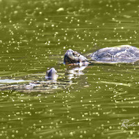
Spotted close to walking trail in Ebor NSW. Intense body colour indicates recent skin shedding.


9 Comments
Clever idea Steven. If I had to pick I’d choose the B&W, as I feel this is projecting a mood that gets lost a bit when color is introduced.
That being said, I fully expect opinion to be divided and can see others appreciating the splash of color.
The images work well for me.
Thank you, I think I agree, my concern is that not only does the color become dominant, but it grabs the eye to a smaller area. But I may be overthinking it. :)
I prefer the straight B&W, too. Full color would be OK, but the other one shown illustrates indecision.
If this is full-color, as stated below, then I withdraw my "indecision" criticism, but I still prefer the B&W.
Of the two like the others i prefer the b&w. I would like to see the full color though because I could see how that could really work too.
The one with yellow is actually full color
I actually prefer the color. It's like a b&w and then...what? Oh, there's color! Excellent photos.
thank you all for the feedback
Between 2 posted, Colour for me. yellow element is providing some focal point.
Well, the frames could not hold my attention beyond a glance in lake of strong story in my opinion .
Thanks.