Any Critique?
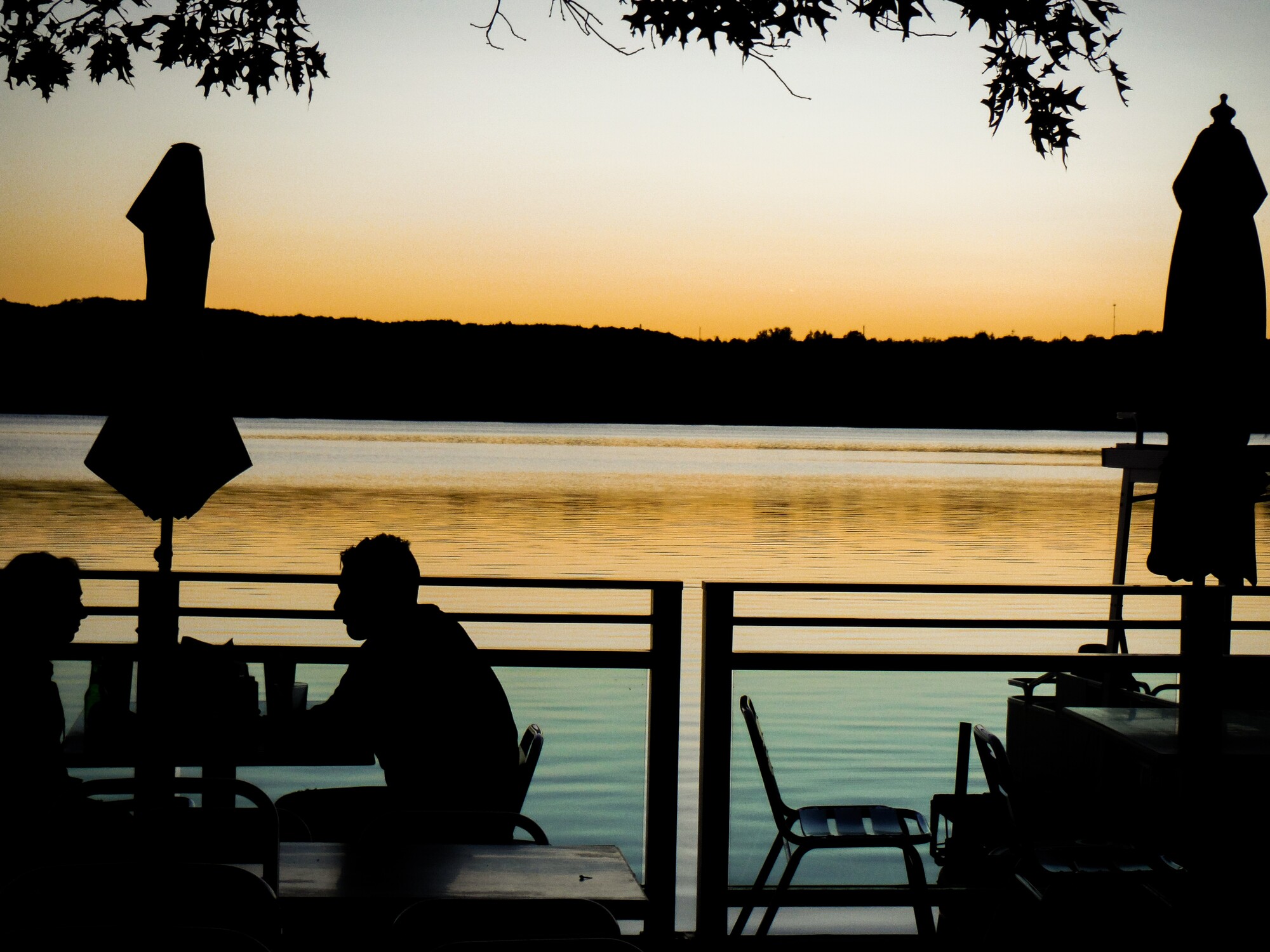
This is my first post so I am looking for any improvements you might have. The only post production I did was adding contrast and making the blacks more vibrant and making the edges a little crisper.
This is my first post so I am looking for any improvements you might have. The only post production I did was adding contrast and making the blacks more vibrant and making the edges a little crisper.
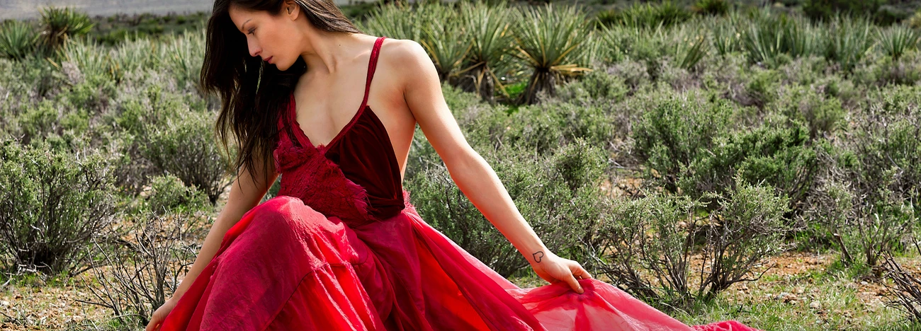
It looked like a pursuit, but in reality, it was a peaceful movement.
I see these comments on many photos - BTW - those who are putting comments like "Needs Work" should elaborate to say what is needed according to them.

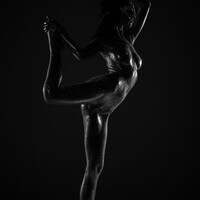
Mia is a natural in front of the camera. She knows where the light is and plays to it in a soft, knowing way.


4 Comments
It's kind of a cool shot, but it doesn't seem extremely compelling. Not sure this counts as a "portrait" though. The colors look good but it seems like the sky should be darker; also, the horizon isn't level.
Thank you for your feedback. I would agree that this isn't the most compelling shot. I could probably make the sky darker in post, but this is the original photo, unedited. The horizon isn't level because I was trying to get some more detail from the deck of the boat. There is also an island towards the right of the screen so that may have skewed it (see red ink in attachment). I intended to use this photo as more of a background for a marketing campaign I'm working on.
Do you think it would have made it better for the people sitting at the table to be in the middle of the photo?
Hmm.... no? Only because then the umbrella stand would be sticking straight up in the center of the photo and that might be odd. Overall the photo is fine, I think mostly it just doesn't seem at all like a portrait, so it's hard to critique except in that context. At least, in this forum anyway :)