Late spring in the park
She decided it's time for red lipstick and a photo shoot. Do the photos look a bit cold?
She decided it's time for red lipstick and a photo shoot. Do the photos look a bit cold?
It looked like a pursuit, but in reality, it was a peaceful movement.
I see these comments on many photos - BTW - those who are putting comments like "Needs Work" should elaborate to say what is needed according to them.

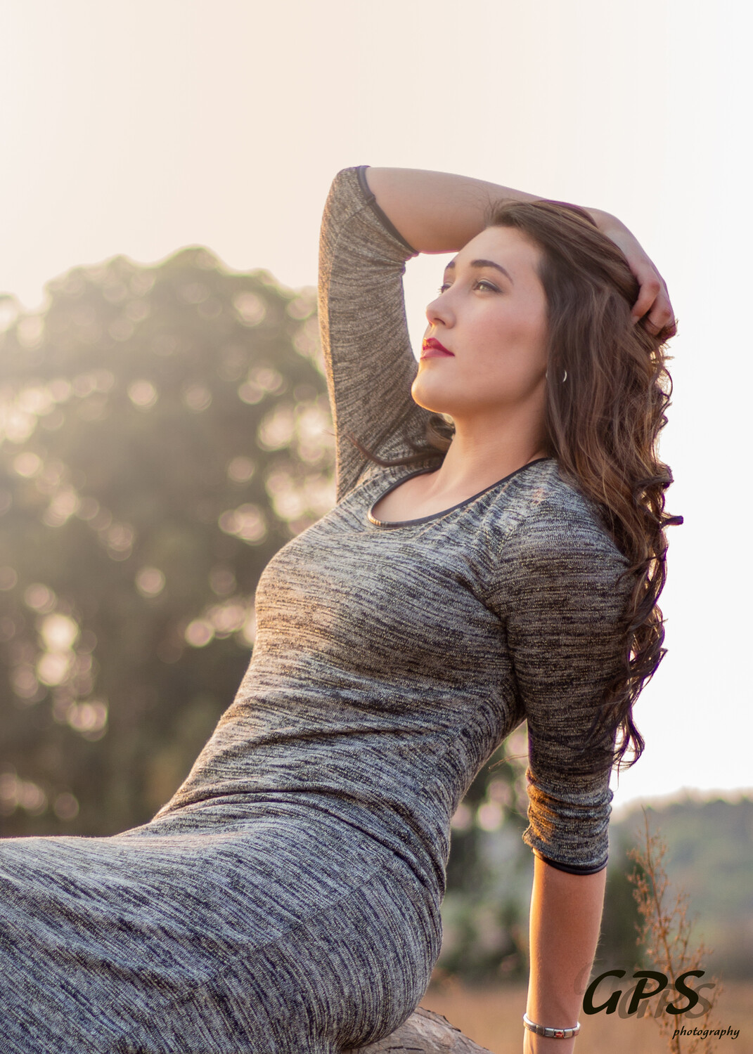
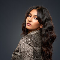
Mia is a natural in front of the camera. She knows where the light is and plays to it in a soft, knowing way.


8 Comments
I disagree about the subject, she's plenty pretty for nice portraits of everyday attractive people. However, her expression and posing is lacking and dead faced. She looks like she's doing someone a favor and is not happy about doing it.
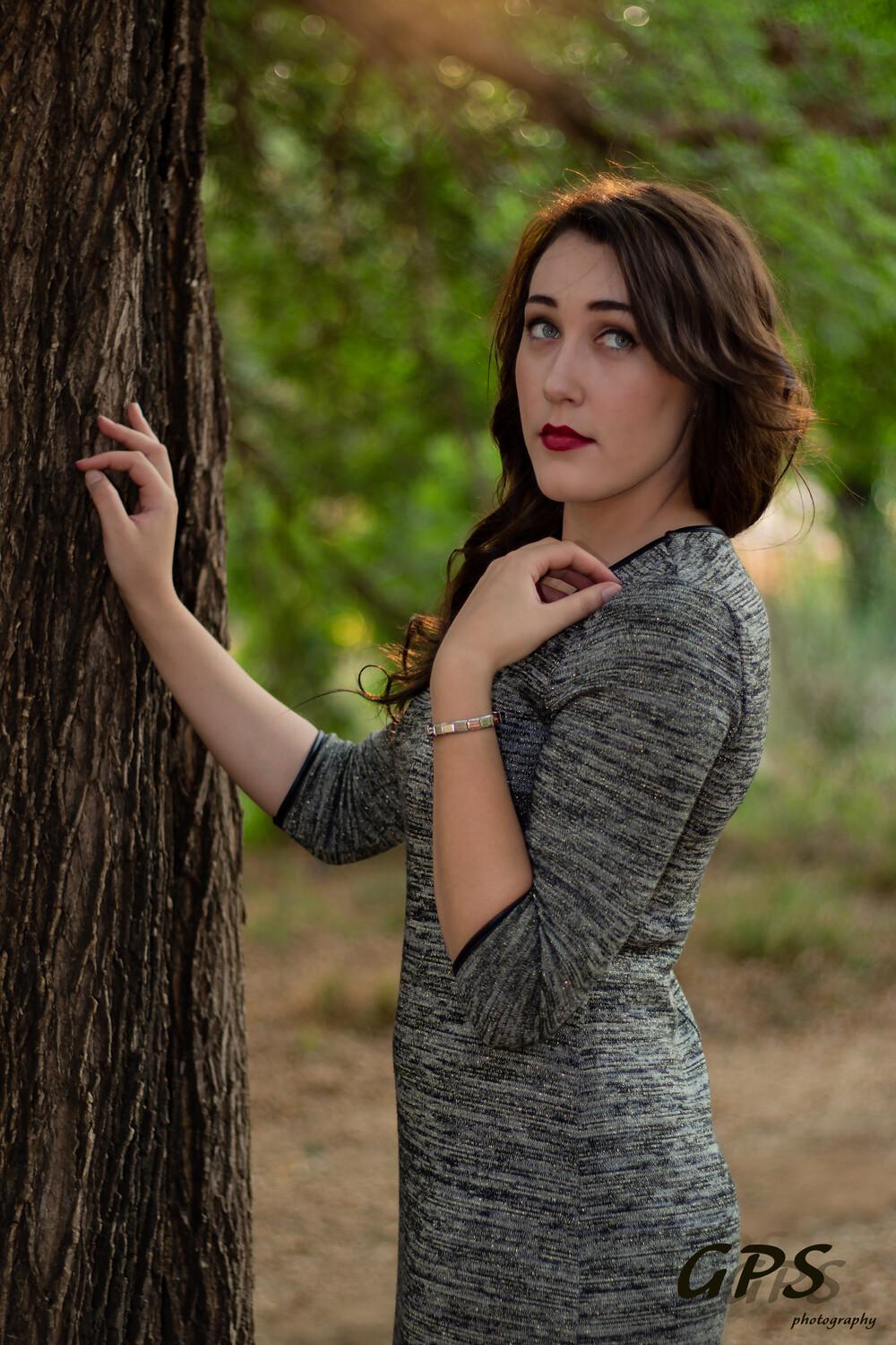
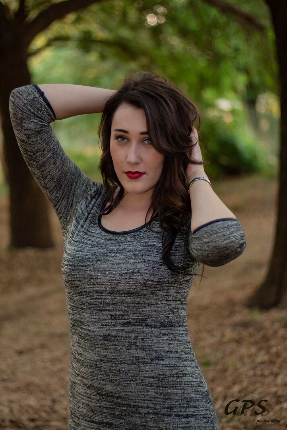
The lighting in the first two images is a bit flat and slightly dark, they could use some pop in the highlights and midtones. But I like the sunlight on her hair and slight lens flare in the first shot.
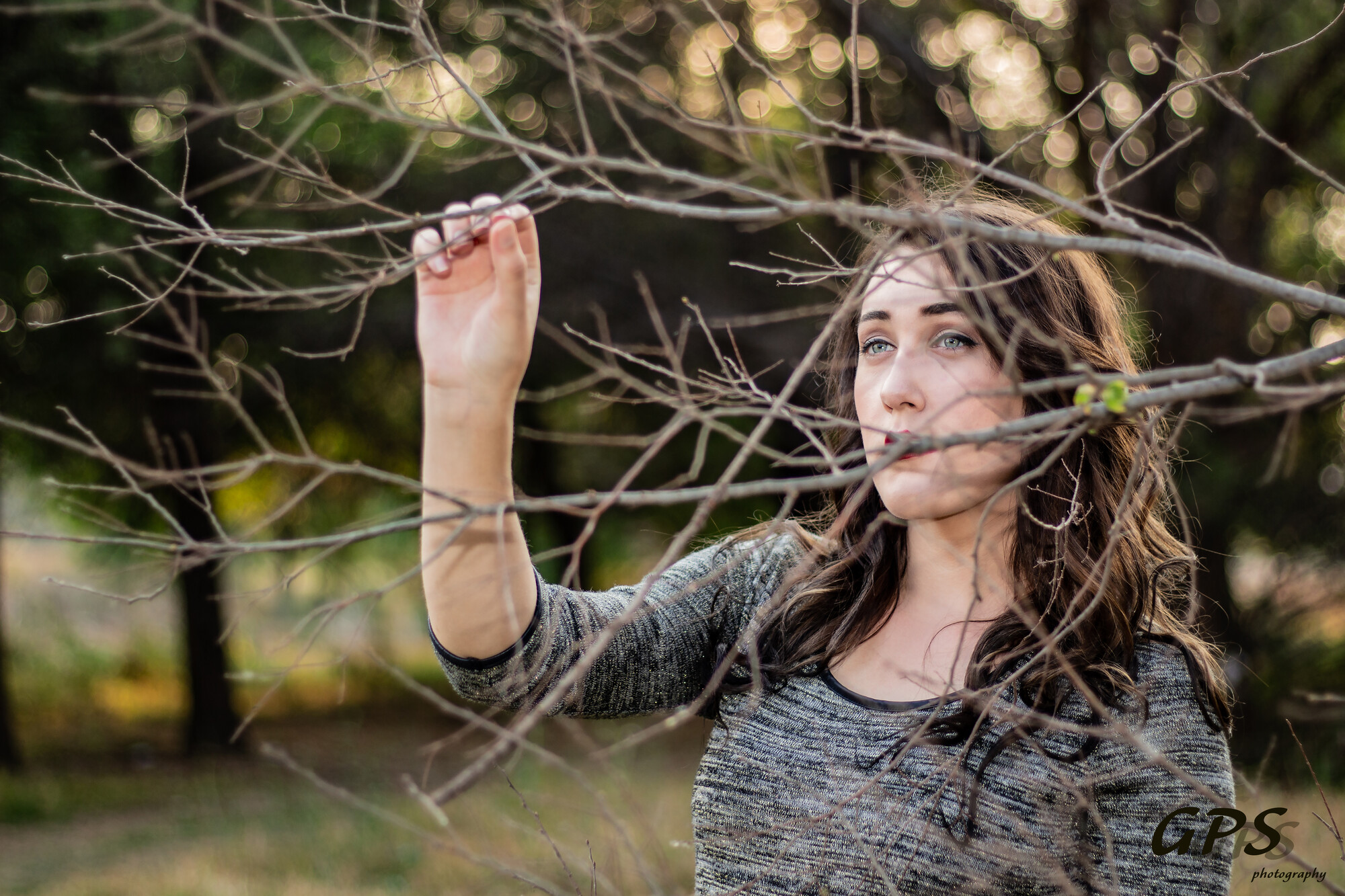
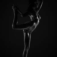
The fourth image with the branch covering her mouth looks weird. Not just because of the covered mouth, but also because her hand looks big in comparison to her head. I assume this is more due to its proximity to the lens and not because she actually has large hands. (Watch out for the flat of the palms or backs of hands pointing straight at the camera, and also their proximity to you.)
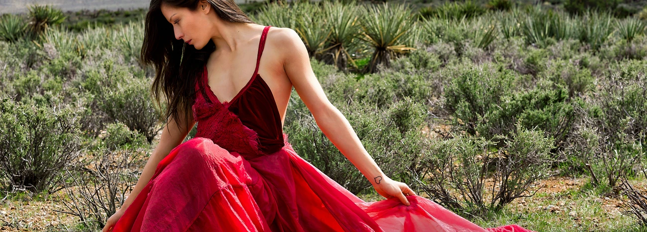
The last image is the nicest in my opinion, but it's a pity the crop cuts her left arm off into a stump though.
Hope this helps
with the hand? :)
In terms of lighting? Thanks
That shot showing the hand is MUCH better! And this is better too. The only thing is that now there's mixed color on her skin, in places it looks magenta and in others it looks more orange - but overall it's definitely better.
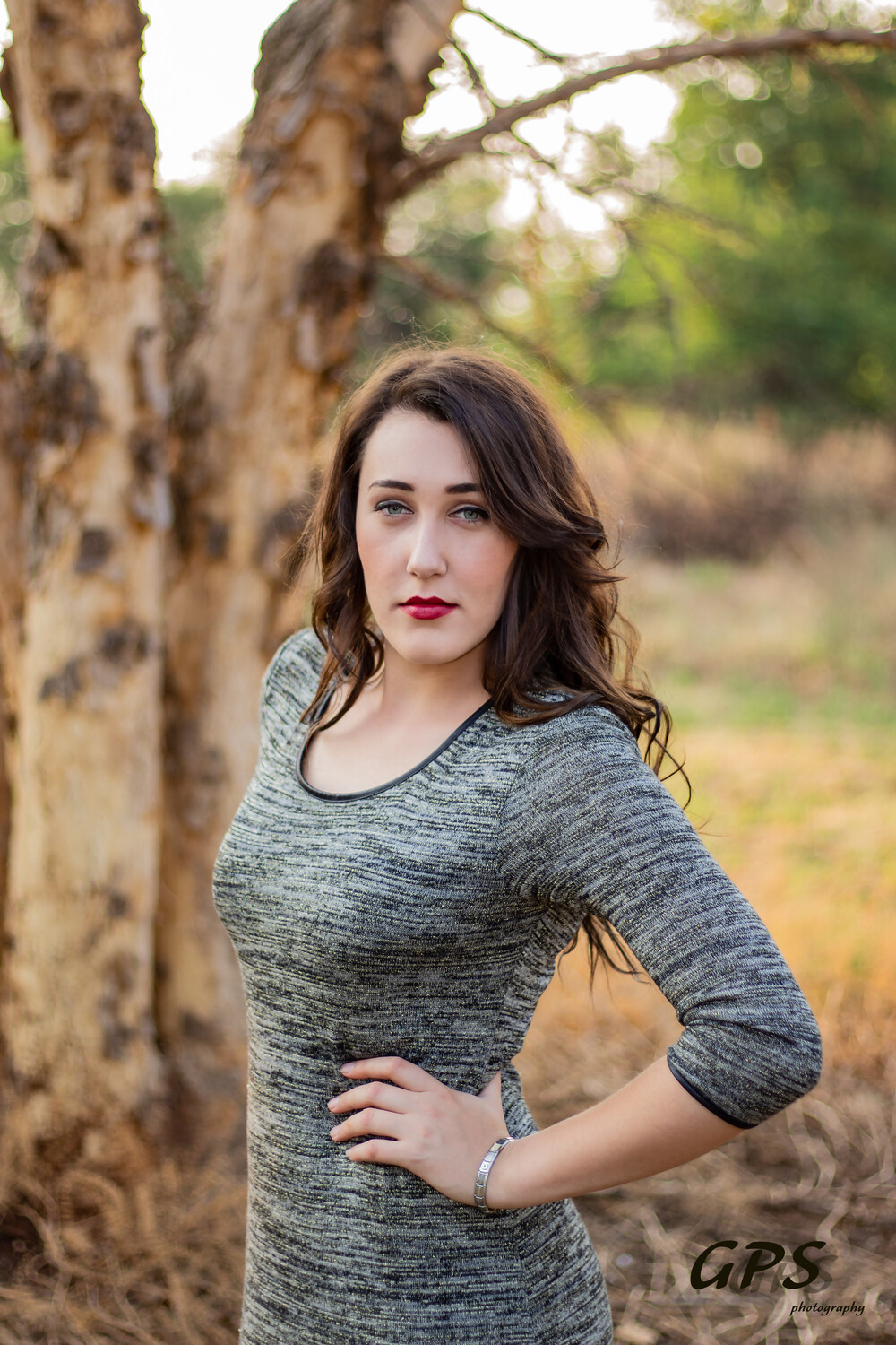
Third one and last one are the best in my humble opinion. I think those poses work better for that dress. Cutting her hand off is unfortunate in the last one. She's a beautiful young woman, not sure what shasha was looking at.
I like the pop of sunlight on her hair in the first photo.
I feel overall this is one of those "only show the good photos" situations. The 3rd photo just overall isn't my favorite (framing, pose, facial expression), and isn't flattering to the model. I feel overall the set would've been better without it.
With the first two photos, I could've used more light on the subject, which could easily be fixed in photoshop.
Last two photos I really like!
She's beautiful. Not everything has to be over the top glamour. This "plain Jane" looks great. The first 2 photos are fine (though the whole tree thing....meh). The exposure needs to be raised at least a stop or more, which someone correctly said can be easily done in PS or whatever editing program you use.
The photos don't look cold, but they do look rather flat.
I would consider looking into poses that flatter your model a little more than these do.
Overall they're not bad, but I don't think these are doing either you or your subject any favors.