
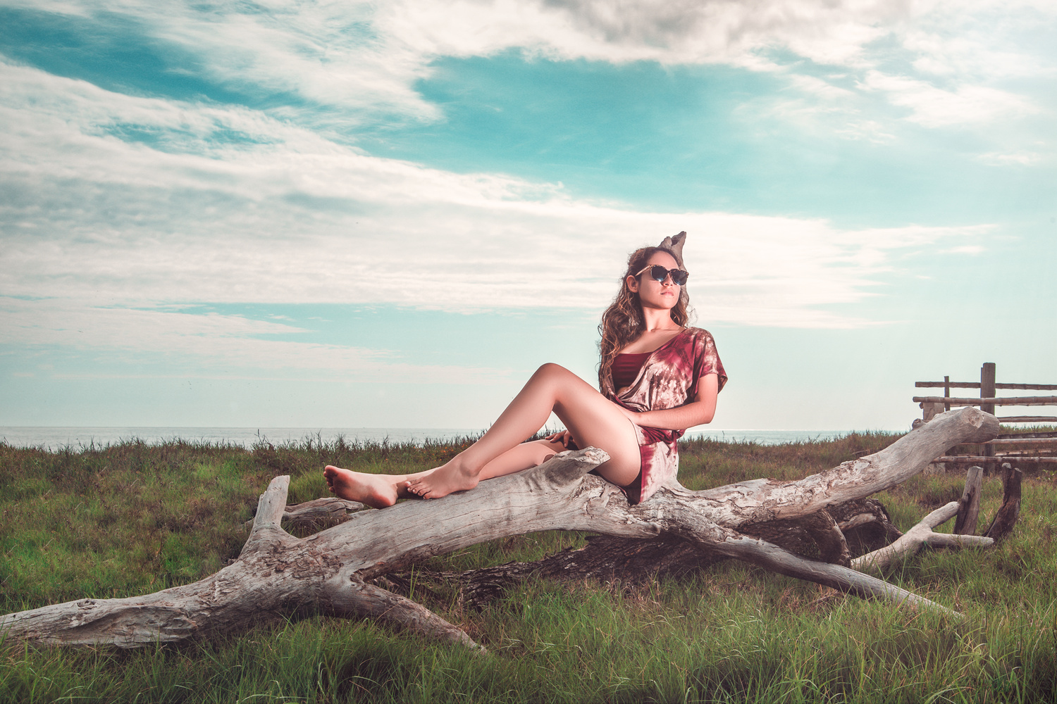
Trying new colors, looking foward for your comments.
I took this one a few days ago, i`m trying a new post processing.
I took this one a few days ago, i`m trying a new post processing.

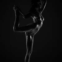
It looked like a pursuit, but in reality, it was a peaceful movement.

I see these comments on many photos - BTW - those who are putting comments like "Needs Work" should elaborate to say what is needed according to them.


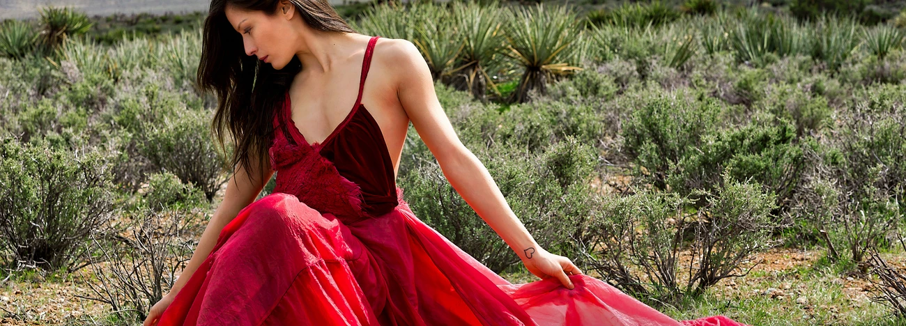
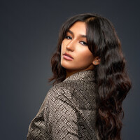
Mia is a natural in front of the camera. She knows where the light is and plays to it in a soft, knowing way.






2 Comments
The color toning is nice, but there are a few things I'd change: your fill light or reflector is bouncing up from beneath creating an unnatural look of being lit from below (and not in a good way). For some odd reason there's a bright highlight at the top of her thigh that is distracting looks out of place. I zoomed in and it looks like the post processing on her skin is a bit heavy handed. Also, she's so far away in this picture that I can't tell what is the thing on her head? Something else to consider is having her centered in the middle of the image isn't really working here. Sometimes it works especially when you have leading lines directing your eye to the center. In this case, the leading lines move side to side and as a result, this looks like a picture that someone was trying to take of a pretty landscape with a big piece of driftwood and oh, there just happens to be a girl in the middle of it. I hope that makes sense.
thank you for your comments, i see your point and it makes sense! i appreciate constructive critics :)