The Hayward - would like to hear critical analysis...
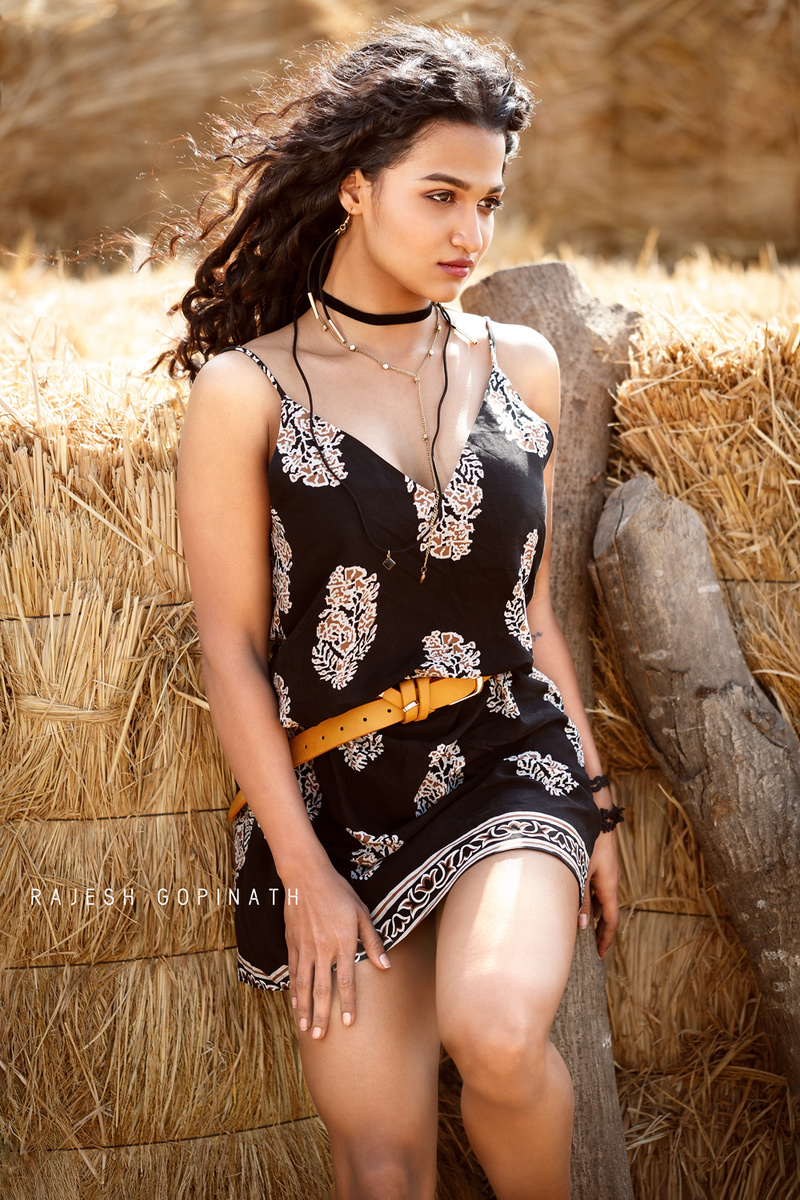
I tried to underexpose the background (it was strongly back-lit) a bit and filled the model with HSS. Wind served the hair blowing job naturally.
Even though it didnt do justice to boho look, it was an effort in styling.
Canon 100mm 2.8 on Canon 5DM3, f 2.8, 1/640, ISO 200, Godox AD200 as extra light source.


5 Comments
You want critical, I'll give you critical! j/k :D
The hay behind her could use some burning.
The framing feels off balanced. I would have slightly have her more on the camera left.
Maybe a touch more headroom.
More often than not, as her left foot on the log, knees bent up directly at the camera never turns out well. It has an awkward foreshortened look.
Cropping at the knees. Don't do it. Cropping at the ankles. Don't do that either. That's the problem with this kind of leg position. You're stuck. If you try to do a 3/4 crop, you'll still end up cropping across the other knee.
Cleanup the knees. Her right knee is too dark. I'd dodge and color match it closely with the rest of her leg.
I don't know how I should thank you. First of all, you took out time to give such a detailed review. Second of all, we often get appreciation more and forget the basics "to learn from critics". And we as creative artists, may not buy when random people criticise. And when a photographer who talk critically and sensibly, that is the biggest learning curve. All points noted carefully and will keep in mind as learning whenever I shoot next time...
Also, whenever you see a post from me, you can be blunt as your review for this pic. Thank you so much...
Excellent job on the lighting, I wouldn't have guessed that you used flash to fill in the backlight. You blended it seamlessly with the sun.
Composition wise, I agree about the knee - This pose is fine, but you should have the model turn her knee to the left (her right) so it's pointing away from the camera. This is much more flattering to the model's body and also has the added advantage of not making her knee look approximately the same size as her face due to foreshortening. Cropping above her knee would have been better too (even if you'd had her turn her leg to the side as I suggested).
The logs are a little weird; I would have maybe put her a little more to the side of them, or taken them out of the frame entirely. The one directly behind her just looks a little awkward with her body half covering it and half not covering it.
Overall I like the image. The only other nitpick I have is that her dress is folding over the pretty yellow belt on the camera right side of her body, seeing more of the belt on that side would also define her waist more.
Hope this helps!
I don't know how I should thank you. First of all, you took out time to give such a detailed review. Second of all, we often get appreciation more and forget the basics "to learn from critics". And we as creative artists, may not buy when random people criticise. And when a photographer who talk critically and sensibly, that is the biggest learning curve. All points noted carefully and will keep in mind as learning whenever I shoot next time...
Also, whenever you see a post from me, you can be blunt as your review for this pic. Thank you so much...
Rajesh,
Very nice image and I agree with the comments of the others that have given of their time.
A couple of things that I noticed:
-You are using HSS so I would have overpowered the sun in order not to have the blown out highlights on her left shoulder. You have no detail in the image you uploaded. If there is data in the RAW file I would burn it in.
-The stripe of light on her left leg is distracting. Also burn that in or overpower the sun.
-One of the loges is growing out of her left shoulder
-It would help if you did an edge burn on all the edges of the picture so as to draw the eye to your subject. Or you can use a vignette.
It is a really nice image and the things I mentioned above a client would not see.