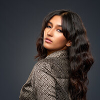
Desirè
We went to take photos of her and her showjumping horse, however the horse wasn't interested to be saddled up. So we took a few portrait shots. Two photos I made matte as it adds mood.
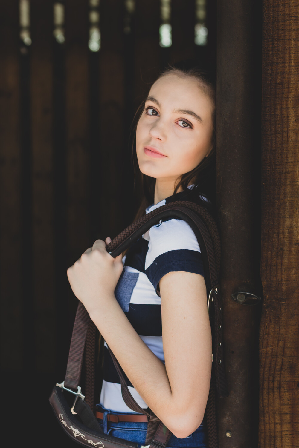
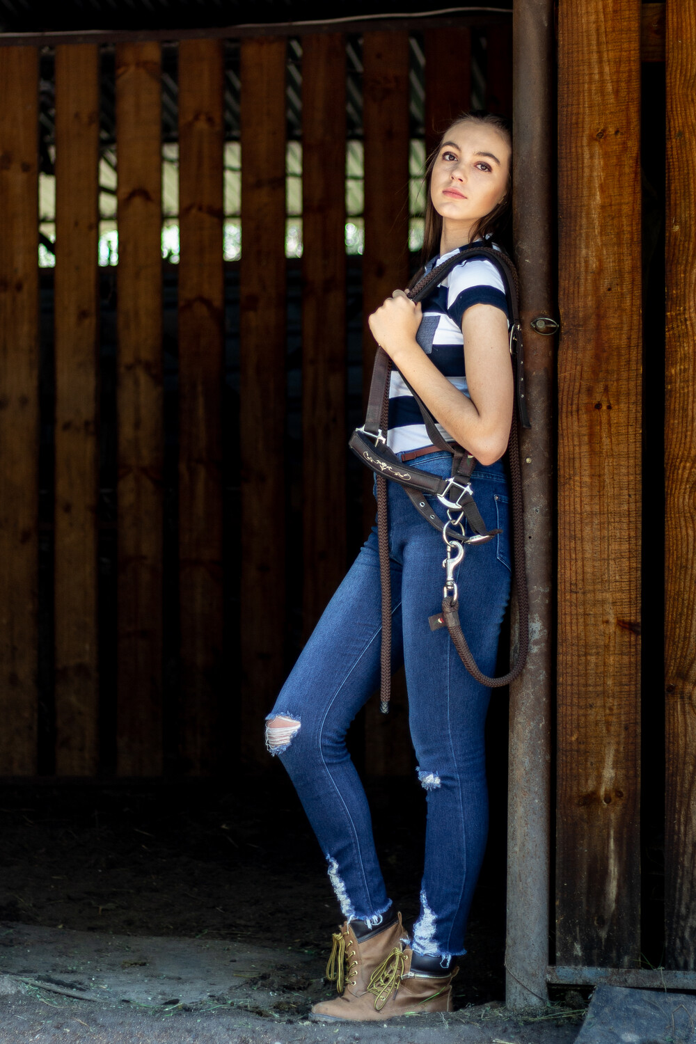
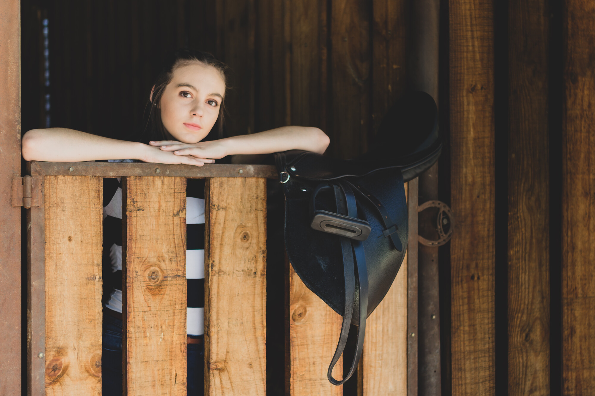
We went to take photos of her and her showjumping horse, however the horse wasn't interested to be saddled up. So we took a few portrait shots. Two photos I made matte as it adds mood.
It looked like a pursuit, but in reality, it was a peaceful movement.
I see these comments on many photos - BTW - those who are putting comments like "Needs Work" should elaborate to say what is needed according to them.

Mia is a natural in front of the camera. She knows where the light is and plays to it in a soft, knowing way.


2 Comments
Probably just a matter of preference:
1. Her skin looks too bright. If you want a quick and dirty way to experiment, you can take the RGB slider on the curves and drag the middle slowly down...to taste. You may have to lift the shadows a little to compensate. In the end, you'll end up with more color and detail to her skin, including some blush on her cheeks. But, sometimes, more detail comes more retouching. An example, this may add some slight shadows under the eyes.
2. I understand you did 2 of them as a matte for mood. But, if your intent is present/deliver these as a set, you should pick a style for consistency and cohesion. Either do them all matte or not do them in matte.
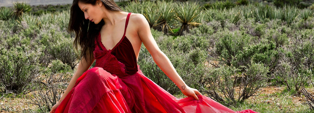
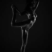
As an example, I'm currently working on the below set. They are not finalized yet. But, imagine if these had different styles on them. That'd be a mess and look noobish. In short, IMHO, for a specific look/location, pick a style stick to it. When you move to a different outfit/location, then change it up if you like.
Point #1. The bright skin had me thinking aswell. That's maybe why I posted the photos for feedback. And you nailed it. Thanks
Point #2 I knew I'm in for critique having 2 matte and 1 normal. Thanks for confirming to stick to one style