I took a couple of shots of this beautiful model during a beauty photo session. I would like to read your feedback and critique of these photos. I'm still working my way into the beauty/fashion portrait and I will really appreciate your comments in order to improve my images.
Beauty, Portrait & Editorial Makeup Photography and Retouching
404 Posts
3009 Members


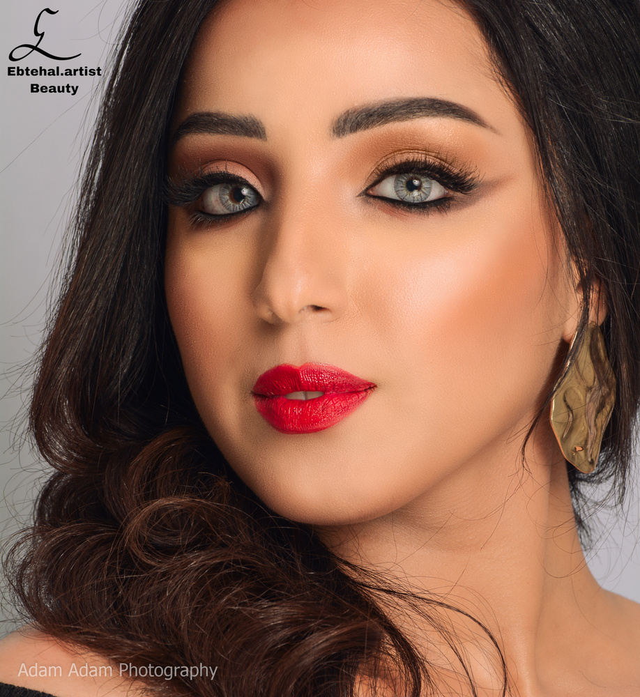

The model will probably be thrilled with these except for the inexplicable double watermarks (both distracting on their own let alone together). The lighting is decent. However, the post processing is quite heavy handed; many of the compositions or crops are odd. I'd use a different makeup artist next time, the look is a bit dated and the contour is very heavy and visible. Her brows look great though.
Try to do everything manually with no frequency separation as that is way too easy to overdo and make everything look fake and plastic. Keeping the skin texture is hard and it takes time, but you'll get there. :) Hope this helps!
Thanks, Sennia. I want to understand why do you think the composition and crops are odd. What's wrong with them.
As you have mentioned, yes I'm using frequency separation. But I don't know if there are any other ways. is there any other specific techniques that do you recommend.
Absolutely. Try doing your healing and cloning on an empty layer, and be super careful with it, and then do the rest of the cleanup via dodge and burn with 2 curves layers. If you're not familiar with these methods, there's tons of information online about them.
As far as the composition and the crops, well - for example in photo 3, you've cropped it into a square which is unflattering to her face, putting emphasis on the roundness of her cheeks and the softness of her jawline and the pointiness of her nose (which aren't bad things but with this crop they look unflattering compared to images 1 and 2). Plus there is a hint of the black sweater on her shoulder at bottom left that is distracting, it should be cloned or cropped out. That's the first place my eye went other than the inexplicable brown/gray lower eyeliner on her makeup. In the 4th image, it looks like you shot her straight on and again cropped it right around her face which makes her face look a lot more round than it actually is. The crop going through her forehead also brings attention to the not great contouring done by the makeup artist.
The things I DO like about photos 3 and 4 are that her hands aren't in them, so there's that. :)
Also, if you're using the clarity slider at all - don't. Or at least back it off by about 50%. hope this helps...
That's was really helpful. Thanks a lot.