Compositional Feedback
Working on framing the pictures better so would love to hear your feedback on the composition of these images. What could have been done better? What you think works and what is missing?
Thanks much!
Working on framing the pictures better so would love to hear your feedback on the composition of these images. What could have been done better? What you think works and what is missing?
Thanks much!
Evening just after sunset at Taliesin West. Scottsdale, Arizona. View of the dining room & bell tower.
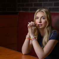
Recently, I taught an Off Camera Flash class. Paige was my model for the class. We were outdoors but it started to rain. Luckily, a nearby restaurant let us conduct the class in their dining room.


Recently, I taught an Off Camera Flash class. Paige was my model for the class. We were outdoors but it started to rain. Luckily, a nearby restaurant let us conduct the class in their dining room.


1 Comment
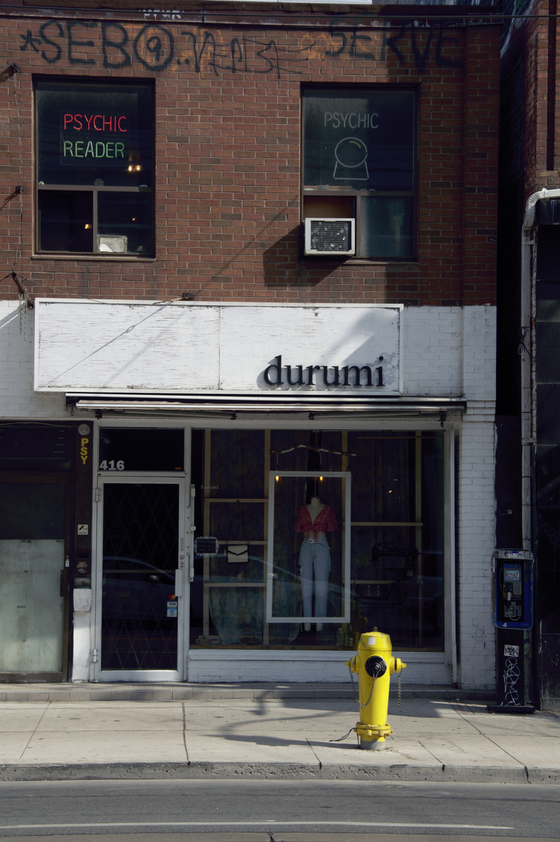
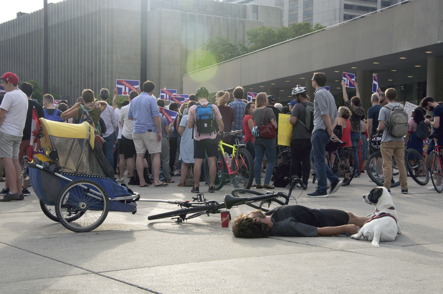
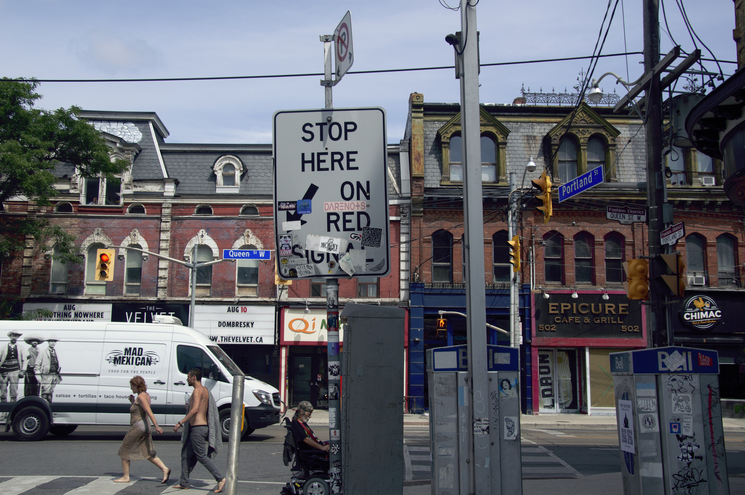
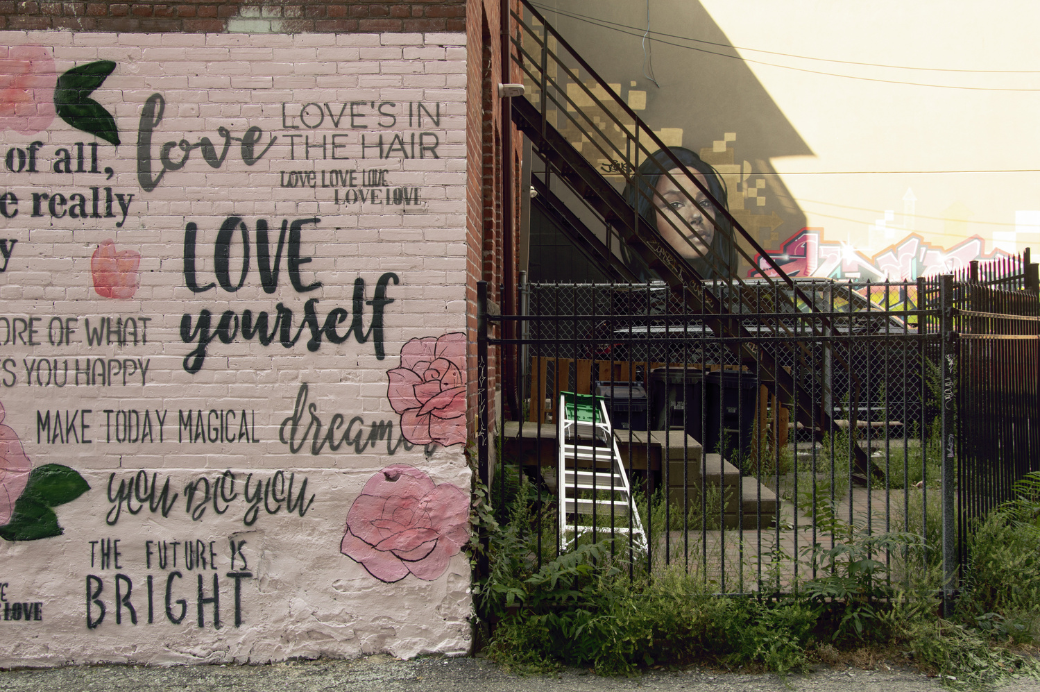
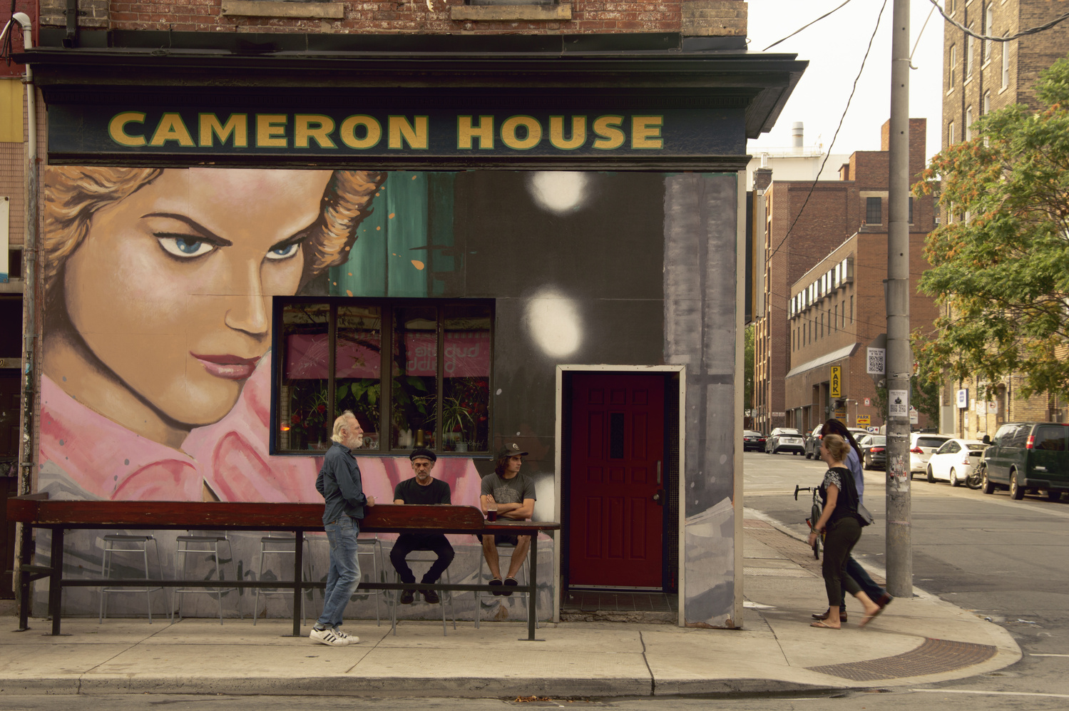
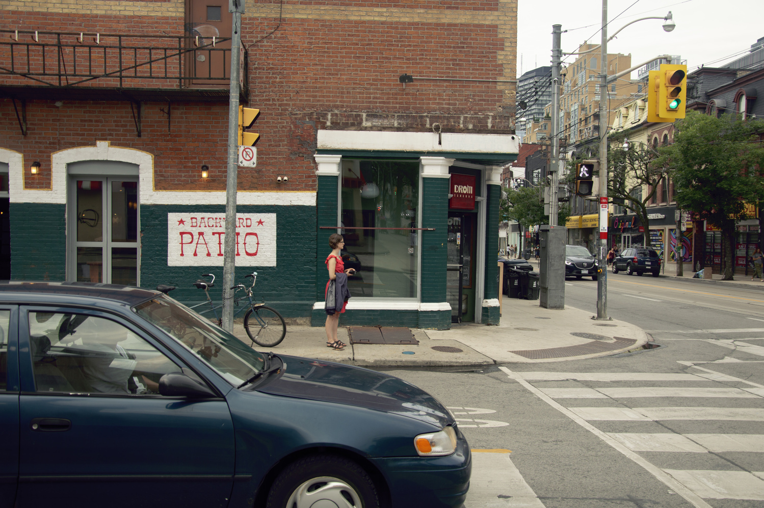
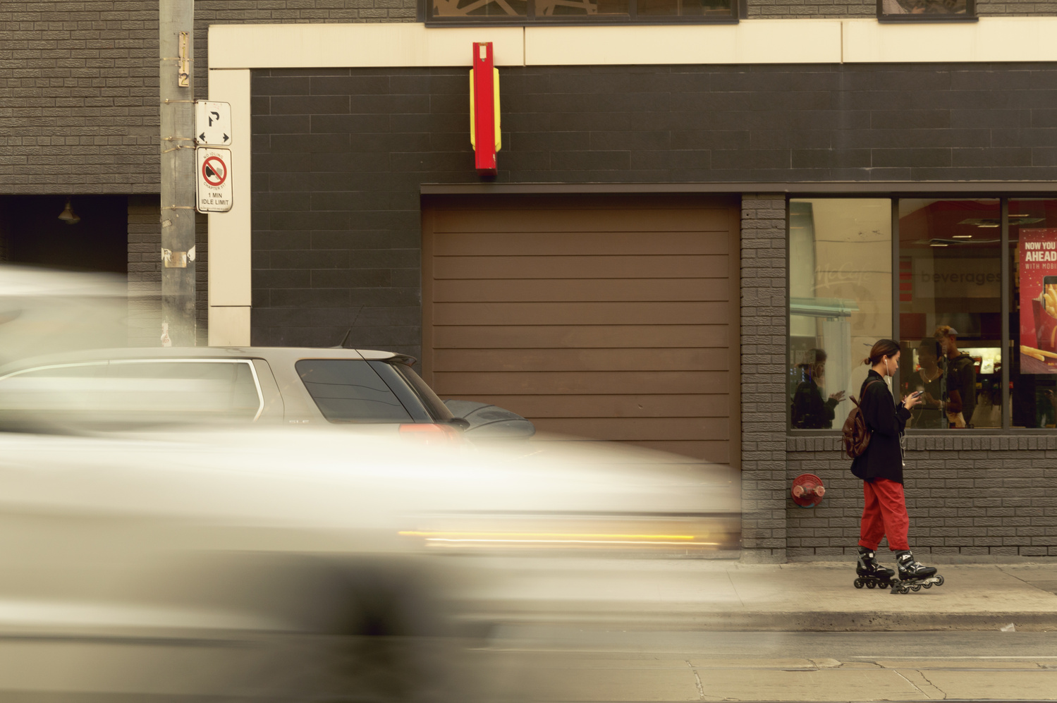
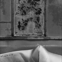
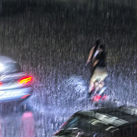
Hi. I´d be glad to give some thoughts: basically I feel you´re going the right direction in composing theses images, which are (mostly, except the one with the guy and the bike) all done in a two-dimensional perspective, i.e. "flat". I think the best one is the picture with the mural "love yourself": the feel of the composition seems the most balanced out. The first picture (durumi) I would have given just a little more "headroom" around the sides. Also, when composing these "flat" kind of perspectives, I allways try to fix the vertical and horizontal lines the best I can in post production (feels to me as if the face of the building is not really quite parallel to the plane of the film). The image with the biker seems a little confusing since there isn´t really a definite point of interest. Maybe you should have tried getting closer to the guy and his dog while still keeping the people in the background (and by going down closer to the ground). On the third picture ("stop here") I understand that the confusion is what you wanted to show with all the signs and stuff in the foreground -- yet I think you should have left more space on the bottom of the frame instead of cutting it off. Then the Cameron House image is also fine, again also a little more space on the left so as not to have "two borders" right beside each other, i.e. the border of the mural with the woman´s face and the border of the picture itself. The sixth picture "Backyard Patio" would have worked better without the car -- I would have walked onto the street and take the picture from there. The last image with the blurred car I would also crop a little wider - again I think there are two borders on the top which seem too close to me (the white horizontal line and the border of the picture itself). So to sum up I would try to crop the pictures a little wider (try around and see), and if there is a main subject, try to get the viewer to be more focused on it (unless of course you deliberately didn´t want that). Thanks for putting it up for a review and hope I my ideas are helpful to your further photographic journey! take care, Heiko