
First Ever Architectural Shot (Need Some Advice)
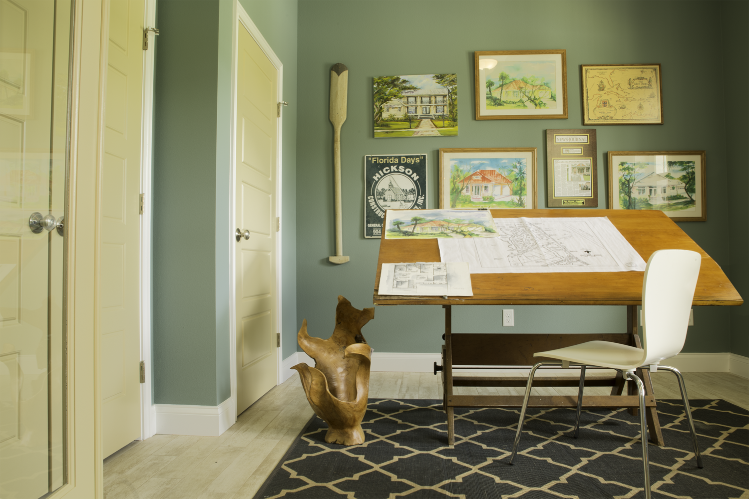
During my first semester as a UCF student, one of our last projects was to all get together and shoot some photos for a local group of homes that would soon be opening. We couldn't really move bigger furniture, so we were pretty much stuck with what was already placed for staging.
I really enjoyed shooting this and, in the future, might see if I can do more shoots like this down the line.
One thing that always bothered me: would you guys have edited out the outlet? My Professor said not to, as the "client" wanted to keep things as they were. For my own photography, as I am also able to use this in my portfolio, I'd like to take it out. Do you guys find it a distracting component like I do? What's considered the "norm" for editing out minor distractions in architectural work?


11 Comments
Welcome Quinn! Your professor might be right in certain scenarios. If these photos are meant for renter/buyers, the client might want to show there's an outlet on that wall. However most other clients prefer not to see them or simply don't care. I have a pretty liberal policy on healing out minor distractions - often an odd reflection or shadow.
Thank you very much! The client wanted to keep the outlets, but I think for my own portfolio I'll edit them out. I also want to fix the distortion that Andrew mentioned below. Weird that my Professor didn't mention that :/
Hi Quinn, a nice shot. If it's for an architect (as opposed to real estate agent for example) I see no problem in removing things such as outlets and in fact it will be preferable for most. Your image has barrel distortion and the verticals aren't vertical, you can fix this in post-production. Hope that helps :) Andy
Hi Andrew, thank you for pointing out the distortion! It's something I have a very hard time seeing myself unless someone actually points it out. I think I'll fix the distortion and remove the outlet from here.
First - well done! Good composition - very dynamic, which isn't easy in a geometric image like this.
Second - I agree that the distortion is off-putting. As photographers we notice this stuff. Mere mortals may not realize they're looking at distortion, but they'll subconsciously feel something is off. So fix it (LightRoom is great at this)
Third - Delete the outlet. I follow the Jackie O rule when it comes to retouching. She said something to the affect of - Before you leave the house, look in the mirror, and whatever accessory you see first - take it off." If the outlet sticks out to you - get rid of it. Trust your instincts.
Fourth - This job (architectural photography) is 90% moving furniture. Lift with your knees.
Thank you for all of your advice! I'll definitely fix it in Lightroom. (Which means learning how to fix this sort of distortion. I'm sure there's a million YT vids at my disposal)
And thank goodness about the outlet. In this case, we weren't allowed to move furniture, but if I ever get to shoot architecturally again I am 100% prepared for some heavy lifting!
I agree with all the previous comments but would add this:
I shoot mostly architecture and my clients WANT a lot of details retouched out.
For instance in a commercial space we routinely retouch all exit signs, fire extinguishers, sprinklers, informational signs and so on. The point is that they want to see the form of the space and not be distracted by the details mandated by a working building. They are showcasing design, not compliance with city codes.
In real estate photography we often retouch out various items such as lamp cords, switches and plugs. One client removes ALL ceiling lights (?). Some argue about truth in advertising and in some jurisdictions such retouching is a violation of law. In America it is legal as far as I know.
Always ask the client if they want stuff retouched out or not. Beauty is in the eye of the checkbook holder.
'Beauty is in the eye of the checkbook holder'! That made me laugh and is entirely true. I've decided to take out the outlets for my own use. It's great to hear all this advice from seasoned architectural photogs :)
When I was first starting out 40+ years ago (I guess that makes me old, though I am certainly still immature) I was very protective of my "vision". I did not like clients telling me what they wanted. I felt like they were adulterating my artistic vision and reducing it to pap.
I then realized that commissioned work was already an acknowledgement that I was selling myself. Thus I lost that "preciousness" about my work.
This is not to say that I have no creativity or ideas that I bring to the job, but rather I creatively and skillfully give the client something they love and asked for. On many occasions I can bring a different idea to the project that results in something they did not expect but love. Sometimes they bring something that I did not expect that enlarges my skill and vision set.
What many photographers rarely mention is the enormously significant role Art Directors play in the final result.
ADs often have a meticulously blocked out scene complete with models, wardrobe and props that permit scant improvisation by the photographer. I call this the "Annie Leibovitz" model. Vanity Fair has planned these shoots down to the last detail where Ms. Leibovitz shoots images from the position the AD selected of a scene staged and lit by others with only the slightest comment by the photographer. Adjustments are made by the creative team looking at images as they are shot relegating the photographer to role of a voice activated camera stand. The celebrity of the photographer is the ingredient people think is significant but could actually be performed by any decent assistant.
So yes, we are creative and love making a brilliant image but often that image will be designed and directed by the person controlling the checkbook and the booking calendar.
Well done Quinn. I agree with previous comments and I would like to add a few of my own if you would allow.
First, understand what are the requirements for the photography and what is the end result. If the photography is for client use only where publication or display is not required, some details like wall outlets may not be important. If publication or display of the photography is the goal pay more attention to the details.
Second, begin to develop the ability of seeing the images in your mind first, then as a finished image. Digital post production tools will help you, but I emphasize the importance of in-camera visualization before pressing the shutter. Think about what it is that you are trying to convey. Remember, Quinn, that it is the quality of the image that counts.
Great thread. A lot of valuable comments here. Thanks for posting this, Quinn. Here are my additional thoughts if you don't mind me sharing. These points are based on critiques that I've received from my photo editors from various agencies I contribute to:
1. The glass door on the left would be considered clutter. How to correct? Move in and to the right, make sure you've got a decent wide angle lens e.g. 10-20mm.
2. Shoot the desk head-on & centered with the chair pushed in and centered. Make sure everything is level and your angle is perpendicular to the back wall. So, you would have to move to the right a little. Your camera height is okay but, I'd try to have an even amount of floor and ceiling.
3. Remove the reflections of the light and window from the glass frames in the back. Try shooting with natural light if possible using long expo and sturdy tripod with remote timer or 2s delay.
4. Remove the unidentifiable thing on the floor left of the desk. Remove all items from the drafting table or leave just one centered on the table.
5. Check your white balance. The tone would be too yellow for my photo editors. Maybe increase the red and brown if warmth is what you are going for. But, the exposure looks fab.
enjoy,
mark