
Feedback on my first interiors?
I’ve recently started getting into shooting interiors and architecture so I decided to buy mike Kelley’s tutorial bundle, I’ve only watched about half of the first tutorial and couldn’t help but go out and give some of the techniques a try! All of these shots were taken with either a 24-105 canon or the 14mm samyang (I know it’s way wider than I need but sometimes 24 seems so cropped) and a single speed light. I’d love for any feedback on the images on how I could improve, thank you!


9 Comments
Looks great, Alex! The only criticism that I have in each of these photos would be the windows being blown out. The interiors look fantastic in my opinion, but the skies are all completely white and too bright.
Great job!
Thank you Kody! I’ve been trying really hard to flash pop the windows so that I can get the exterior properly exposed but keep having trouble with it looking to faked if you know what I mean, any tips for this?
I loved them , but i think some masked windows looks unrealistic ...keep up the good work.
Thank you, I totally agree though some do look unrealistic!
Interesting interiors... They look like they presented a pretty good challenge with all those bold colors. Solid first effort!
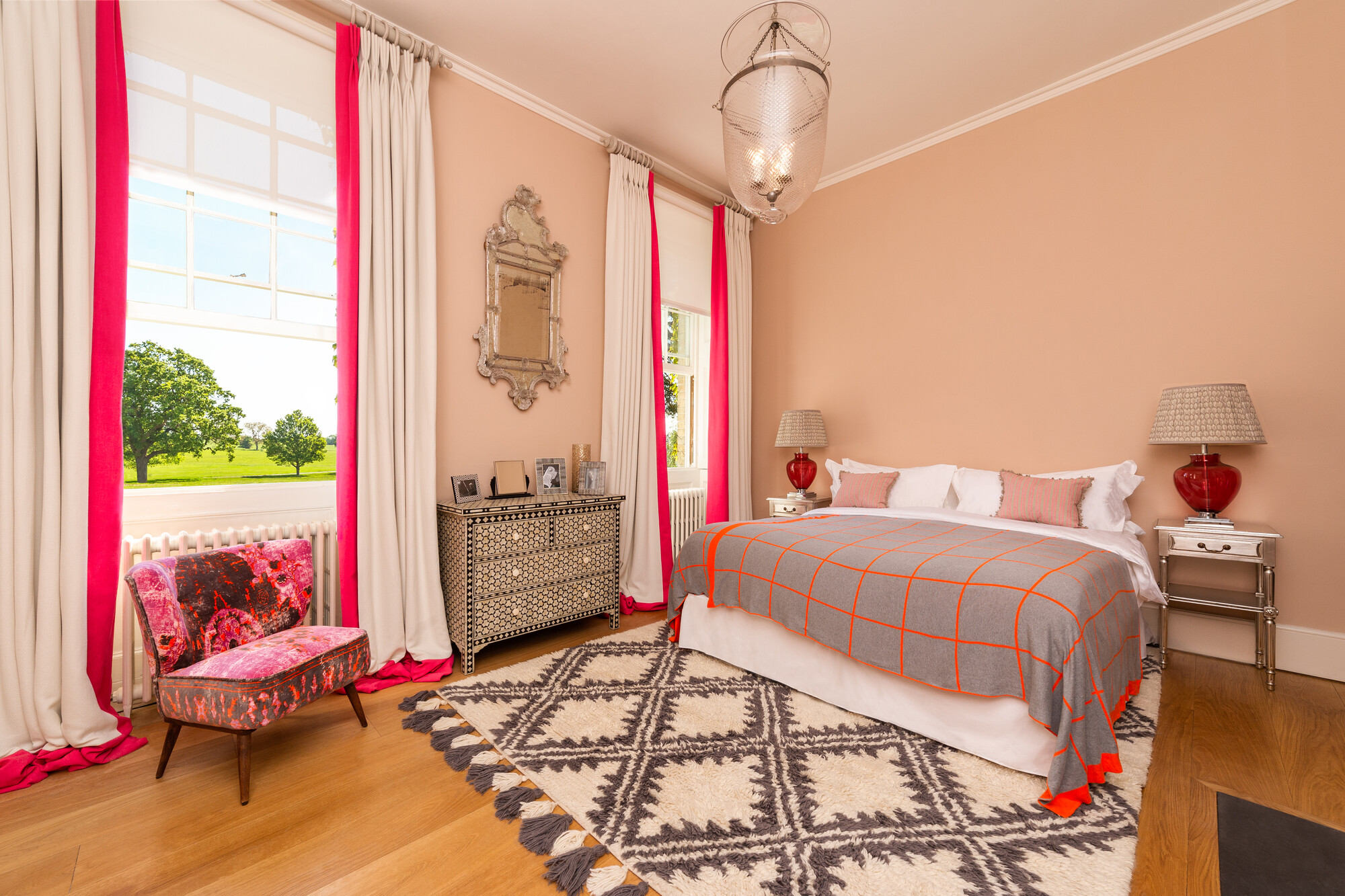
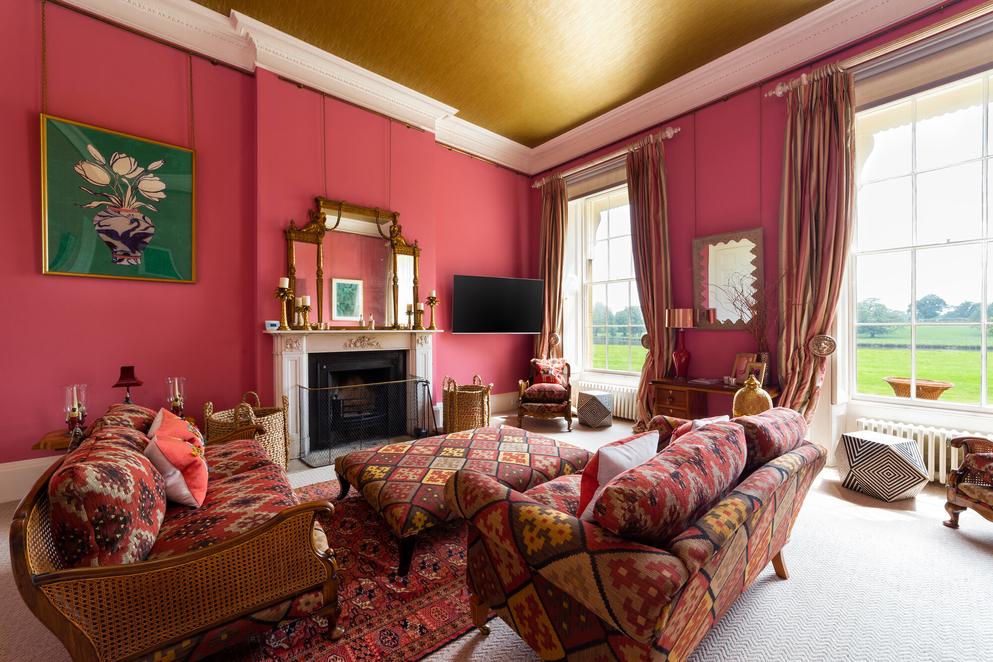
The first two images have the strongest composition and most natural lighting, IMHO. The last 4 images feel too wide & too flashy. Are some of the furniture pieces comp'ed in? The sofa in #3 and the chair in #4 look a bit like they're floating in the scene.
Thanks for sharing!
Thank you Colin, it was really fun shooting these interiors as it present a nice range of colours and styles. I get that too with, the top two were shot on 24mm where as most of the others were shot at 14mm and I do feel it makes them look a little too wide. Im going to try and tone down the the furniture in number 3 and 4 so they look less photoshopped in!
I think it they look excellent. However, I noticed in the third and fourth photos that the furniture almost seems composited though they may just be there in real life. I think that if you focus more on how the scene looks with natural light and use the composited light to compliment it, I think you could improve how realistic your images look.
Thank you for the feedback! I totally agree with what you're saying, I feel I need to learn how to balance the natural light with the added in speedlight flashes!
Alexander, honestly these are a great first set of images!
I wouldn't be so worried as others have said about the blown out windows. It depends on the client. If you pick up a recent copy of Architectural Digest you'll see the trend is away from the HDR look of perfectly exposed window scenes. Many of the editorial shots lit by daylight are almost white in the windows. Now a corporate client may not go for that look.
Mike Kelley's tutorial really is a good course but just remember it's only one way to approach interiors. Once you've mastered that you can try others.
Really, the only thought I might offer is to be careful with that 14mm. It creates a cartoon amount of distortion. If the room is too small then choose something you see that tells the story without feeling like you have to shoot the wide shot.
Another trick I might share is that when you have tungsten lights in a day-lit scene, shoot them both on and off then blend the right amount of illumination you want into the picture and the wall behind it. That way you aren't stuck with the color temp mis-match.
Glad you're having fun with it!