Loft apartment in downtown La Jolla, CA
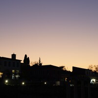
I shot this a few days ago and would like to hear some feedback from the group
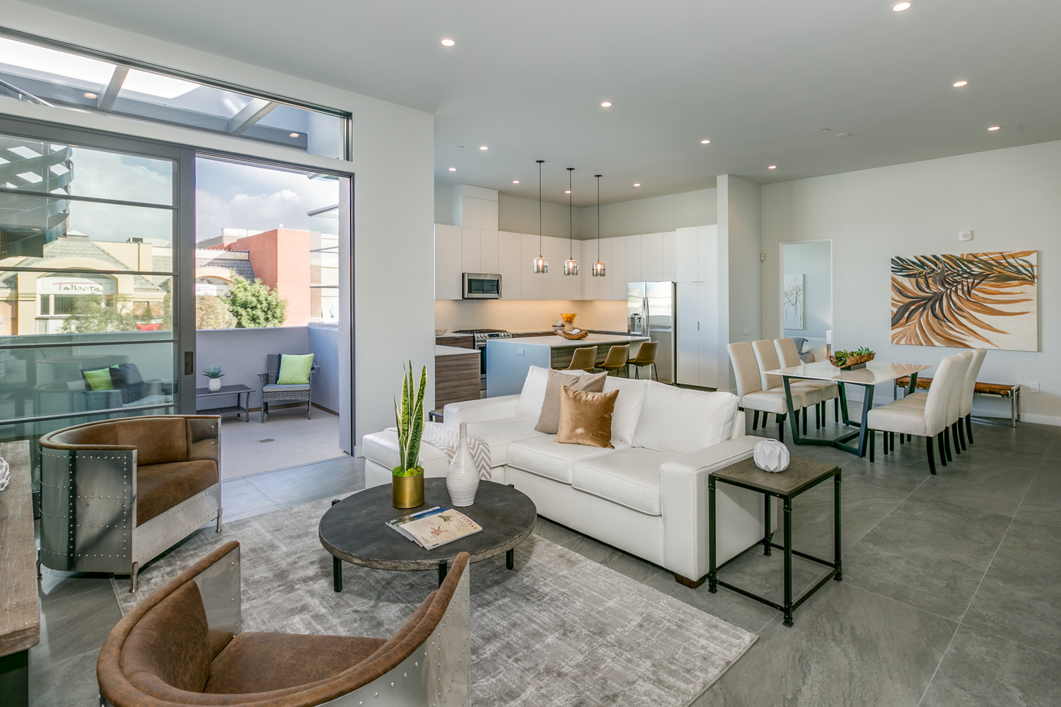
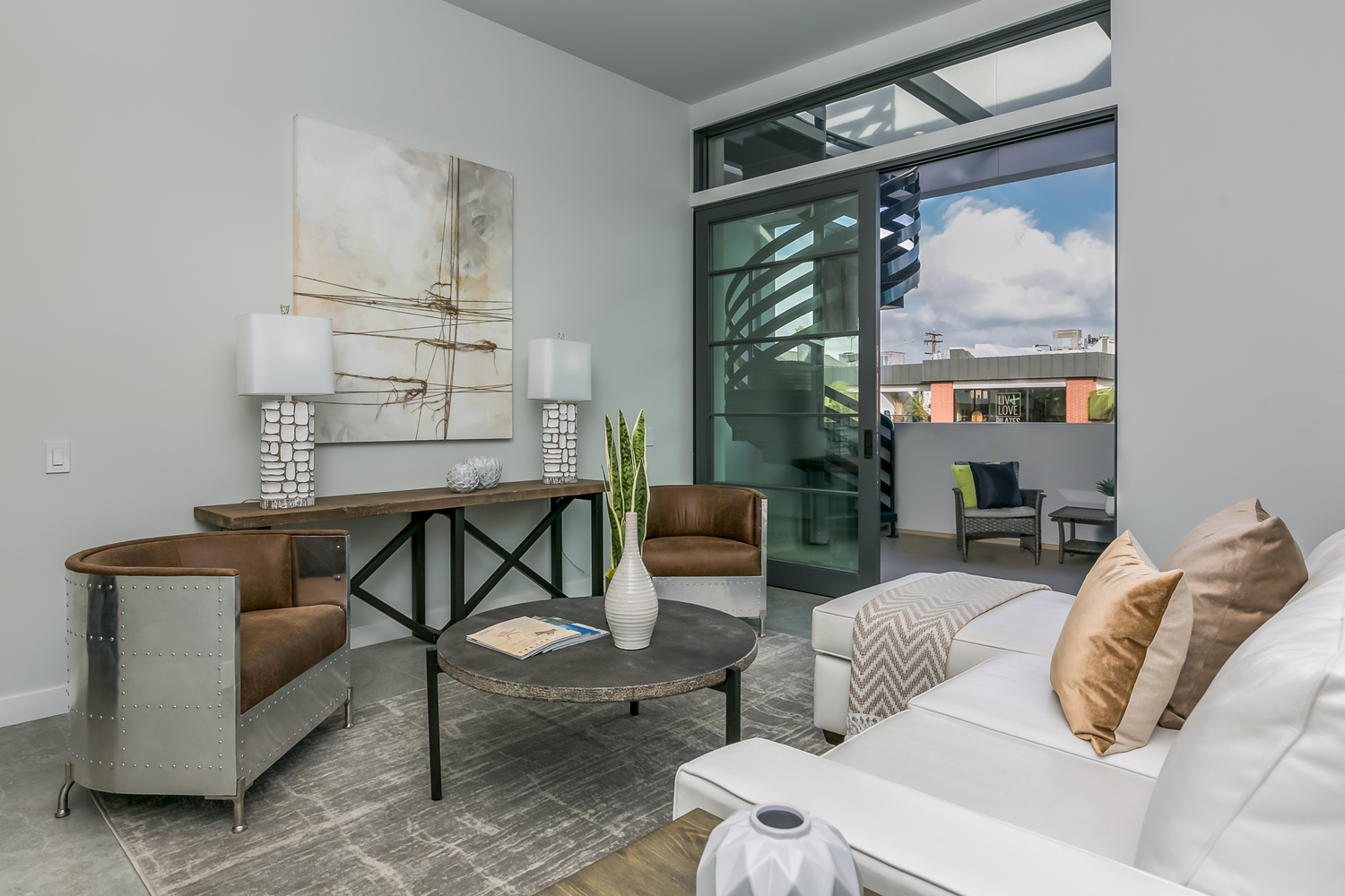
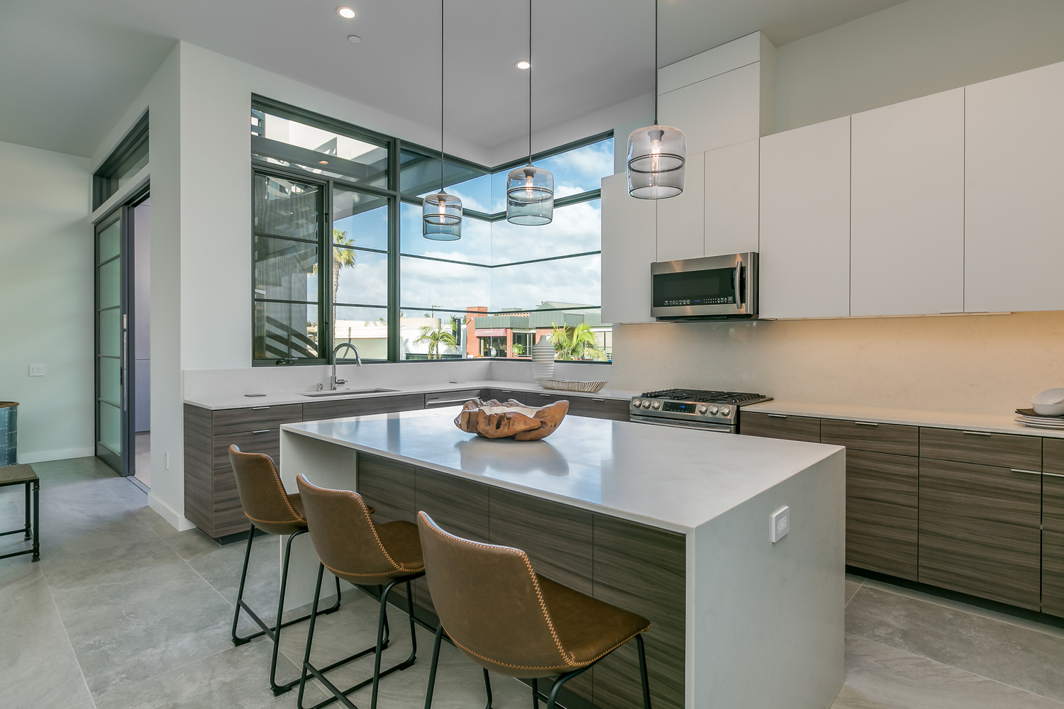
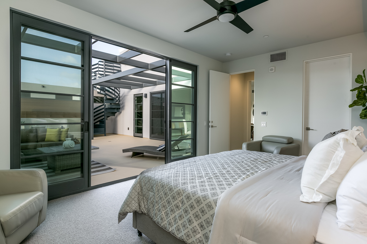

I shot this a few days ago and would like to hear some feedback from the group
A few shots from the winter of 2025. The last one was inside of the Acropolis Museum. (Unfortunately, I could get everyone to walk exactly where I wanted them to. hahaha)


For iPhone users - a new version of Bluristic has dropped (v1.8) which offers new features and significant improvements in stability & useability.
I am interested in learning Macro/Closeup photography and understanding that Focus Bracketing is a good part of the process, I thought I would give focus stacking a try.
Another visit to our garden using a vintage lens (Canon FD 50mm f/1.4) on my Canon R5. NOTE: With this lens the minimum focusing distance is 18" at which point you have 1/4" depth of field.


4 Comments
I am not an architectural photographer but one of my son's sells real estate so I see a few samples. This is why you do what you do Ian. Very good work.I remember reading about a famous architectural photographer once(don't remember his name but I think he was an American) who always had people in his shots. I wonder why no one seems to do that now. Just a thought. Maybe others have an opinion on this.
Good solid images.
My main points would be in photo #1 crop out a bit more of the ceiling and up from bottom . Leave in most of the chair but come up to suggest it but not let the seat draw the eye.
In both #1 and #2 I would allow more ambient light to soften the dark shadows.
In all of them I would open up the rooms with a little more ambient.
I would also use a H&S brush to desaturate the blue cast or add a bit of warmth to the walls.
As for people in interior phots , that is NOT for real estate photos but for architectural images that show how the space is used.
good feedback, thanks for taking the time Indy
Solid work!
Personally I try to not have objects in the frame that are cut off halfway. For example, #1 the table on the left and the chair. #2 The vase in front and the top of the window frame. #3 the object on the kitchen top and on the left the side table thingy. On the last picture the bed looks a bit messy and there's a shadow on the left point that makes it look like the sheet is a bit dirty.
Nice lighting and good representation of the place!