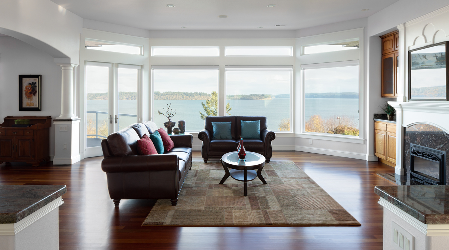
Natural Interior - First Attempt
My 1st try at interior natural light. I'd love some feedback if you can spare the time!

My 1st try at interior natural light. I'd love some feedback if you can spare the time!
A few shots from the winter of 2025. The last one was inside of the Acropolis Museum. (Unfortunately, I could get everyone to walk exactly where I wanted them to. hahaha)


For iPhone users - a new version of Bluristic has dropped (v1.8) which offers new features and significant improvements in stability & useability.
I am interested in learning Macro/Closeup photography and understanding that Focus Bracketing is a good part of the process, I thought I would give focus stacking a try.
Another visit to our garden using a vintage lens (Canon FD 50mm f/1.4) on my Canon R5. NOTE: With this lens the minimum focusing distance is 18" at which point you have 1/4" depth of field.


7 Comments
Hi Dave,
I think anybody who shoots directly into a picture window is brave…the exterior here is at the perfect exposure. Not too light or HDR-like. My eye went right to the outside because it's the lightest area.
But once we come inside the one thing that is missing from your shot is shadow detail — look at the couch in the center, the end of the couch at the left and room to the left.
The most ideal way to add shadow detail is exposure blending of 3 to 5 shots. But if you only have one exposure and its RAW then you can make one more conversion of it. Make it brighter and open up the shadow detail. Put it on one layer above your main image and then change the blending method to "Lighten" Then use a mask to only bring in the areas you want to open the shadows.
Once you're good at that you can do the opposite technique to knock down the burned out highlights on the floor and the couch cushions.
Hope that helps…
My thoughts are very similar. For me, it helps to think about what the viewer is going to want to see, especially from a home decor/interior design state of mind. There's nothing wrong with having shadows, but you should have some spots that are bright enough to really show the detail in the materials and finishes for the furniture and surfaces. The dark spot on the left hand side could be lit with some handheld flash and blended in - the countertop in the bottom left could be lit a bit as well to show the detail. Same with the part of the couch nearest the viewer.
I like the venue and I think the shot has a lot of potential, especially from a minimalist point of view if you wanted to get rid of the cushions and tabletop items entirely.
Pretty cool shot, thanks for sharing!
Thank you Daniel. I shot 5 exposures and blended (the hard way, I'll definitely try your suggestion it sounds much easier) ... None of that photo is technically blown-out or missing dark pixel information, but I guess what it looks like is more important than what Photoshop says?
Here's the image I delivered -vs- the one I'm trying to make with natural light:
https://www.davespencerphotography.com/recent/2018/12/16/compare
Thanks again!!
I'm a sucker for using Lightroom now before I use Photoshop. It helps to draw out those tones naturally. On your site comparison, I think something closer to the second one is nice but being too stark makes it seem unnatural.
Thanks for sharing your "delivered" version.That helps me understand the mindset.
I hope you don't mind my boldness but look at what happens when you layer the corrected version on top of your original at 50%.
I now see a much more believable sky and open shadows inside.
(Sorry it's so soft. The two images weren't exactly the same size)
Daniel thank you for taking the time to do that - it's certainly muuuch closer to what I had in mind (and I'm so relieved it was actually hiding there!)
I like highlights that meander back and forth into blown-out territory a bit 'too far'. Shadows too. Contrast is okay for certain elements but globally I'm starting to hate it... (possible over-reaction to delivering RE photos that "pop").
I want thick fluffy whites and soft deep-rich blacks. How do I get there?
Thanks again!
This is wonderful. If I was the client, I would be very happy with this image. The colors, brightness, etc is all on-point.