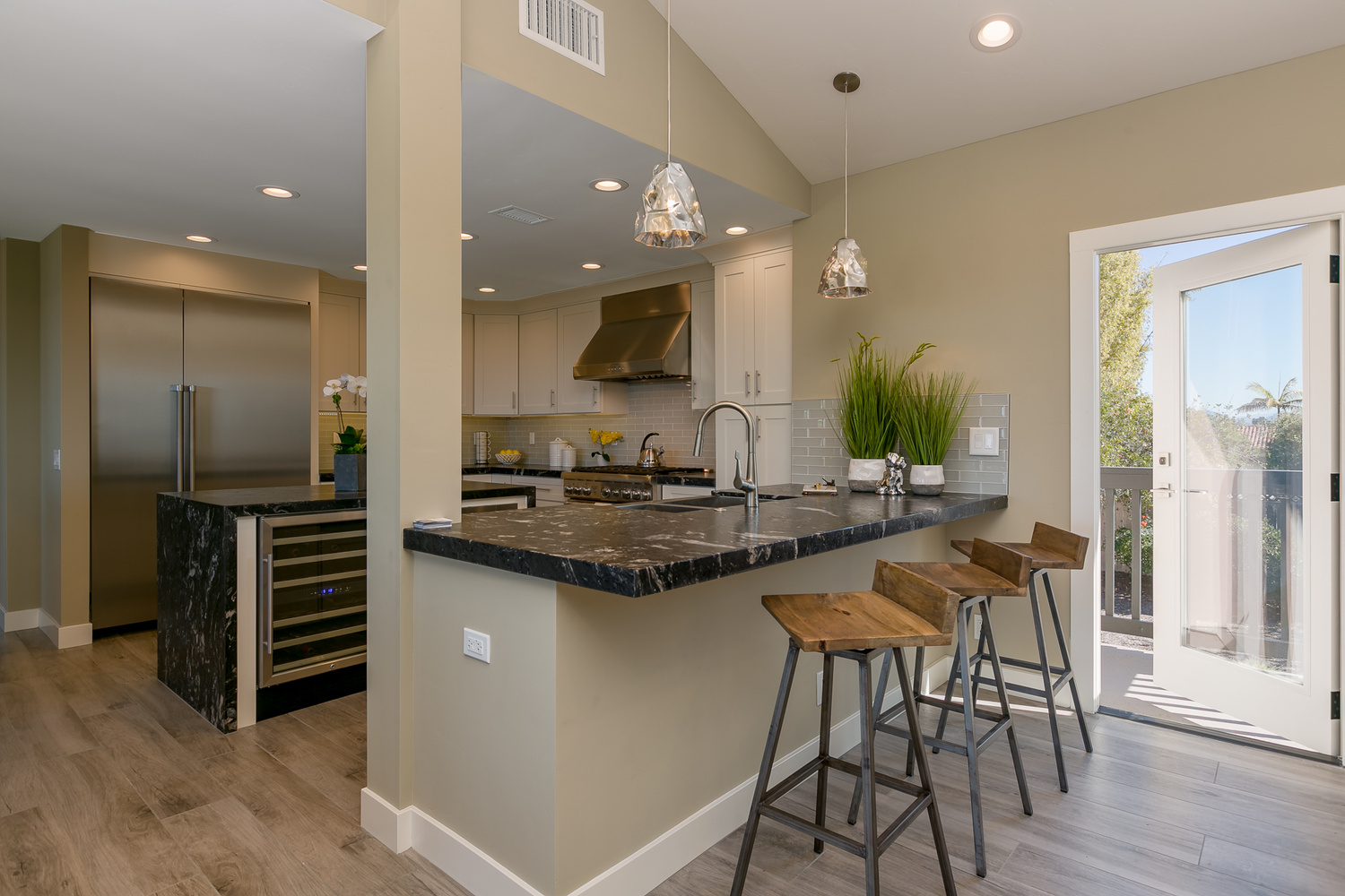
any thoughts on areas to improve upon on this shot
looking for blind spots, and thanks in advance for feedback.

looking for blind spots, and thanks in advance for feedback.
These photos were taken just outside of a small town in central Portugal.


I really enjoy creating something different with drones. I've had the Mavic now for about four weeks and I absolutely love it.


Client came and needed headshots immediately. Set up a single Broncolor Para 133 in the dining room. Delivered 20 pics. Setup, Shoot, Edit and delivered within 30 minutes.
This is a water reservoir for the city of Curitiba, Brazil
Here are a couple long exposure shots using my original 50 year old Minolta SR-T201 and kit lens shooting Fujifilm Neopan Acros 100 II. Both images were taken just at the end of blue hour.


11 Comments
It's too dark in the kitchen area, but is otherwise pretty nice. I might crop the air vent out too.
The column center left grabs the eye. Try recomposing with it on the edge or removed from view.
Looks like a nice home - couple of suggestions
- Remember your audience. Prospective home buyers are going to be the most receptive to bright and inviting spaces. I would increase the exposure of the kitchen area in particular. The dynamic range of the bar is nice looking from a photographic standpoint but it isn't going to sell the home.
- Stage the home as it would be used by the buyer. Close the door - the open door doesn't look inviting, it looks like a kid ran out and left it open. I like the idea and it would be great if it were french doors leading out to a patio or something along those lines, but this is more of a side access in the context of this shot.
- Frame the shot in a way that gives the prospective homeowner the best view of the space. As another commenter mentioned, the column being in the middle of the shot is tough as, well, you can't exactly move it, so it would be up to you to try to shoot around it. For this shot, I would choose to move the camera closer to the door and rotated left 90 degrees to give a view of the kitchen that shows the bar in the foreground and eliminates the column from the shot completely. You can also move the camera left a bit and shoot across the bar with the door in the background to showcase the deck and view if you'd like using a more isometric perspective. I think it would look pretty nice.
Thanks for sharing!
I agree with the brightness and the door.
For the latter, I would take a shot with an open door in addition, for using it to drastically reduce the reflection in the window in post.
great idea, thanks Paul
All good recommendations, thanks for taking the time Rob!
That kitchen beam is obstructive and the angle makes the kitchen seem smaller than it is. Maybe doing this scene in two photos (length of table shot in the direction of the door & shooting into the kitchen from the table) instead of one would have been an alternative.
I think the colors are fine, probably would have added some pop to the ceiling lights in the kitchen.
I like that angle. Imo this image is begging to be captured with a 50mm lens (full-frame mm). If it wasn't shot so wide the post would look much smaller (and the range hood larger - why isn't that light on?). Less wide could also mean cutting the freezer door in half - we know what the other half looks like. Then I'd move that plant to the left a bit left to hide as much of the other door as possible. If you closed the glass door and only showed just 1/3 you'd have a nice 'implied door' that would be plenty I think.
Because of the angle I personally would like the bar stools in a normal position (but not pushed against the wall).
I'd cut the ceiling w-a-y down. Probably even below the ceiling fixture of that right pennant.
I agree 100% with Rob; the lighting looks nice/ natural - but these are advertising photos (think bright & shiny, like a fishing lure :)
I like the thinking on the 50mm... will give that a shot in some future shoots
I agree with the other comments and took some of their suggestions to make this edit. I actually made one that left a little of the column and it was fine, but I think it looks better with it gone altogether.
Longer lens, step back w/ the door shut, stools facing counter...