
My first paid architectural shoot.
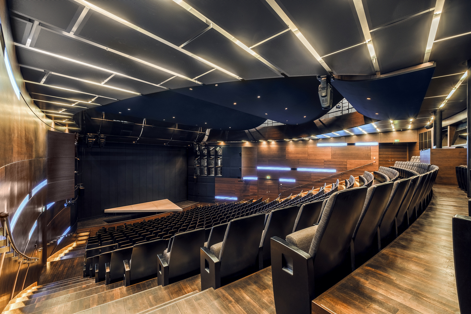
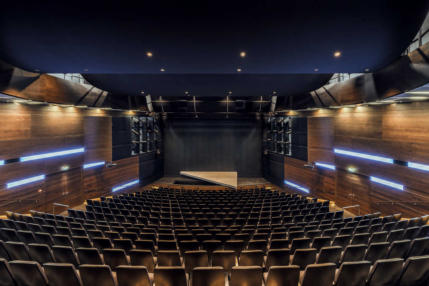
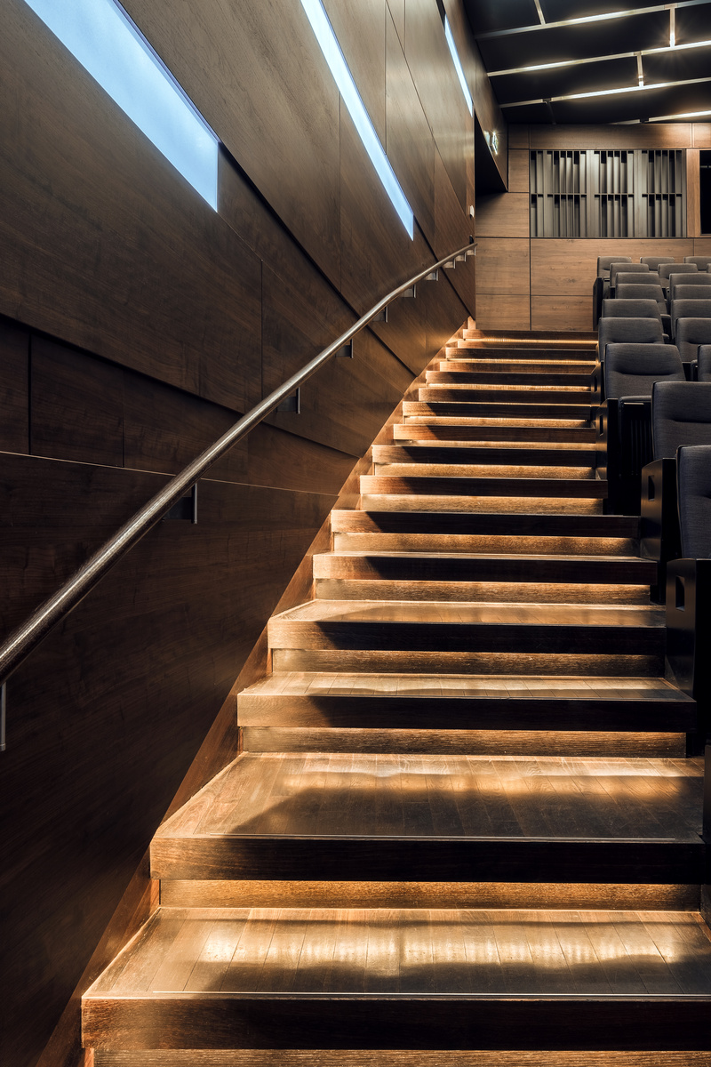
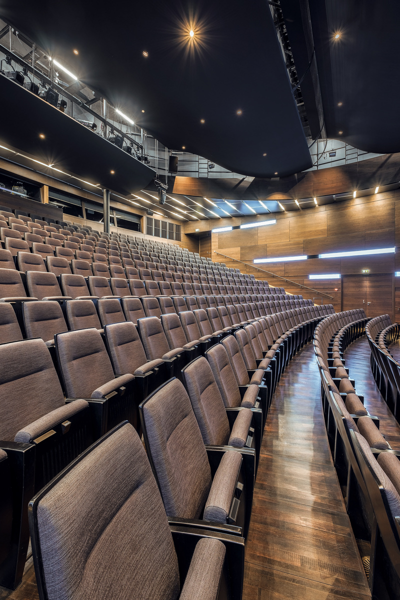
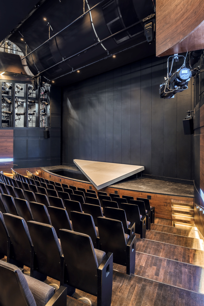
Since I recently started engaging with this nice group of people here on Fstoppers and asked for feedback and critique for my architectural work, I wanted to share my progress in this newly entered field of photography. And as people judged my work that I'd be ready to get professional clients, I almost immediately afterwards was hired to shoot for the State Theatre of Nuremberg. Here are the results of the first two shooting days. Two more ahead.
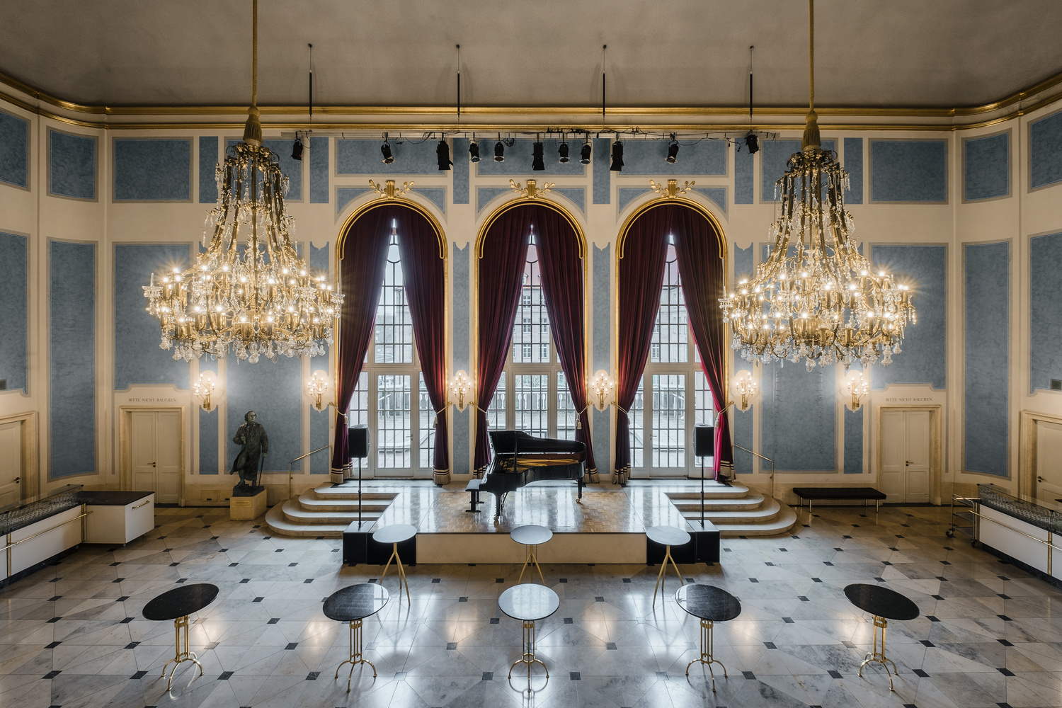
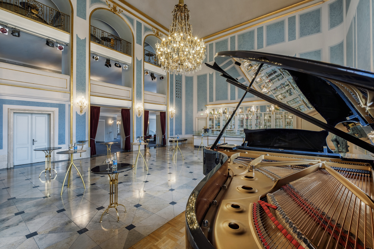
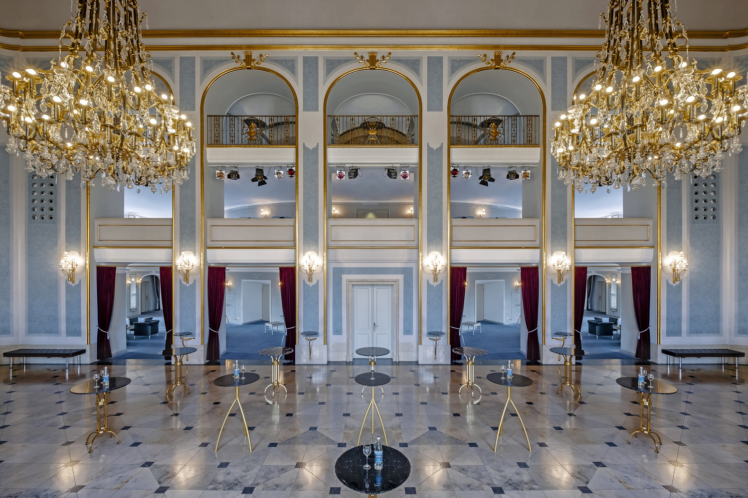
I'm grateful, for all critique I've received so far. My biggest takeaway was to not only shoot one-point perspectives but also isometric pictures to add more dynamic and creativity to it. So I came up with those shots (i.a.).
As for now, I only have the possiblity to shoot on a 10-24mm range, I still have distortion but I try to keep it as little as I possibly can. Anyway, in the near future after two more well-paid jobs, I might buy a Kipon adapter with a Laowa 12mm fullframe lens to counter the distortion. But on Fujifilm, there are not many options so far. Anyway, I think those pictures look still professional despite the mentioned distortion.
Cheers and thanks again for pushing me forward!
Matthias


18 Comments
Well done!!!!
thank you so much, Anna!
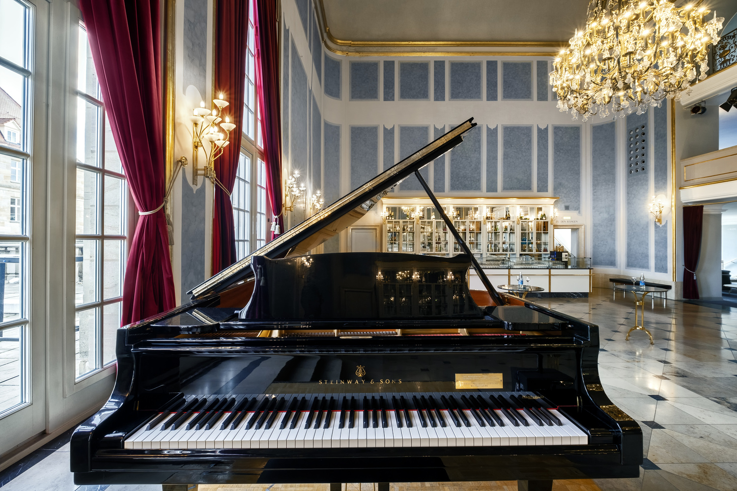
Nice work! My favorite shot is the 3 one with the reflections in the piano.
Thanks Shawn. It's my favourite one too. It shows the functionality of the room as well and has a meaningful foreground element.
Nice work. That room with the chandeliers seems particularly challenging to shoot. You might have overdone it with the chandelier and wall lights, they seem too bright, a room as ornate as that one would probably lend itself to be shot with a flatter profile with less pop from the lights, basically relying more on the natural light. U should be able to adjust it in post with masks.
Compositionally I like what you did with the chandelier'd room, I feel like you could have done something more dramatic and angular in the auditorium, particularly with that modern architecture. You did mention you are only shooting 24mm only so that could be part of the issue. Great job overall, thanks for sharing.
Thanks Francisco. i really appreciate your feedback! Indeed, the chandeliered room was terribly difficult. In the first shot, I manually blended together 7 exposures, masked the walls to match the colour as it was the only one shooting straight into the window light. I tried that shot twice, so I shot it on both days. What are you proposing to make the light pop even less? When I masked in my dark exposure from the outside, it created horrible halos around the window frames' edges. Also the two different white balances are hard. Any idea for that?
About the auditorium: I shoot on a 10-24mm lens. (But APS-C [Fuji]. And most of the shots were shot on 10mm. Picture 1, 2 and 5 are my favourite ones in that series, in particular I found the first one to be already quite spectacular and angled with lots of leading lines in the ceiling, seats and side walls into different directions. I was already slammed into the corner. What kind of angle are you missing or wishing for?
Thanks for the nice conversation here.
Cheers!
I just would have done an exposure with the interior lights dimmed down and then blended that in. The first shot also has excessive reflection on the ground from the exterior and interior light, I probably would have masked out the interior light reflections on the ground.
The white balance looks ok, wouldnt really know more about it without pulling it into photoshop. The challenge is you simply have a lot of whites in the shot, particularly the wall paint, the doors, and the piano keys.
As a side note, an interesting technique ive seen for targeting colors that are being difficult to deal with, is to simply crop into a certain part of your image that you want to adjust. This will give you a new histogram that makes it easier to target certain tones. Once you're done with your adjustments you can crop back to your original image.
I'm sure the auditorium was challenging to shoot because of the dimensions. All I was suggesting is that it would have been nice to see a couple of fine art style shots. There is nothing wrong with the photos you did.
A polarizing filter on the one the shot used for the interior lighting in the first shot would possibly have helped with reducing the reflections from the lights and may have helped reduce the halos around the lights.
I'd say you earned your pay. Nicely done!
Thank you :)
That was nice to read!
Great work! What lighting gear did you use?
Thanks. In all pictures of this set only natural light.
A great work!
Fantastic work mate!!! The piano shot with the reflection is great. Only critique I would have is the one point perspective of the piano keys is slightly off. Also, although not necessary, sometimes its good to choose one aspect of a room and capture that, instead of its entirety. If its done right theres not a whole lot of guessing on the viewers behalf. For example, shooting the one point perspective of the piano but only having half of the keys in the frame may have made a nice composition with the bar in the background.
Thank you so much for that feedback!
I tried as hard as I could to fix the perspective in post, but you still saw that i was slightly off. So you're really knit-picking, which is good :) I think, an untrained eye doesn't see that though. Your proposition for a more "mysterious" perspective was really helpful. Trying to embody that into my work. Cheers!
I concur with j g. To demonstrate, I did a perspective correction, and also pulled the left side in just a touch to get rid of the blue partial table leg outside the window. Makes for a cleaner image.
great work!
Matthias you have done a great job of capturing a very difficult range of interiors .You have worked very hard to produce these wonderful results .The first 4 images of the classic room with ornate chandeliers would of been difficult with all the reflective surfaces .If I may suggest my eye always go back to the ceiling of those 4 images a bit of lightening on the ceiling, it's just a bit off colour or some additional lighting to bring some crispness to the ceiling .This is minor compared to the rest of these excellent images .Thankyou !