More Posts in: Architectural Photography
These photos were taken just outside of a small town in central Portugal.
I really enjoy creating something different with drones. I've had the Mavic now for about four weeks and I absolutely love it.
Client came and needed headshots immediately. Set up a single Broncolor Para 133 in the dining room. Delivered 20 pics. Setup, Shoot, Edit and delivered within 30 minutes.
This is a water reservoir for the city of Curitiba, Brazil
Here are a couple long exposure shots using my original 50 year old Minolta SR-T201 and kit lens shooting Fujifilm Neopan Acros 100 II. Both images were taken just at the end of blue hour.


9 Comments
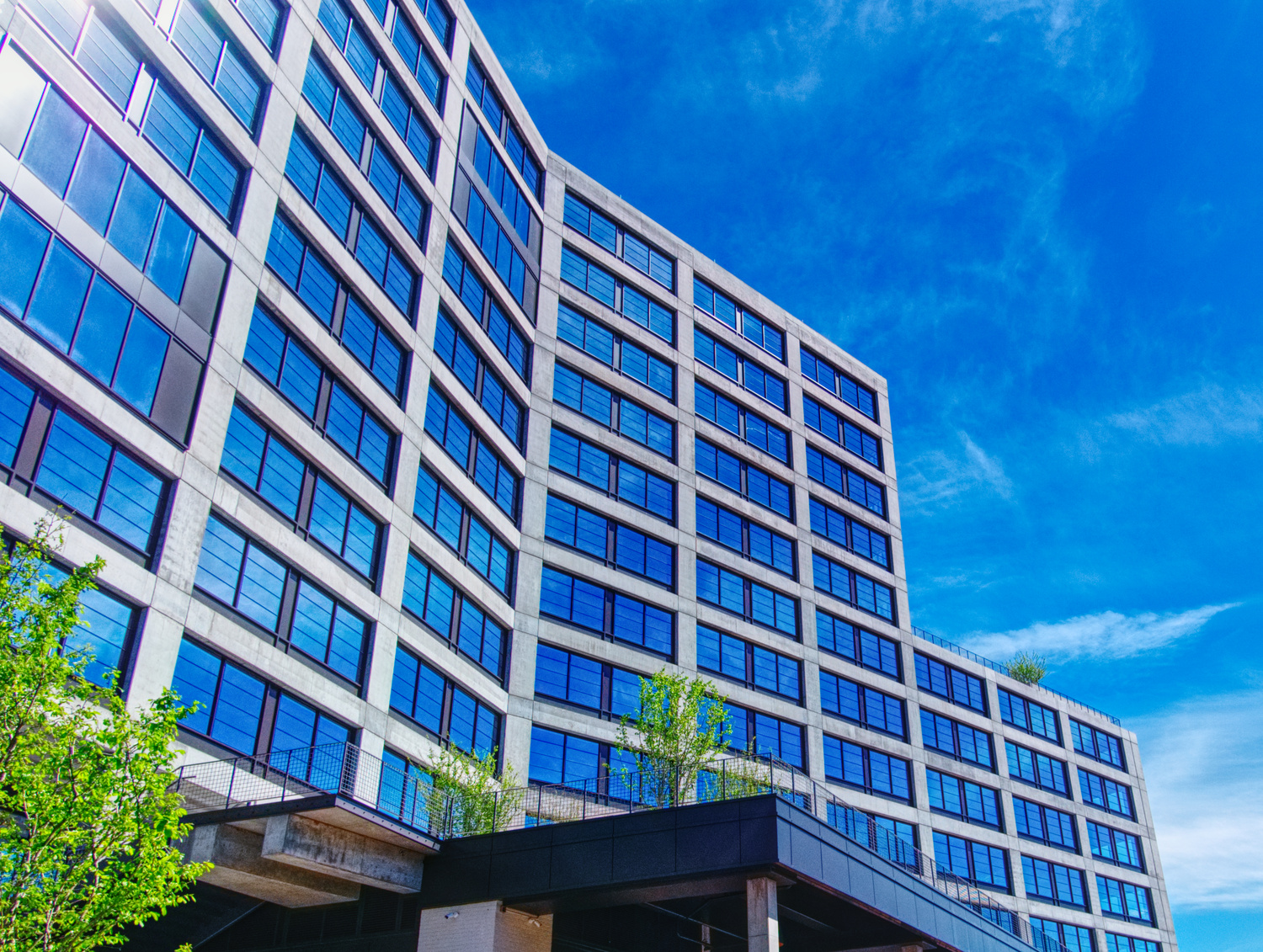
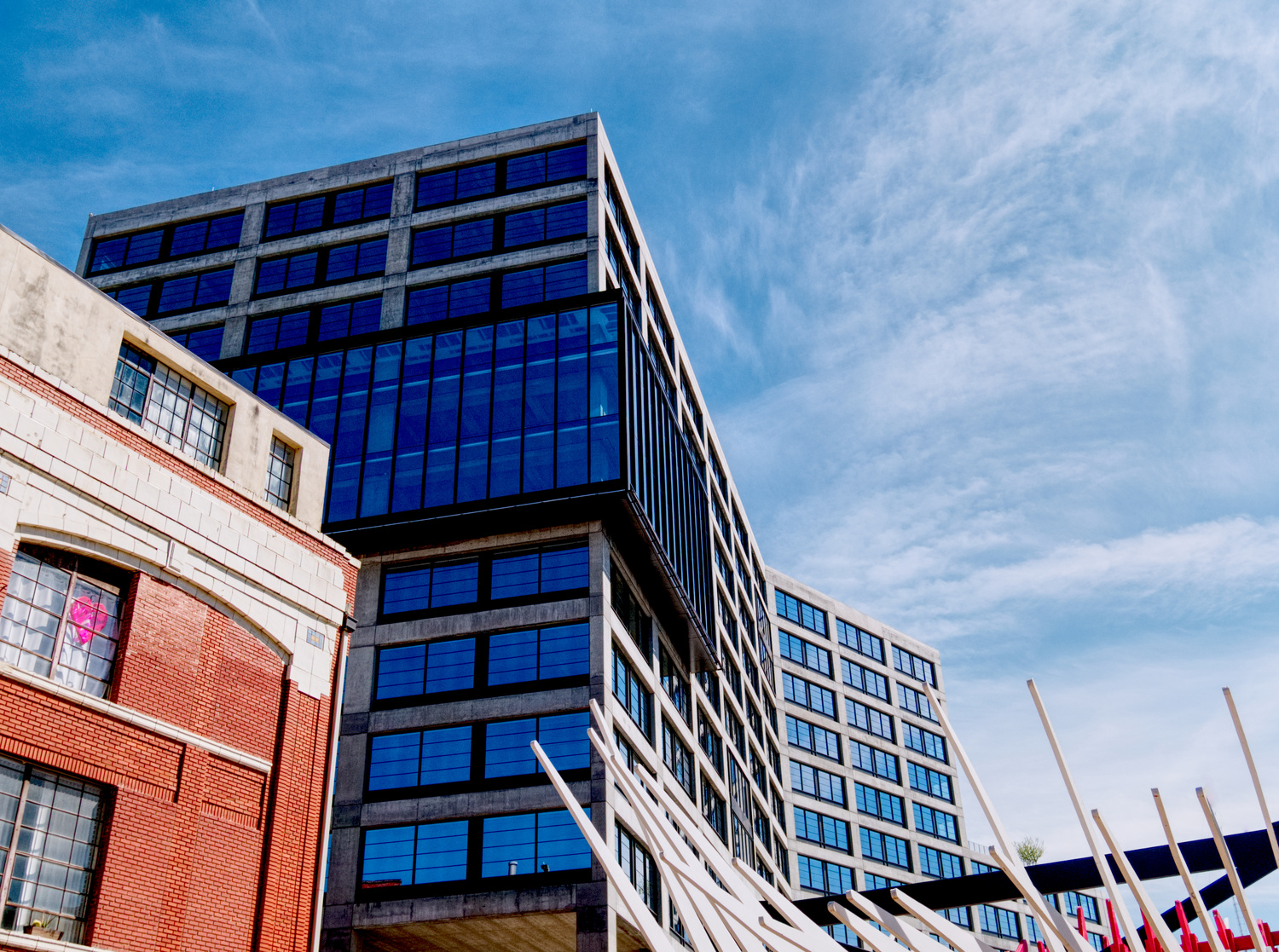
Good composition on 1, but I would like to see the ground floor/entryway. I would like to see just a sliver of ground on 2 as well, and those white poles and red brick building on 3 are somewhat distracting so I would have avoided this angle altogether.
Angles need to be corrected on all 3 shots, and I would bring down the blue saturation quite a bit as your clouds have been turned blue and in addition, there is quite a bit of noise introduced typically with overly saturated blues.
Awesome, thanks for the critique
Cool set of shots, they look oversaturated though, particularly the 1st and 3rd one. As Ian said, too much blue. I'd probably drop a good amount of the blue from the windows and see how that looks. It also seems like you overprocessed it with something like excessive dehaze. Just feels oversharpened.
Yeah I see what you mean, I think that might be the tone compression and local contrast. Im gonna have another shot in post and see if I can dial things down a bit, thanks
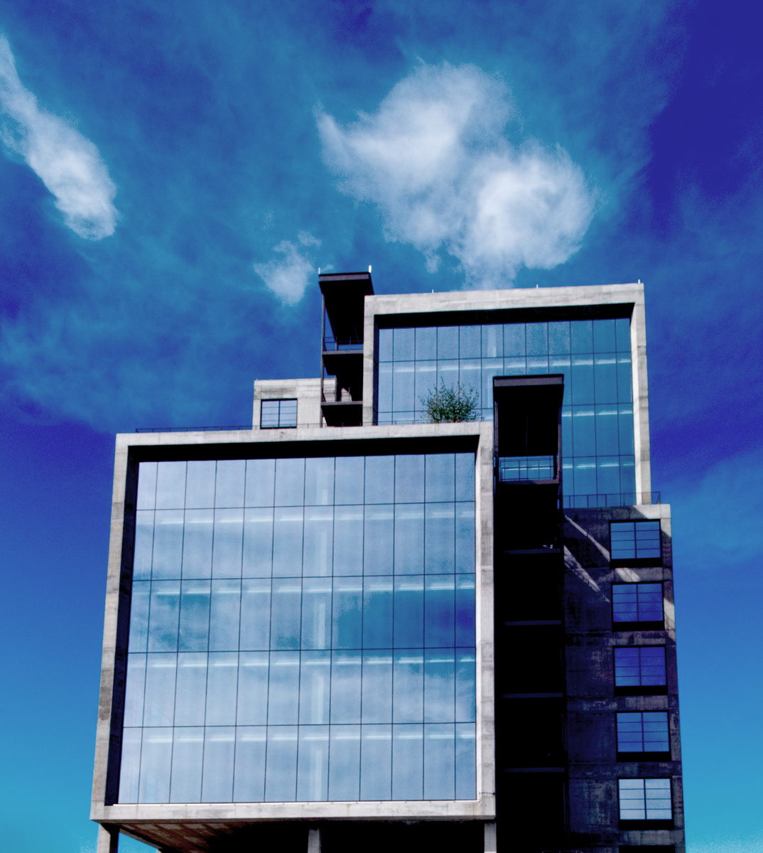
All three images have merit in my opinion, and give me a sense of what you saw and wanted to convey, James. You're doing a lot better than I was at 5 months!
The previous posts make points I'd largely echo, especially about saturation - things that I find easily occur in processing, and point to the need for restraint and review (preferably after a day or more and after looking at other images).
While Ian has a point about the verticals being corrected, I'm not so sure, especially with the first.
My favourite is the second, as I like simplicity, and for me the lack of "distractions" from the building helps. However, including very contrasting matter like the vegetation of the sculptural forms in the third can work well as a foil, or deliberate contrast, so that's your artistic choice; others will or won't like it, but stick with what seems right to you is what I'd say. I append a quick edit, straightening and pulling back the blues a lot.
Your posted files are a bit small to make the most of them for viewers on this site - selling yourself short. I look forward to seeing more of your posts.
Thanks Chris, I appreciate the comments and the edit man. Pulling back the blue and learning restraint makes a lot of sense--as a lifelong musician I def understand how that is an important part of evolving as the same is true in music and other artistic disciplines. The weather in Atlanta doesn't often allow for a ton of nice building shots so I was fortunate to grab these.
The clouds look natural now, James! Without that distraction, the viewer's eye is freer to wander around the image, savour the wispy clouds, the bold forms of the building, and the contrast between the two. Thus, the entire image benefits substantially.
The odd-looking clouds could be likened to an out-of-tune guitar in a band, or just one stumbling member of the rhythm section. Just a small problem? ;-)
Now, your band's COOKIN'!
What's with Atlanta weather?
And maybe saturation equates to drummer pyrotechnics...
I like that haha, maybe "saturation is the hair metal of photography" or something like that. And don't get me started on Atlanta weather... rain october-may, oppressive heat june-september.