
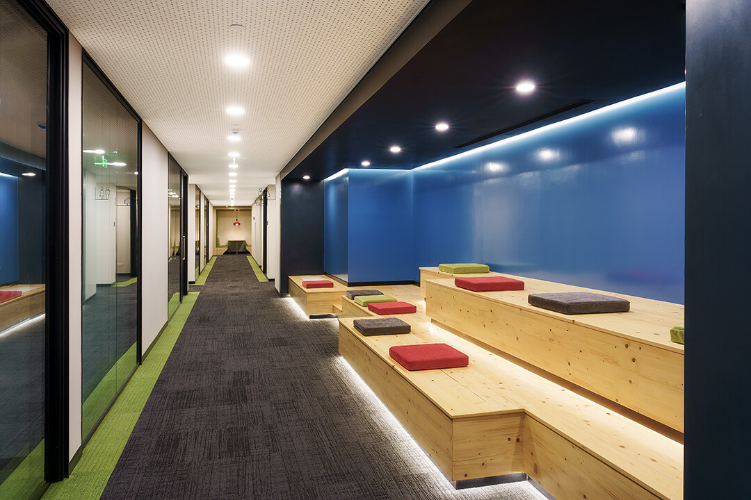
Colour variation
Hi. Have recently captured images of a corporate interior space. As my standard process, I take 5 brackets for each focus. I focus stack and then composite the image for exposure blends.
For some dark / pastel colours I observed colour variations. in these posted images I came across blue colour variation at the ceiling of the seating feature. Requesting fraternity to guide with ways to correct it in post processing. It can be any level of advancement. Am willing to learn and practice it. Am working in Photoshop.
Please feel free to comment on any and every aspect of this work beyond discussed point, if you may.
Thanks for support.


8 Comments
Methodology sounds rigorous. Do your lenses ‘focus-breathe’ or has that not been an issue?
Hi William. Well in interiors the nearest focuses are also usually at the mid distance ranges and not very much close to camera. so focus breathing is not that much of a problem. however, rarely the mismatch is seen in focus stacked frames but for that part I mask it with other single frame or even patch the part.
In art frames where shallow depth of field is played with, I usually work around with single frames. I did not face much of problem.
in my limited knowledge, focus breathing perhaps is not much of problem in wide angle range, Or say am blessed with better lenses with higher magnification ratio. I use sony 24mm at 1.4 and Zeiss 16-35 at 4.
Thanks.
True enough re wide angle lenses. What I like about this is that it provides a means for overcoming the problem of unsatisfactory sharpness when striving for maximum DOF (with a single exposure) when photographing buildings. Break the problem up into chunks! Make so much sense! Think I’ll give this technique a try next time... Cheers.👍
Hi. Any suggestion for variable colour issue?
Hi Vijay.
I think your work is getting better with each project.
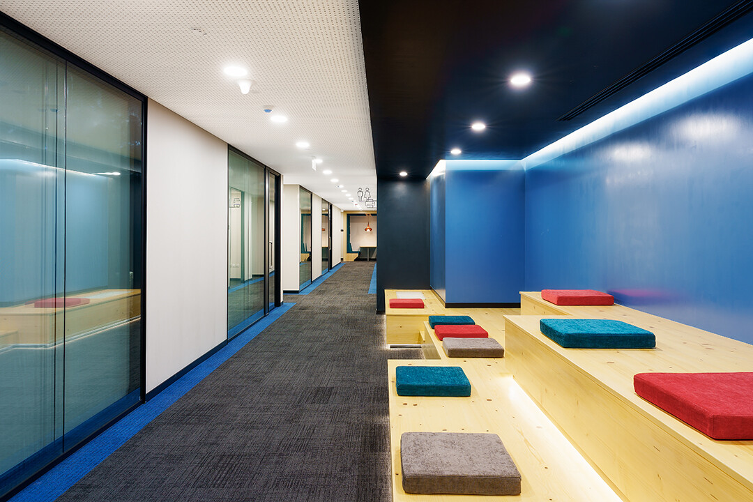
I noticed the first image isn't a true one-point perspective because the vanishing point isn't in the center of the frame. So even though your horizon is level it has the dreaded "up-hill" effect to the right side of the frame. It can be fixed by using a tilt-shift lens… or correcting in PS but that leaves artifacts.
The second image was taken with the vanishing point near the virtual "center" of the hallway space so it's a true one point perspective. Notice how the pattern on the carpet looks level.
Thanks Daniel for your reflections. Any suggestion for colour variation?
As a matter of fact, yes. I have developed a technique that works well for removing color casts in walls and ceilings. Your photos are good subjects for this technique because there isn't any artwork or wall hangings to work around.
In Photoshop create a sample of the color in its pure form without the cast. It could be the blue on the wall of even a sample of the neutral wall color on the left. Then using the Paint Brush and a soft brush, set the opacity to 30%, the flow to 75-100% and the blend mode to "Color."
Paint the wall or ceiling with the soft edge brush in one to five passes as needed to correct the color cast. It may be necessary to mask out the wall because of the soft brush.
Here is an example of the effect from your first image. I brushed in pure color on the blue wall, the dark ceiling and the cream ceiling. Compare it side by side with your original. The beauty of this technique is it doesn't alter the luminosity.
Hi Daniel. Thanks a lot for explanation and sample. Was generally aware about your way but perhaps was not employing suitable balance of opacity, flow and other elements.
Will practice again. Thanks.