
House built in 1902 in Morristown NJ
New to photography. Any feedback or critiques would be greatly appreciated! Photographed different rooms practicing composition and exposure, exposure definitely needs some work in my opinion. Having trouble getting an even exposure, and having issue with lens flare. Had no studio lighting, that is something I still need to invest in. For now, this was the best I could do.


5 Comments
Wow Chris, if you are new to photography then you've started strong. This is a very challenging project!
There are a lot of details to share but rather than drill down too much I can think of some more general tips and recommendations based on these images.
1. The tip that will impact your work the most is using Luminosity masks and multiple images to make your task easier. To do that requires a wide bracket set to give you the most options in post. With 3-5 layers you can brush in the darker layer for windows, lights, and reflective surfaces, and brush in the lighter ares for corners and dark ceilings. Luminosity masks can get a lot more complicated than that but this will give you a good start.
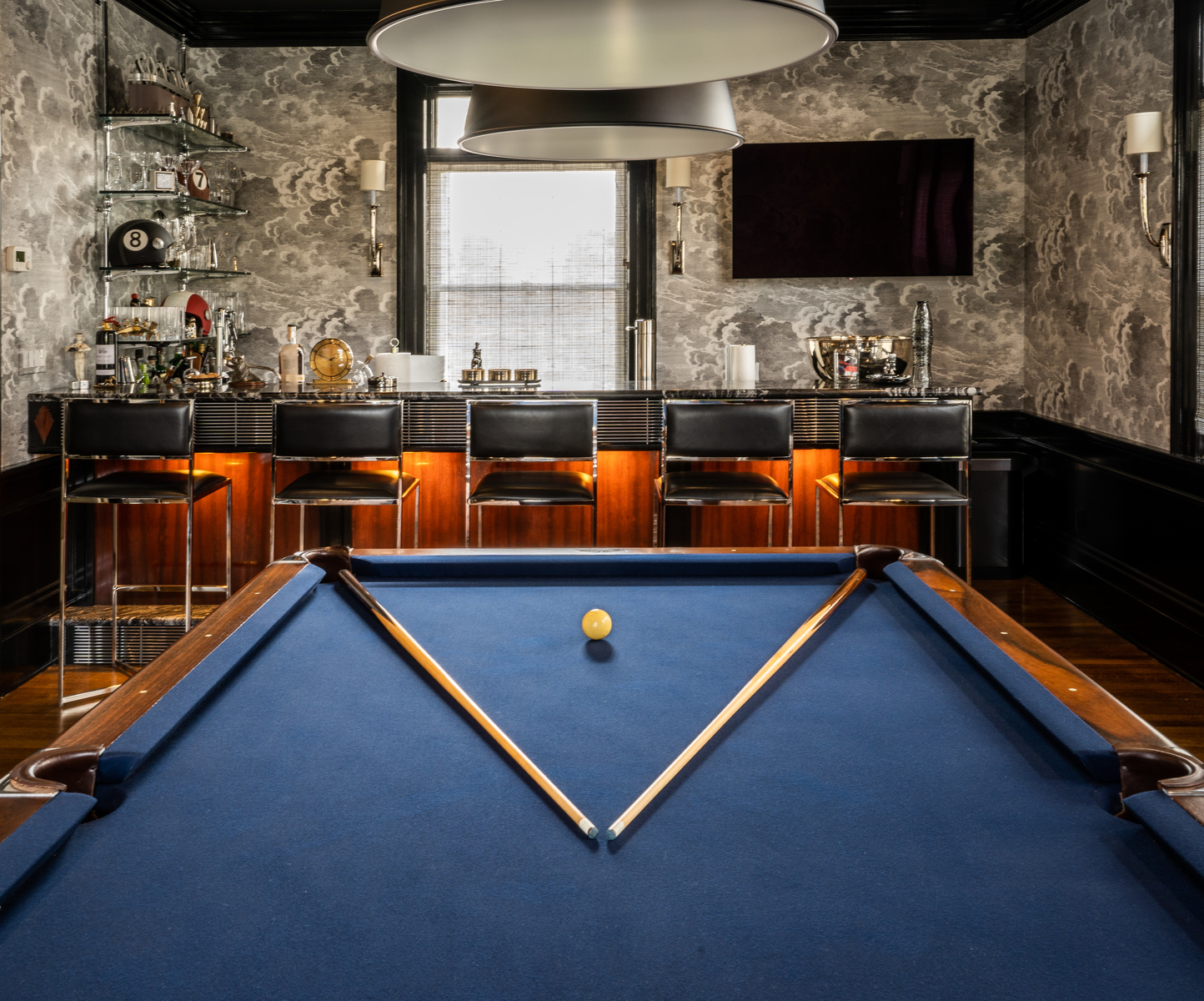
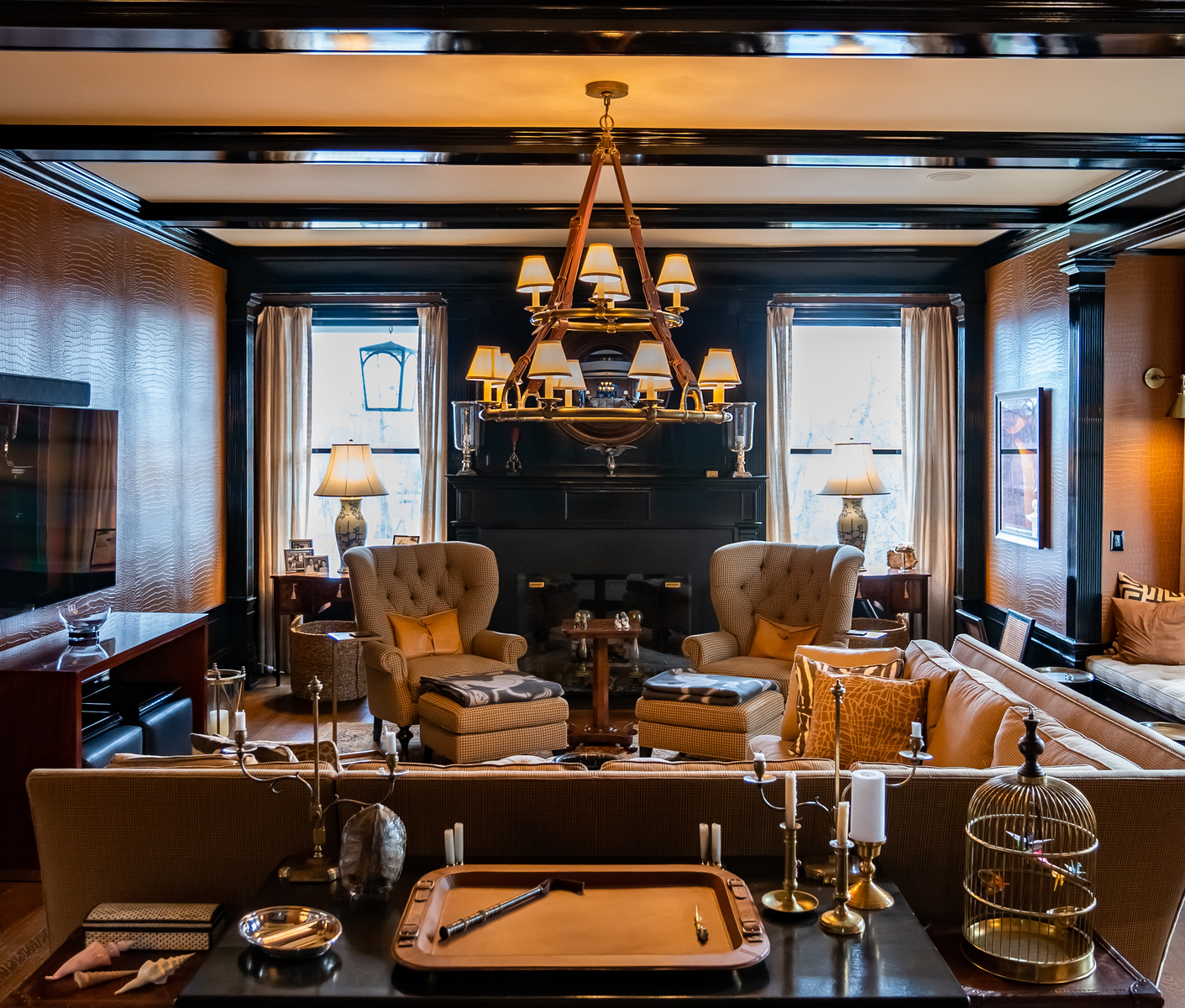
2. In rooms with multiple light sources and color temperatures, decide which source should be dominant. Where daylight is the predominant light source then allow it to be just that. If the tungsten lights aren't on a dimmer then close the drapes for a second exposure at 3400-4000°K. (This technique would work really well with the last shot of the den) If there are no drapes then either add correction gels to the lights or leave them off.
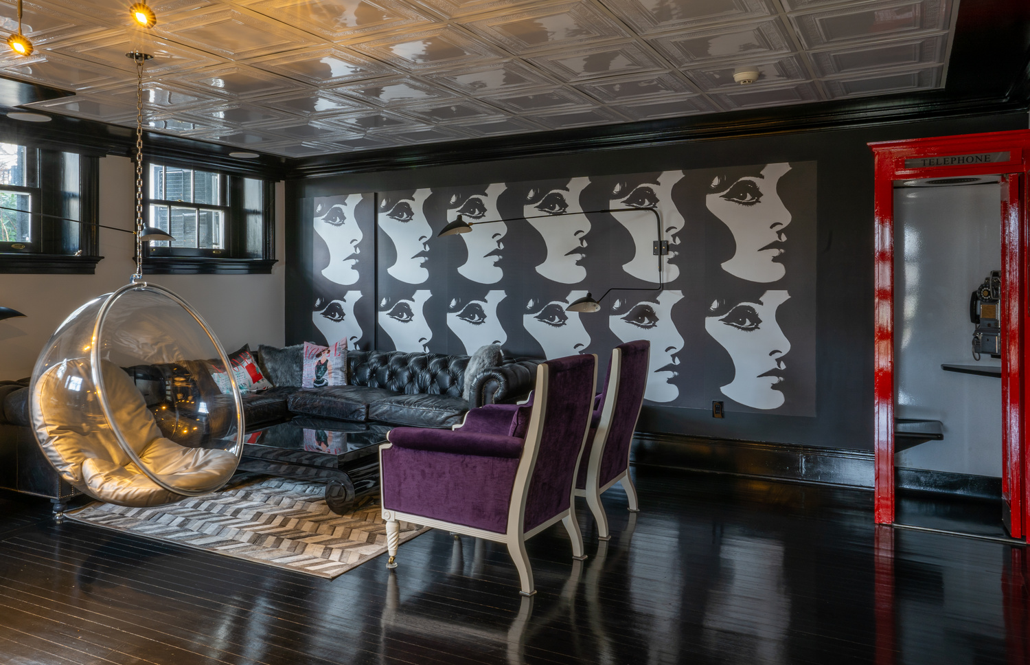
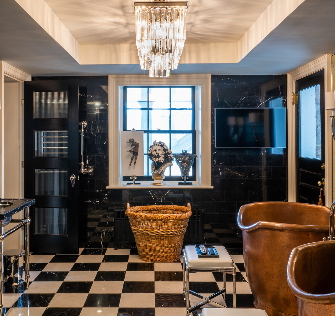
IMO some of your shots are under-exposed. (Esp. images # 1, 3, 4) The second image of the living area is the best balanced, with the billiards table close behind.
3. From a composition perspective always think about where your viewer can enter the image. It's tough to do in a space with lots of furnishings like this but try to leave a path for them to "be" in the image.
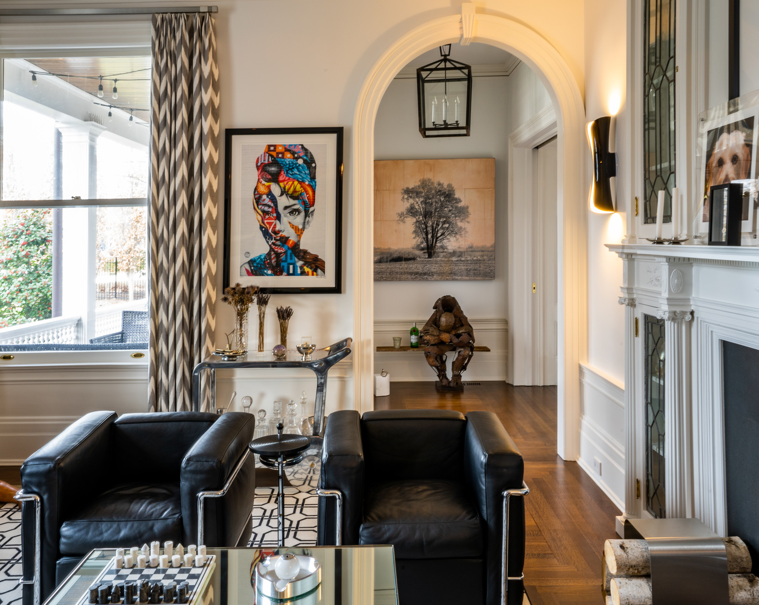
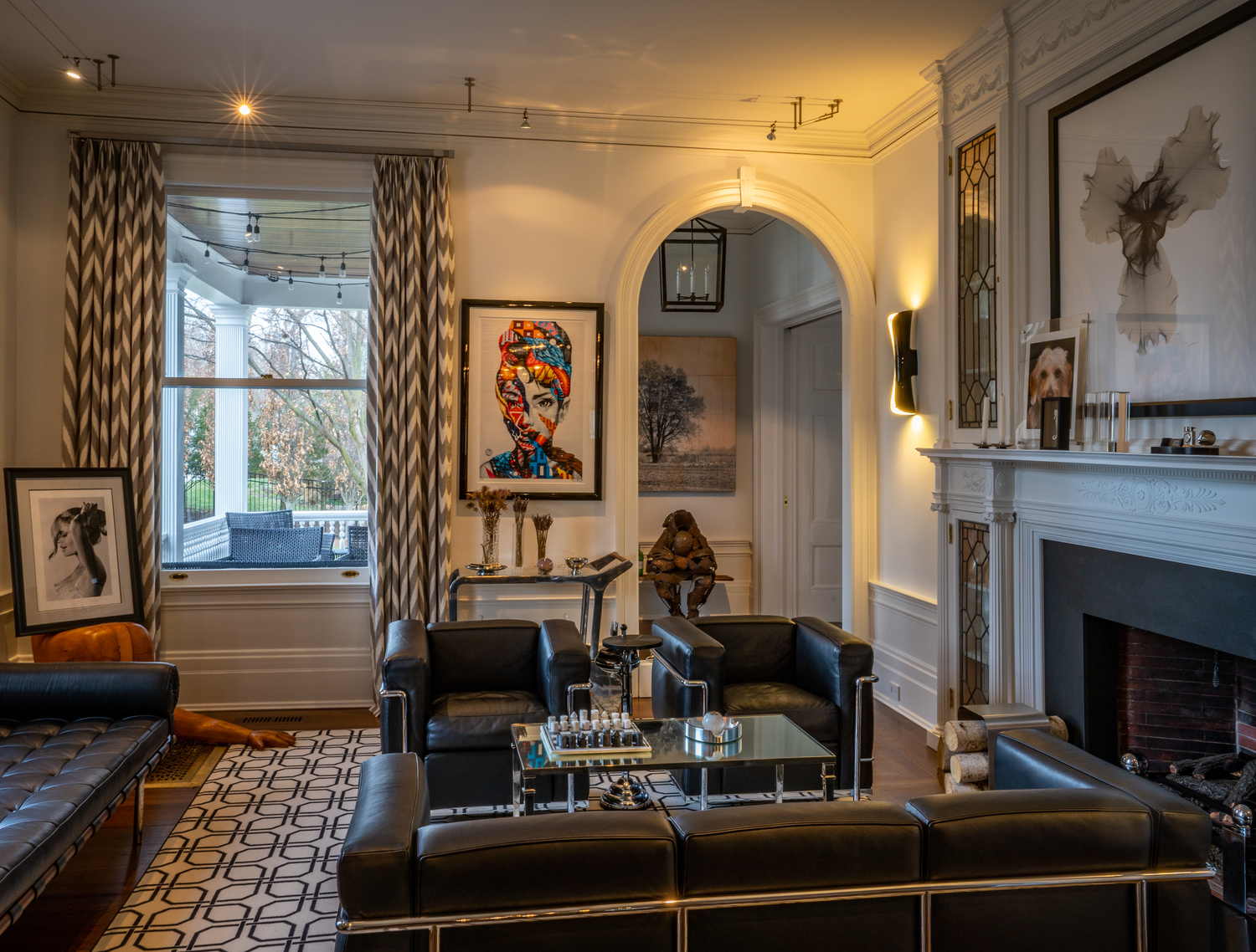
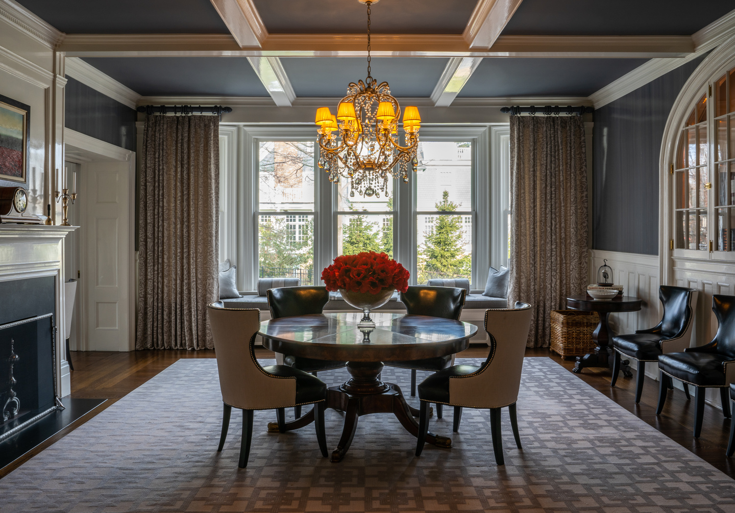
4. Try to avoid a composition that is neither a one-point perspective or a strong two-point perspective like image #3, the living room. It creates oddly angled lines and slanted floors. Images #2, 4, 5, 6, and 8 are very strong one point shots.
I hope my "over-share" isn't discouraging to you because I can assure you these images are better than my first attempt at interiors. If you have access to this house I'd love to see how you apply your new skills.
Wow!!
absolutely agree with all Daniel said. As fellow learner, adding a little.
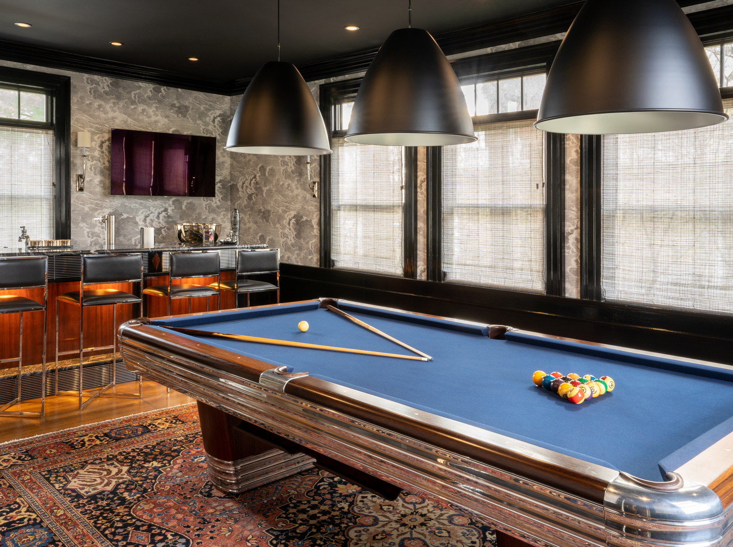
Now a days expert say the new cameras handle dynamic range very well. But old school brackets (and hence compositing) help me learning my art a little better. Where will it help? FIrst obvious one is the replacement of blown window highlights. Going further, one will be able to brush up dark (shadow) areas like image 3 chimney, image 6 walls and so forth.
If its in your hand, click the window shots (where outside need to be shown as requirement brief) towards evening hours. it will reduce the highlights and provide blue hour light. it will also reduce one complication of mixed light colours.
In photography, one thing can be done in multiple ways. Happy clicking. and good luck.
Cheers.
Thank you both so much! This feedback certainly isn't discouraging, I still have a lot to learn, and this was very helpful.
I was aware in the moment that bracketing would probably make the lightening challenges easier, but I am still teaching myself that technique and had limited time so worked with what I could in the moment. that's definitely a technique I want to implement ASAP.
I only had access to the house for about 90 minutes, so I just tried to get as many quality shots as I could without fumbling around with bracketing. The biggest thing I was having trouble with was the light from the windows being blown out and making other areas way overexposed. That's why I leaned towards the underexposure in some shots and tried to pull out the shadows (maybe not the best choice). I guess that's where the bracketing and luminosity masks will come into play in the future. Also may not have been the best time of day to shoot, but had to work with the time I had.
I will have access to this house again in the future, so I can't wait to apply your suggestions and make improvements.
Thank you again for your feedback! It's awesome as a beginner to have this community for feedback and critiques. Excited to share future shots.
All the best
I'm no architectural photographer myself, but see a lot of such images, and I must agree with the others that these are excellent if you are new to photography, Chris!
The only negatives that caught my eye were the perspective issue in 3, especially the crooked sofa, and the symmetrical billiard cues in 6, and even 7, which overly dominate the interior as a whole. I understand that you may not have been at liberty to move them.
It might have been nice to have the lights over the billiard table on, especially as the bar feature lighting is on. Again, maybe not in your control.
Great start!
In the second photo, it appears that you may not have applied lens correction to the image. If you look at the vertical line of the front of the fireplace, it appears that the wall has a bit of a "belly" to it. It appears that the door to the left of the wall in question seems to not be affected by the belly, leading me to ask the question.
You might also try some HDR shots, blended very conservatively to cut or eliminate the overexposure of the scenery outside of the windows. I use Aurora HDR and have a preset that blends the image modifications so subtly that the viewer doesn't recognize that they've been shot using HDR techniques applied very carefully to NOT look cartoonish.
You might also adjust your tripod such that the lens is ~52" (132 cm.) above the floor to get a slightly lower and more effective perspective.
I'd also suggest that you also shoot the rooms from a corner to get more of the adjacent walls into the image. You got the idea in the 7th image. Lowering your perspective point in this image might also reduce the apparent intrusion of the three ceiling light fixtures. I also concur with the comment that these lights would be better turned on to be in sync with other lighting in the room.
For a rookie, you've done a great job with lighting and composition. Keep it up and grow your trade.