
Portfolio Worthy?
Hello,
I am trying to get a foot in the door in doing architectural photography/higher end real estate.
I have been doing landscape/cityscape photography for about 8 years now. So I don't have a ton of "architectural" photos for a portfolio. I've been working on building up a portfolio by photographing buildings in my localish area.
I'm just looking for some feedback on these images and am wondering if something like these belong in my portfolio for architecture? I recently had a job for a local architect and used several of those for my portfolio as well. If you are curious you can see them on my website: kyleforemanphotography.com I didn't want to overload this post with too many photos.
Thanks for looking.


4 Comments
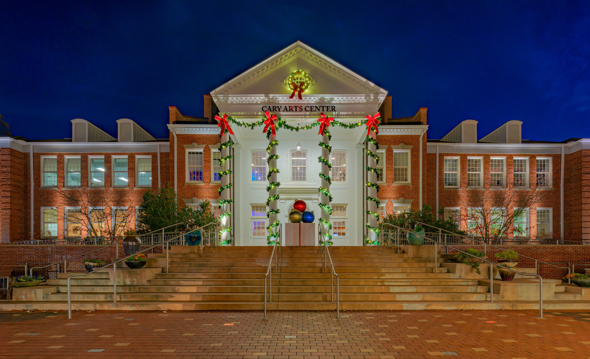
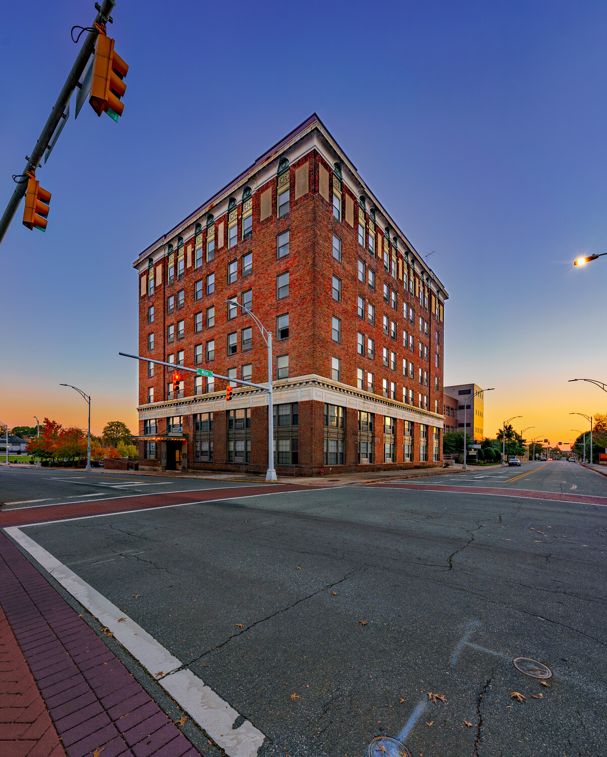
I haven't shot architectural work in many years but my thoughts are that your color balance is leaning greenish-yellow in many shots. In the arts center pic it looks like the white front entrance has had too much highlight recovery.
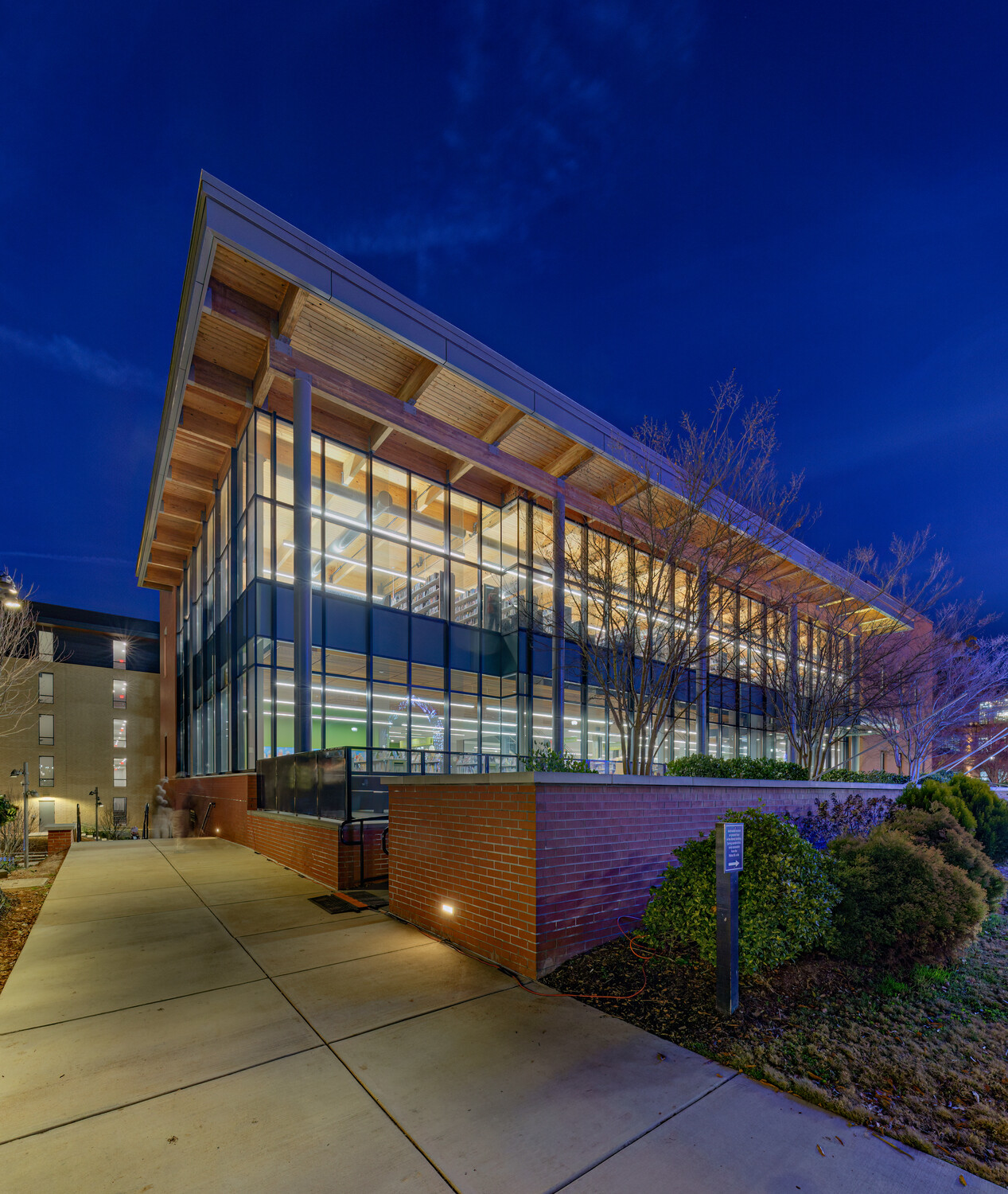
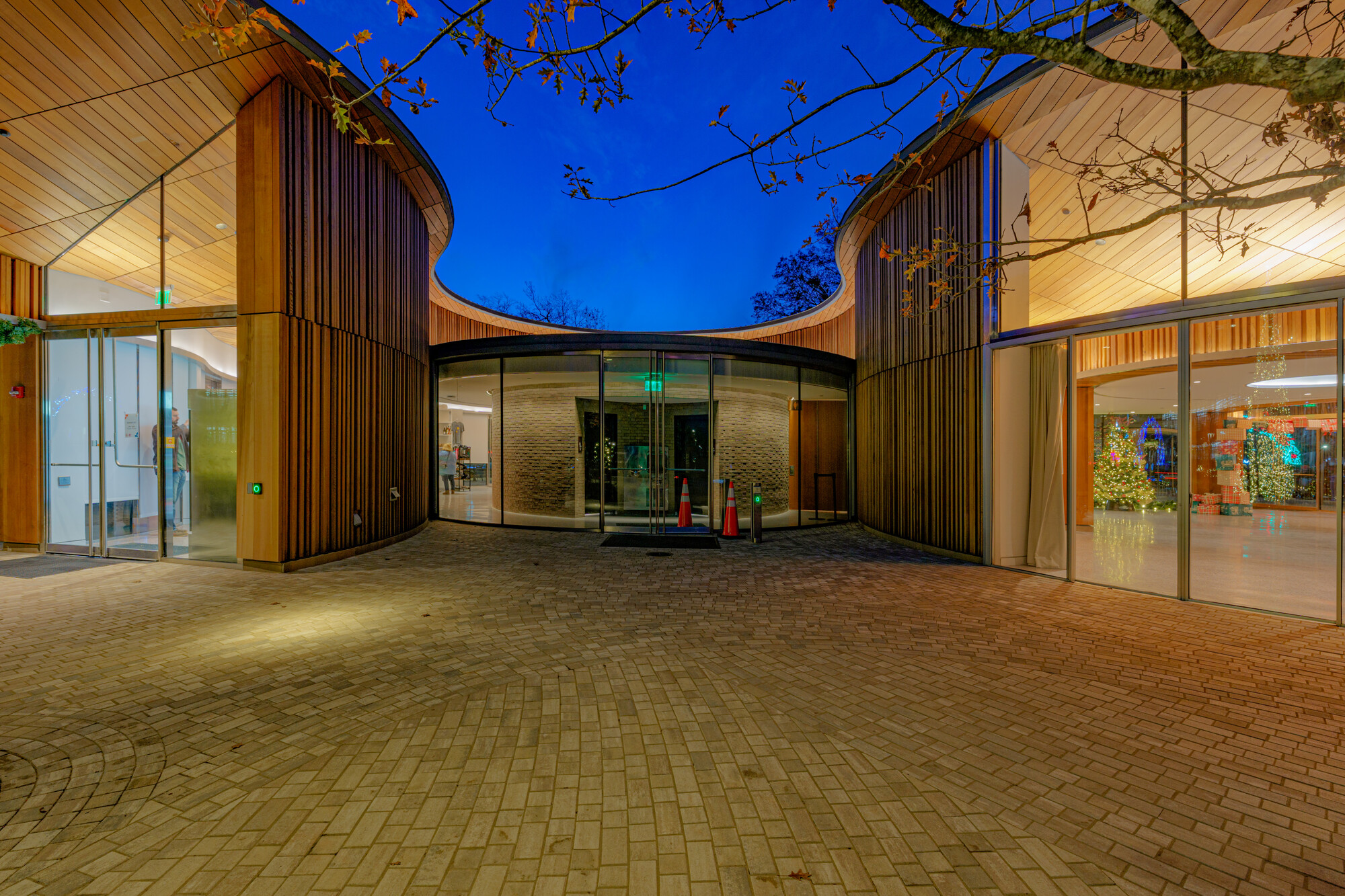
The sidewalk is looking yellowish in the second two images. There are traffic cones in #3
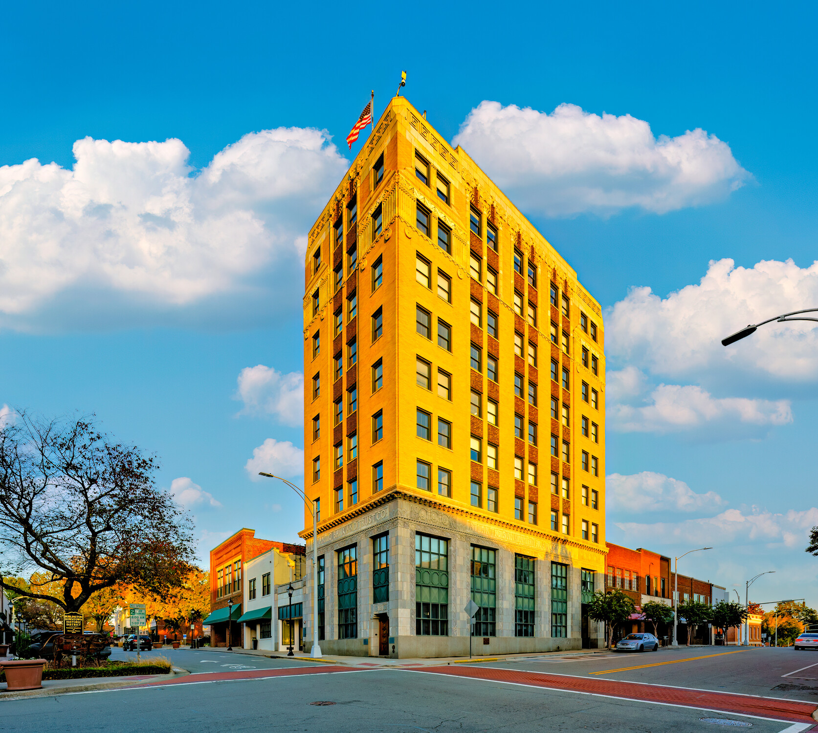
The converging lines in last two seem to be a bit over corrected, especially the yellow one which is taking a bit of the "ship's prow" effect and the colors are bit much unless it is for effect.
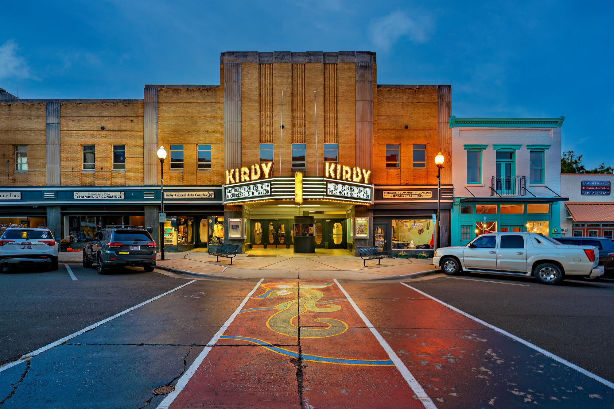
I like the theater photo!
Just my opinion.
I agree with Mike Ditz.
Those are, in my opinion, oversaturated. The skies in particular, but not only. Typically, the last building looks like it's actually painted yellow.
Don't get me wrong: I like the vivid yellow and blue on this one, the “pop” of it… but more from an artsy standpoint. But for business architecture photography, I think it's too much.
I also agree on the fact that the perspectives are over corrected, and some buildings look like having a V shape. Yes, vertical lines are usually straightened up in architecture photography. But when dealing with such a wide-angle lens, there's a tradeoff.
See for example this picture of the same building as the last, with a very similar angle: https://cdn.commercialcafe.com/images/DC29C40F-7828-4F42-9DCA-EB5049DBC…
The perspective is partially corrected. Not to the point of having vertical verticals. (And I still find it a bit much imo.)
Another similar example (for another building): https://images1.loopnet.com/i2/HoPPcwMkmyObvEm7xDZBjO-1sDlJQHr7cuihrvXx…
Also, taking the picture from another position would help make the building look more “solid” in addition to better showing the entrance. See for example: https://www.istockphoto.com/photo/atlantic-bank-and-trust-building-burl…
Here, you can see in particular how being slightly farther from the subject significantly reduces the perspective issue.
That being said, although I think the edit should be refined, I do think the pictures being are a good start (although I wish the third one was pointing slightly higher, to have less floor and show the full curve of the building).
I also really like the theater one (although the sky could be toned down a notch).
Thanks for the feedback everybody, I really do appreciate it.
I don't agree with everything said here but it's still nice to hear what other people think.
I just don't agree that the perspectives are "over corrected." For these types of shots I think the verticals should be vertical. I've been on many other prominent architectural photographers websites and they have shots that have that "v shape" from correcting with a wide angle lens. Also, I just kind of like the way it looks. But I guess that's just me.
I kind of figured "saturation" would be a criticism. I tend to edit these the same way I would a landscape or cityscape which may not be a good thing to do for architectural type shots. I get it. When editing these types of photos I feel like I have to battle my instincts of editing the way I normally would. However, the "yellow" building was really glowing like that from the sun. Maybe I over accentuated it though. That photo is also a sky replacement and I just really liked the juxtaposition of the yellow on the building and the blue sky. But I get it. I approached that photo from an artsy, for lack of a better word, perspective. That photo is part of a personal project I'm working on as are most of these honestly. If I were editing these for a client I probably would tone it down a bit. So I get they may not be a good fit for an architectural portfolio.
I hope this doesn't come off as complaining about what was said because I'm not. I really do appreciate the feedback. Just kind of explaining my thought process on a couple of things is all.
Thanks everybody!
Hi Kyle! I understand your response to the earlier comments, but I still agree about the saturation issue and the perspective correction.
I know you have not over-corrected converging verticals literally, but what one person called the "ship's prow" effect, or what Ansel Adams referred to I think as a "looming" effect spoils them a little for me. This is about the subjective response, not failing to produce an accurate orthogonal projection, like a CAD rendering (which often look unrealistic for the same reason). Adams suggested under-correcting a little (when there is a very low horizon) so it LOOKS right. Many agree - you may not, of course. But I guess if you want commercial success, majority views may need to be prioritised over personal preference.
Also, to my eye, in the final image the lighting on the clouds does not correspond with the near-sunset colour and angle of light on the scene itself. Sky replacement has a lot of caveats about it, or it can look odd and detract from an image without the viewer being clear what is not quite right. Use with caution, in my view.
Since you ask for opinions... ;-)