
Victorian House Project
Hi everyone,
I recently photographed an old Victorian house that a friend of mine restored. My goal for this, was to get some photos I can use to build up my interior design/architectural portfolio.
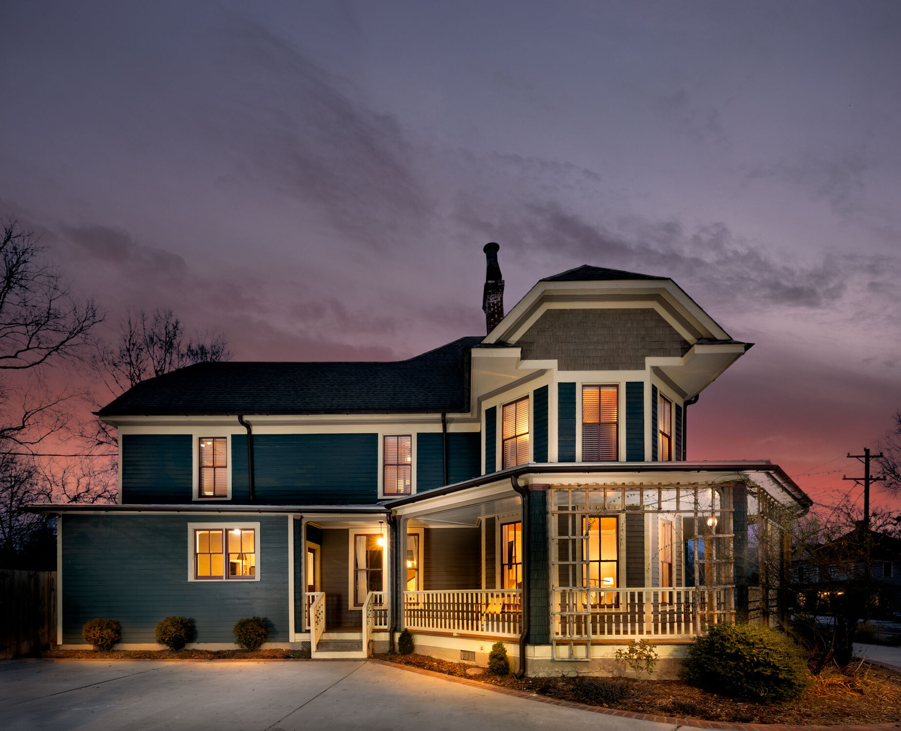
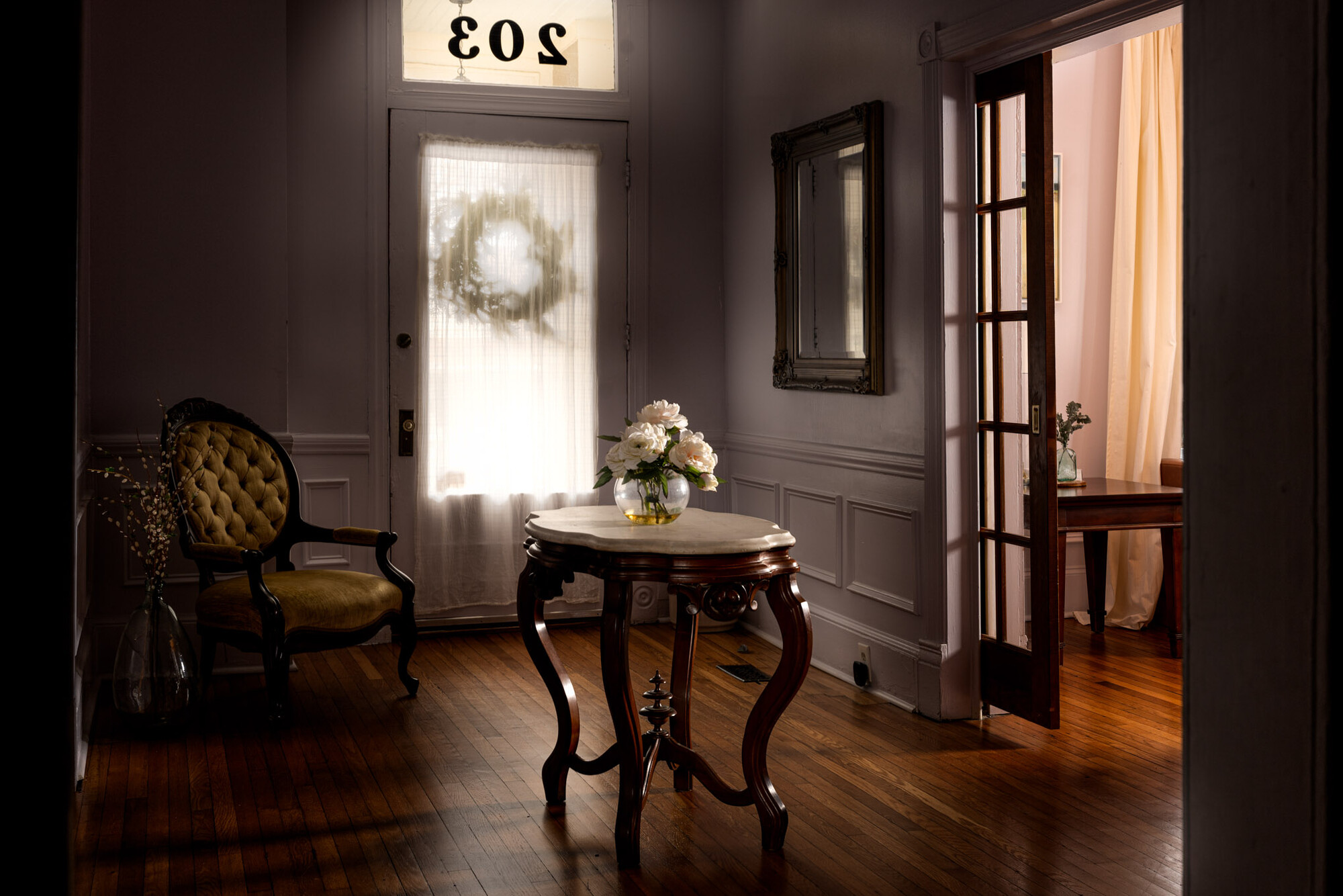
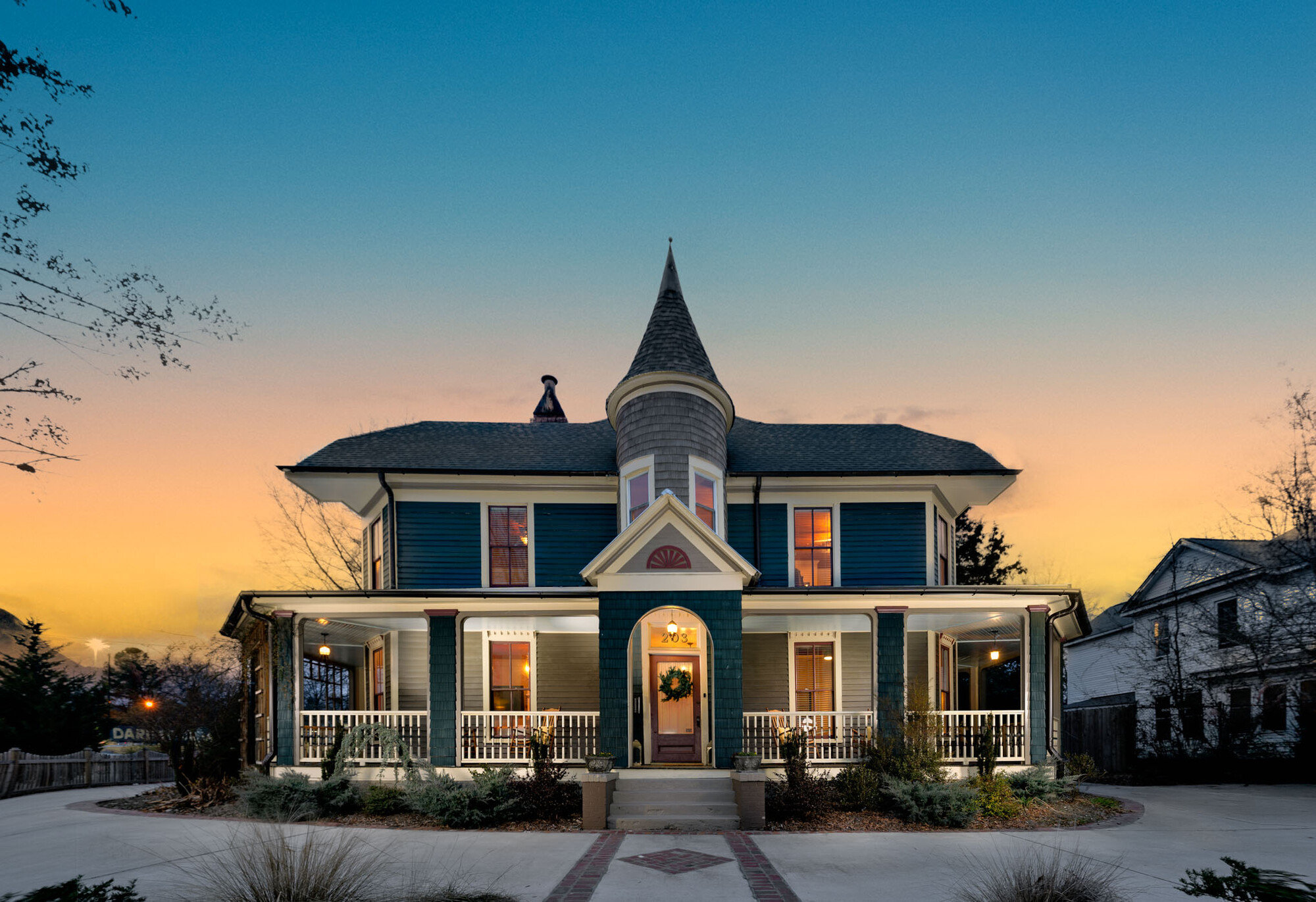
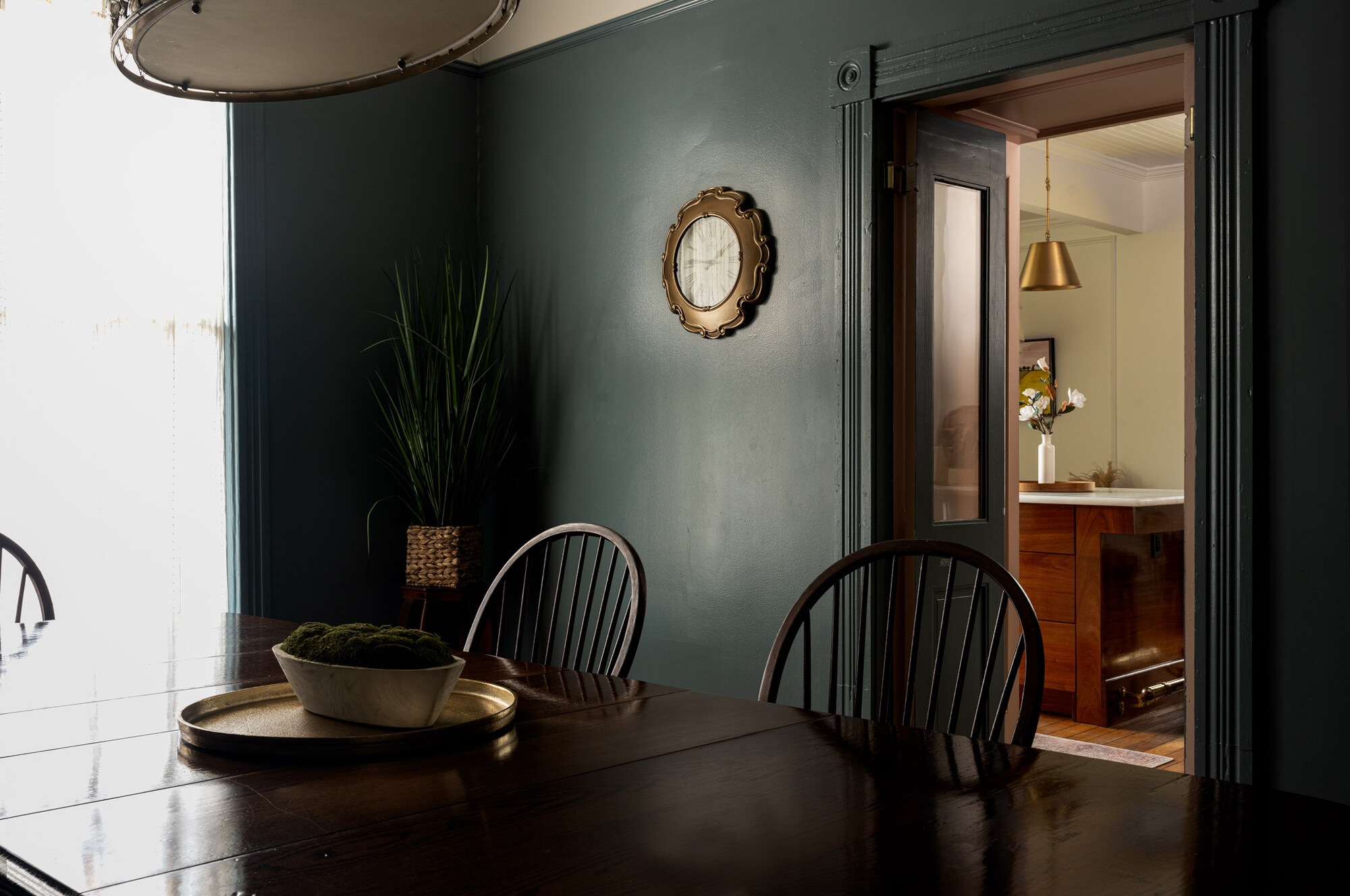
It was a really overcast day but I actually didn't mind it, it allowed me to capture some more moody shots. The house was kind of dark overall but there were pockets of really nice soft light pouring into the house.
All of these shots are a blend of natural light and artificial light from my godox ad300 pro with a soft box. In all of the places I could I took my flash outside and flashed it through the windows to mimic the natural light. I had never tried doing this before but I really like the results I got from it. It's something I will definitely be adding to my bag of tricks for the future.
These are a few of my favorites from the shoot. Thanks for looking!


4 Comments
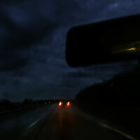
I think all the interior shots are very nice and elegant. Very pleasant light and color. I don`t know about the third outside shot. Maybe slightly overdone sky, but I am not sure. I am very picky now, and probably possible customers would be very happy about it :)
Hi Kyle.
I really think your work is getting better since we talked last.
I do agree with Jan about the sky on the exterior. If you have a mask for the sky maybe just darkening it would help.
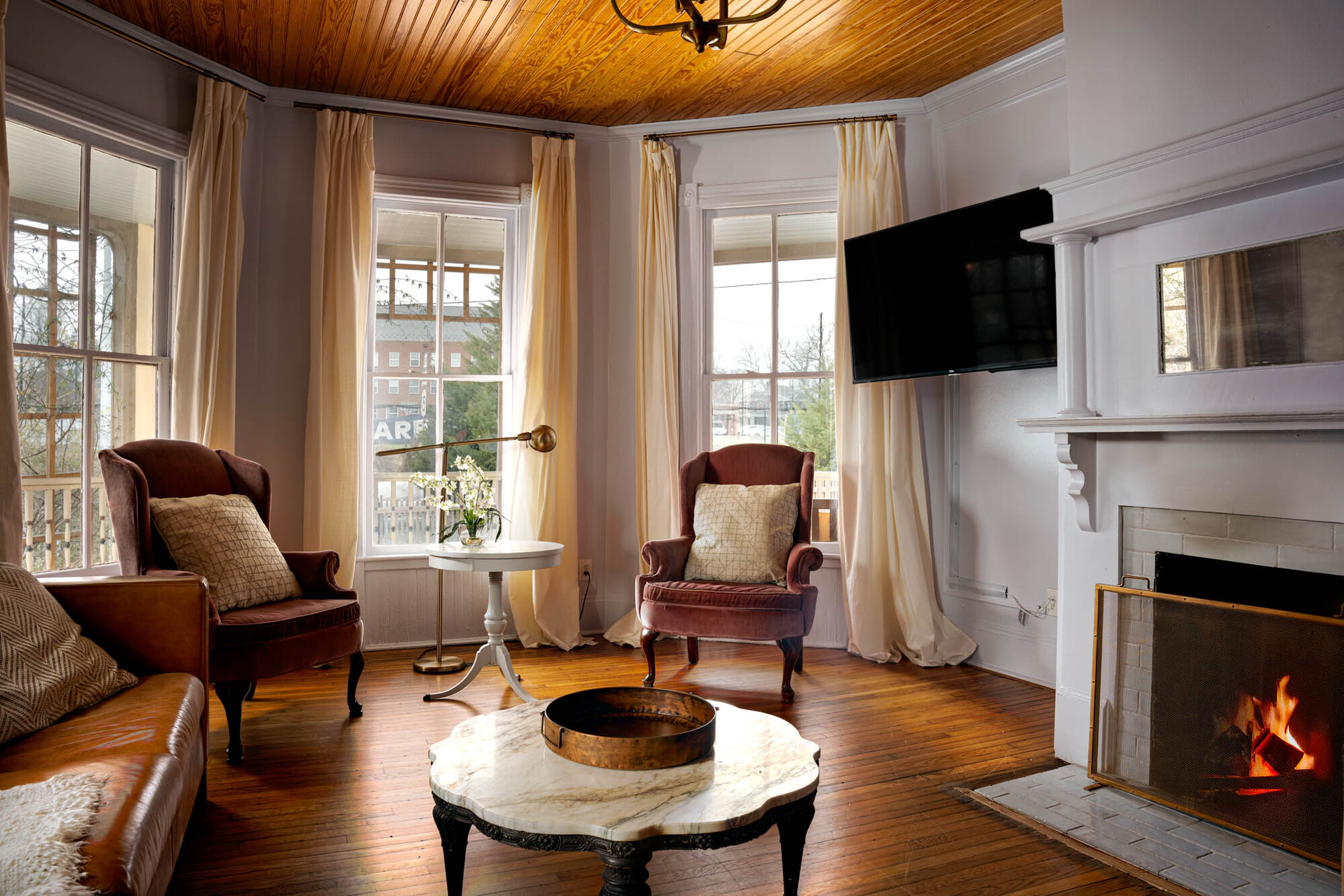
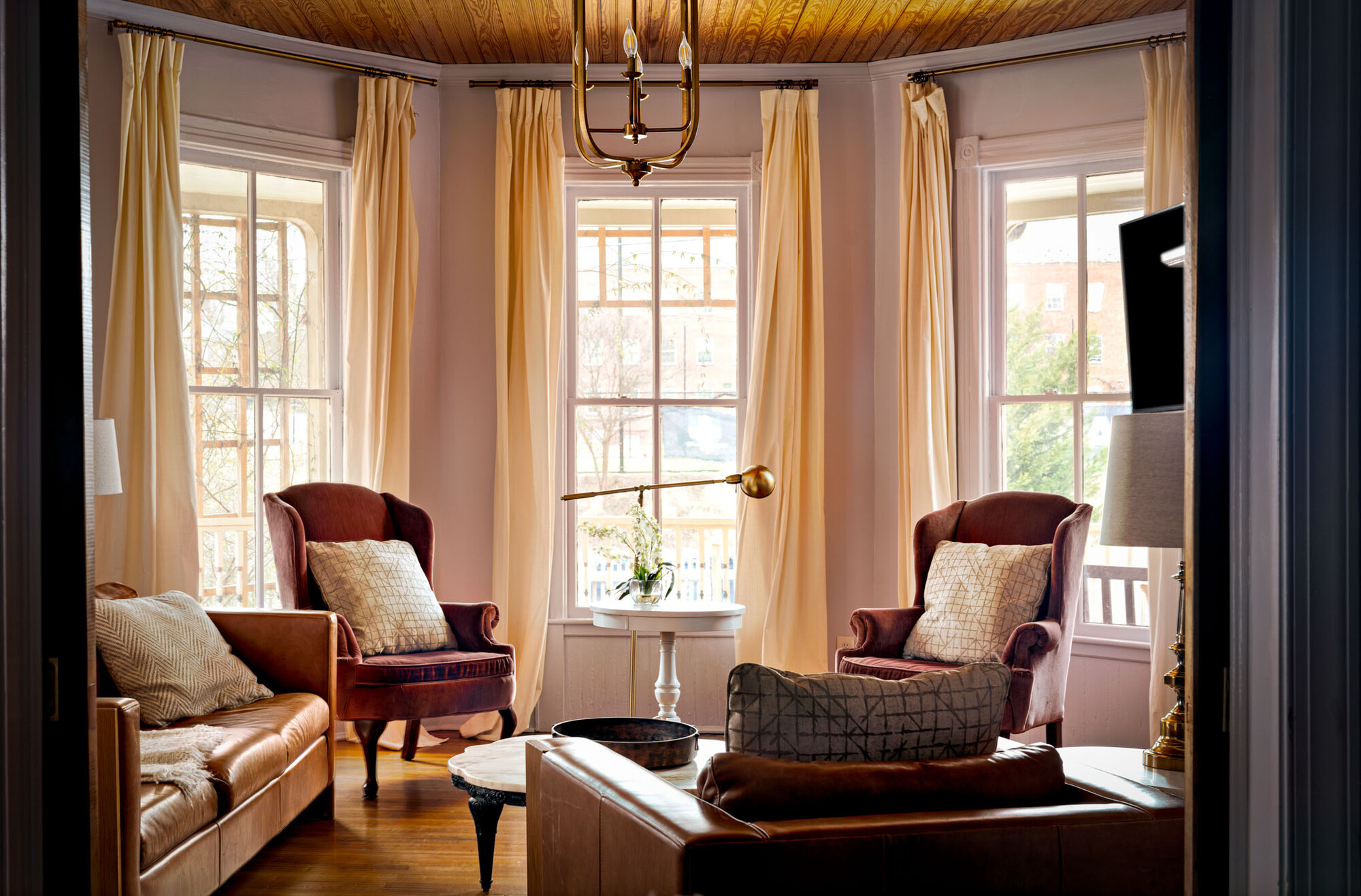
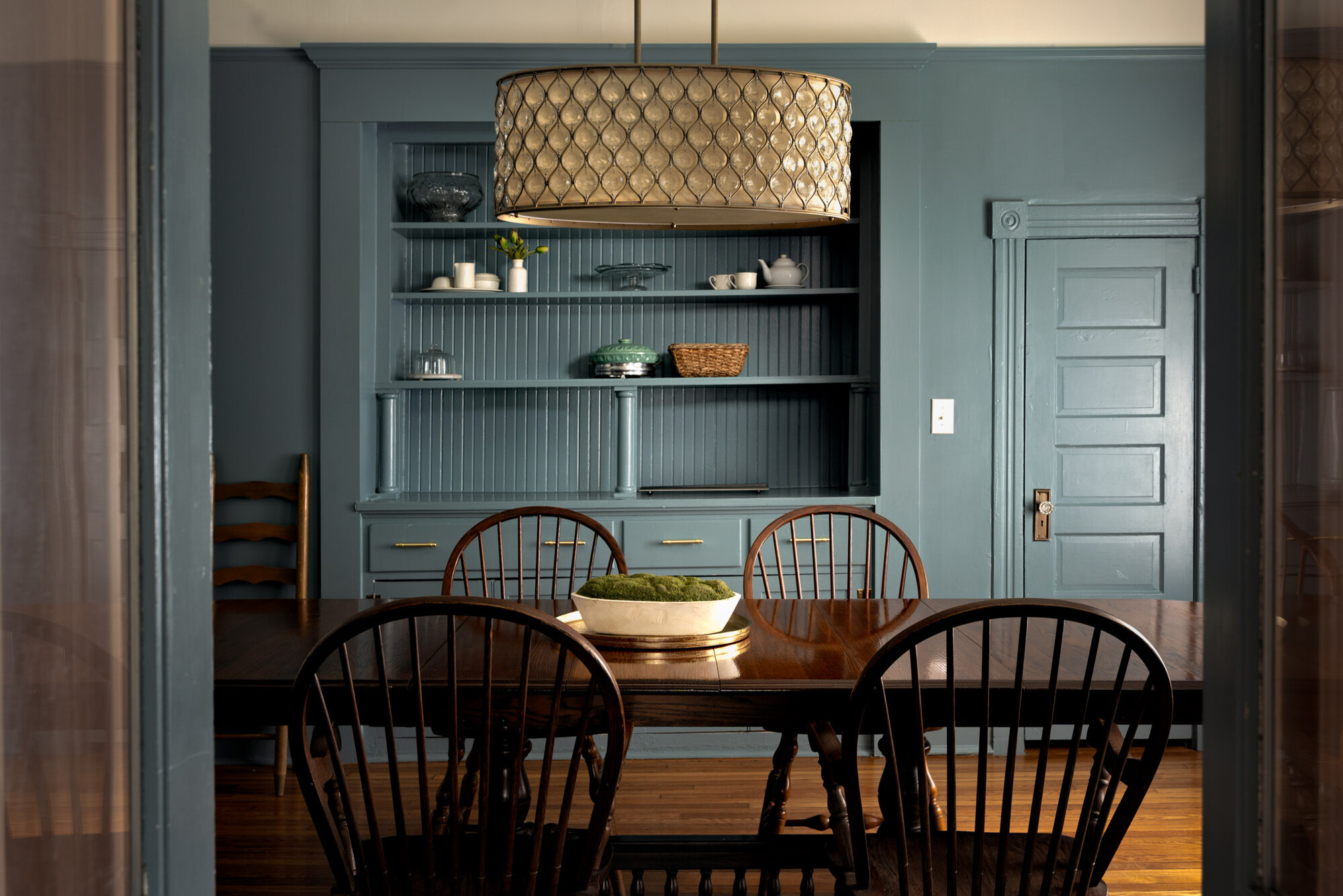
To my eye the dining and living area shots are the strongest. They follow the current trend of natural light and deep shadows. The lighting looks natural and the overcast light actually worked in your favor.
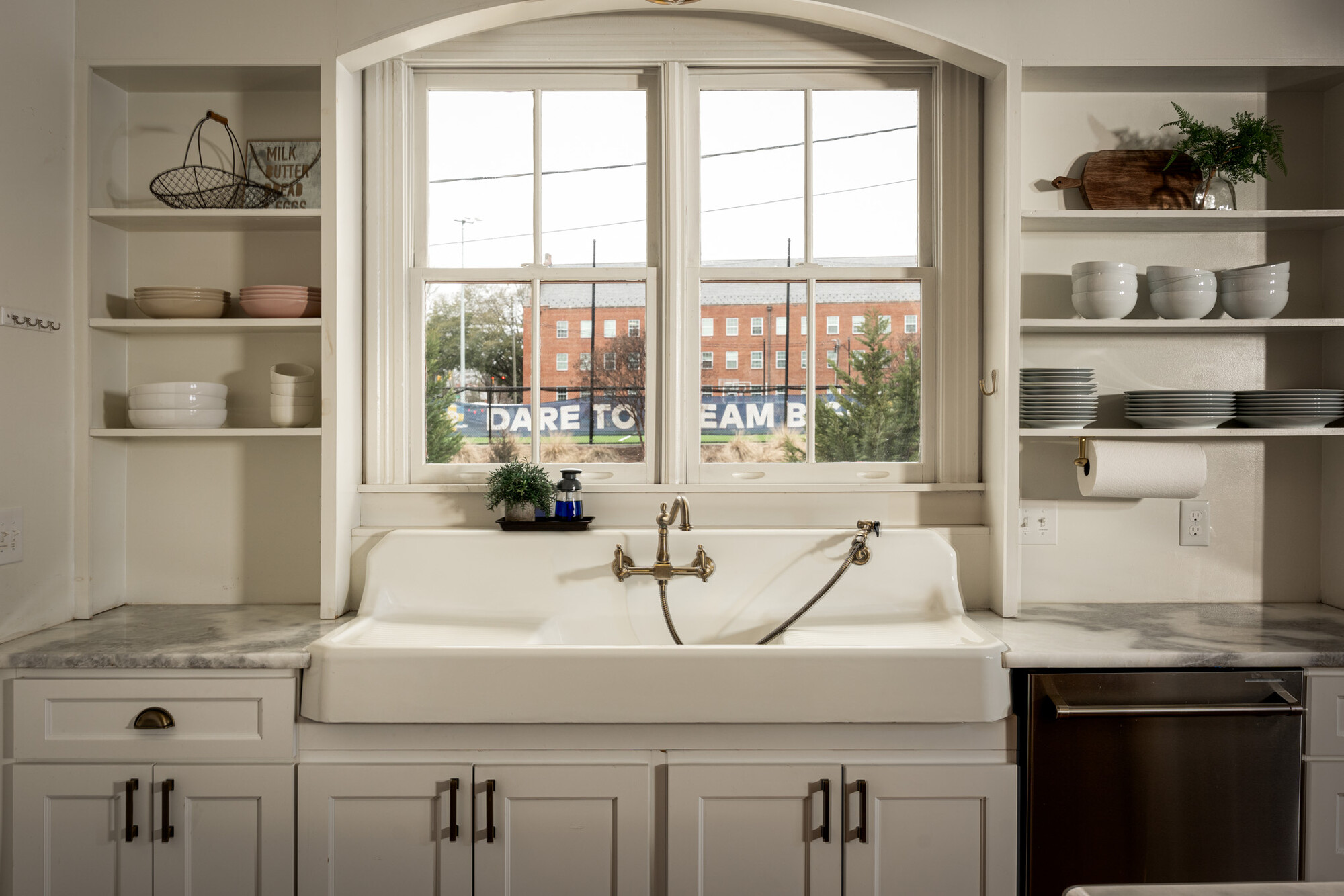
The two images that (IMHO) need a bit of work are the kitchen and bedroom. The low angle light "streaking" in from the side of the kitchen (which I assume is your Godox), doesn't match the soft overcast light we see straight out the window. Unfortunately there isn't an easy way to fix this one unless you replace the image out the window. — not easy.
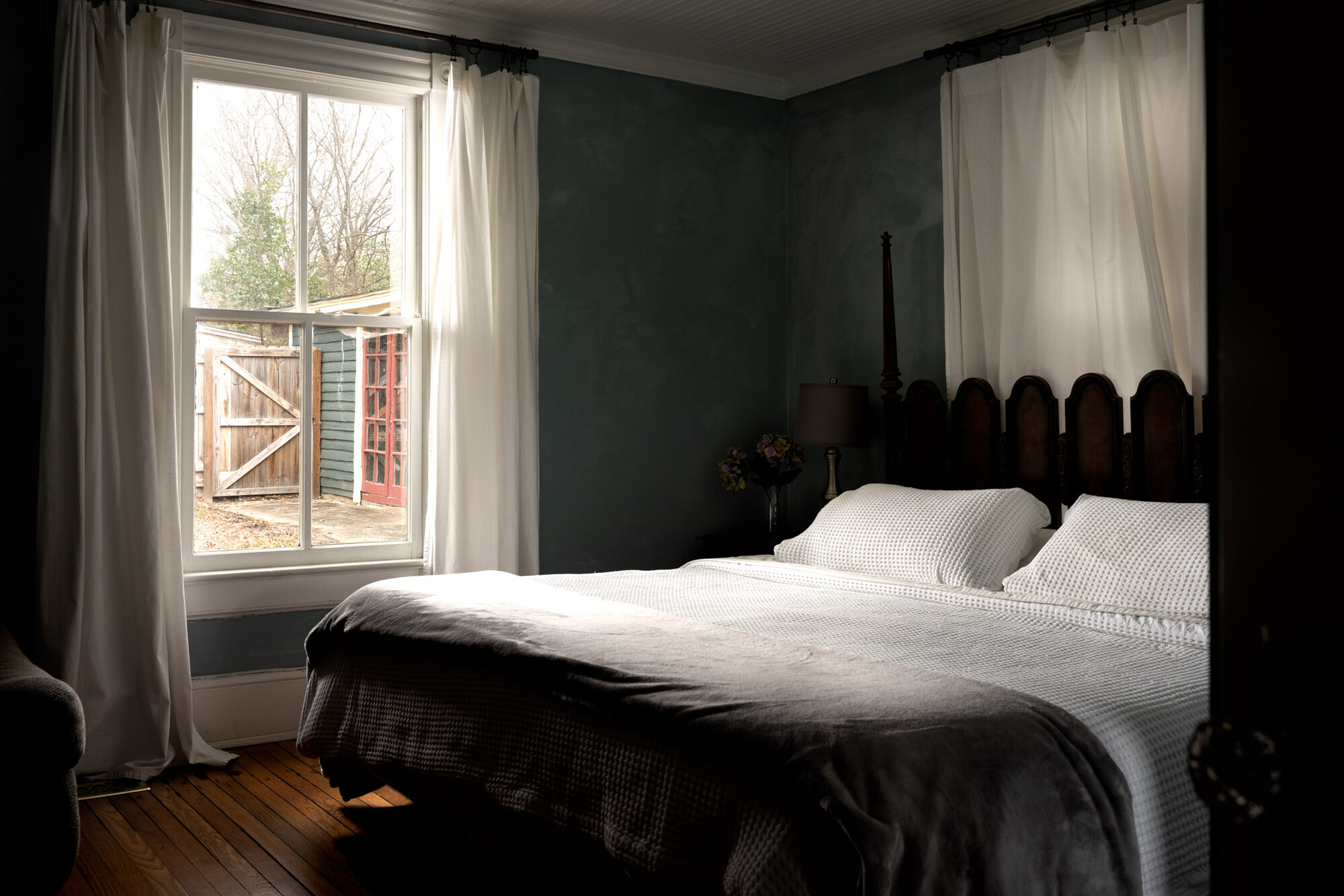
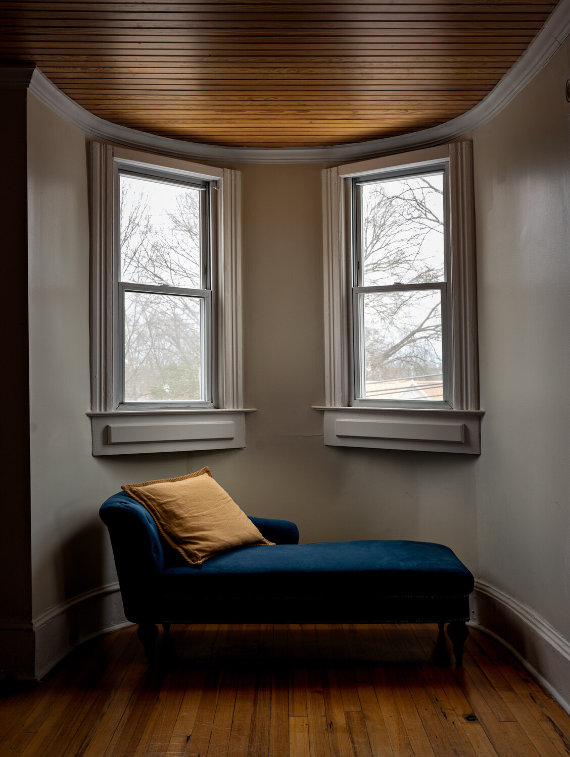
The bedroom is very contrasty and just needs some exposure blending. It's OK that the window is burnt out but the white bedspread is too hot and the shadows are too dark. It would really help to see some detail in the corner and at the end of the bed.
One additional thing I just saw… you have two images of the Living Room and I would suggest losing the 2nd one. Notice how your eye can easily walk into the first image but in the 2nd image the foreground chair "blocks" the viewer from entering the scene.
I appreciate the feedback. The only thing I would say is I disagree about the bedroom shot. It's actually one of my favorites. I like the contrast b/w dark and light. The shadows are fine where they are. When I was editing it I actually did the things you say and I liked it better like this.
I totally get a client might want those changes and I would do that for them. But the photo that would be on my website would be as it is. I always find feedback on these types of things interesting. We all have different tastes. And for things like that I don't think there really is a right or wrong answer. I know "the look" right now seems to be this very light kind of airy look. I personally find the work of Brandon Barre more appealing. Not comparing myself to him by any means at all. But his style seems to be a little different than a lot of the stuff out there. He seems to let those shadows stay dark in a lot of his photos.
You're absolutely right that personal preference always takes precedence. This is for your portfolio so you can do whatever you want. In the end we all work for clients and their preference will eventually take the lead. In my case I worked more for interior designers than architects so you can imagine why deep shadows don't work for them.
Brandon is a great photographer and his work definitely leans toward dark interiors but take a close look and you'll still see a lot of shadow detail.
The last thing I'd mention about contrast is that while it's true that we all have preferences, we have to honor the way that light behaves or things begin to look odd.