Just joined Fstoppers yesterday and this is the first group I joined!
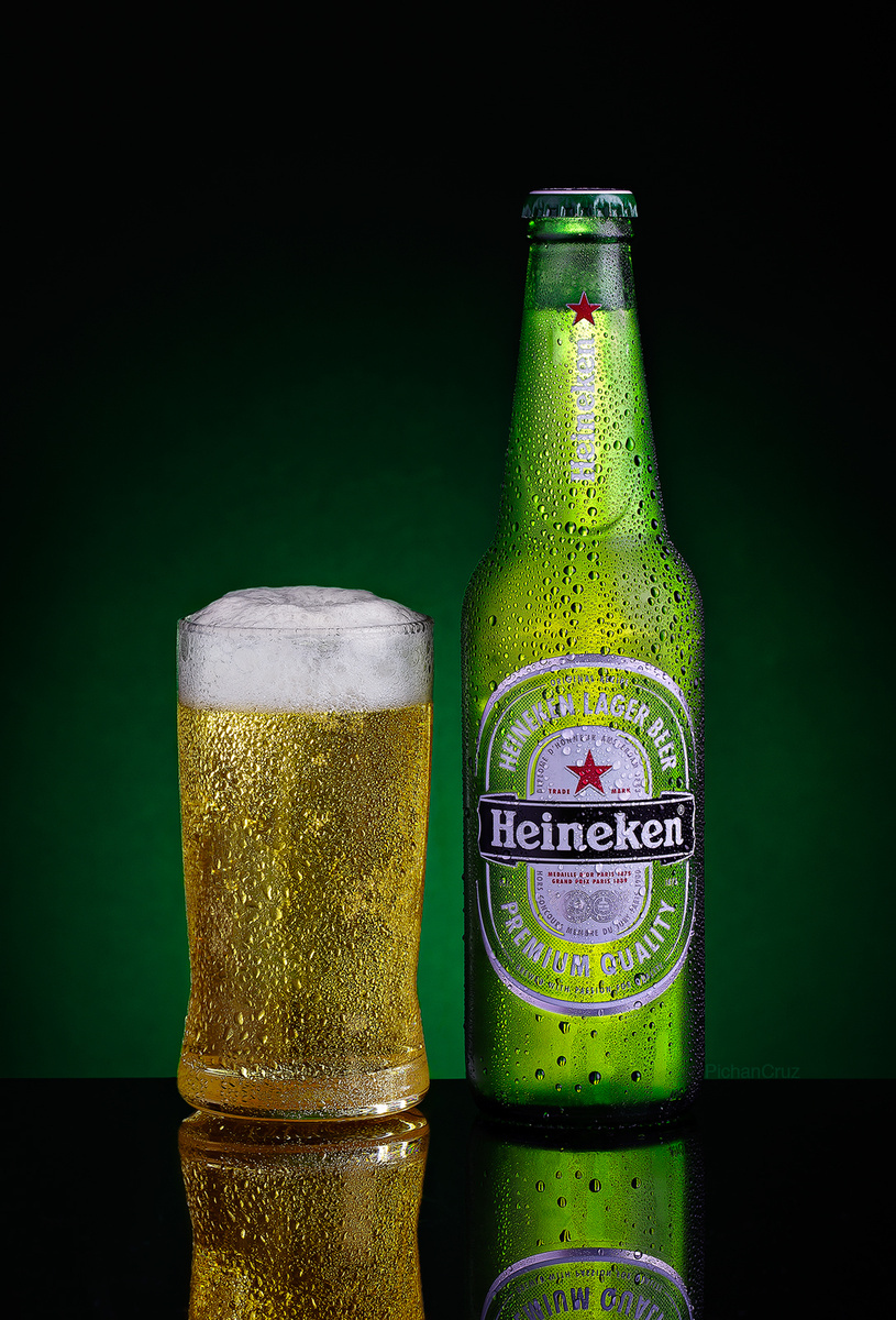
Hi all, I just joined Fstoppers and I'm delighted that there's a lot of product photography members here. Anyway, here's a photo I took a year ago for my product photography class. It's a combination of different shots. I used a combination of strobe and light painting in this photo. I am open to any feedbacks and suggestions to improve my photography. Thank you!


4 Comments
Hi Pichan, welcome to the community.
So, going by your description you are interested in product photography, and you are a year into being a professional photographer. Do you have any recent work? I ask because I feel these first years after our education are of rapid evolution, so I am interested in seeing what you've done recently. Also because these class shots are always guided, so they don't really show your vision as much as the professor's.
Anyway, about this image, first thing I feel is the light used for the liquid transmittance is a little hot, it overpowers everything in your image, specially the label, which should be the center of attention. Also on this light, you must've used the diffuser on one of those 5 in 1 reflectors, at least that's where I've seen this happening, because the fabric has some sheen to it, the light behind it creates these cross streak's that are visible on you bottle (above the label is the center cross). Usually a diffuser like roscoe or lee filters works best, but I had success using tracing paper.
Other little things, your label is underexposed, a top light could've light it nicely without many reflections, or a stronger softbox to the side to create stronger contour and light the label better, stripboxes behind diffuser, etc. Many options there could've worked out. Stronger background light to bring it closer to the bottle's transmittance light, would help to make it believable it's the same light, and the glass also needs a transmittance light like the bottle, they are very nearly the same materials, so should have similar lighting.
Maybe glass has to much water, as it looks like the beer has been poured a while now, so it has lost that freshness. Many use frost in the glass, like it's so freshly poured that it still has the cold frost and didn't start to sweat, or if sweaty, it's still little beads of water, communicate that the beer is fresh, and bubbly, just poured.
One final point, in your composition you chose a glass smaller than the bottle, and placed them side by side, so it's very apparent the difference in height between both. You could use a taller glass, that wouldn't be out of context with this kind of beer, or if this was the specific glass you had to use, changing composition to have the glass in first plane and lower your pov, you could minimize the difference, or maybe with a higher pov and put the glass behind with the bottle closer to the camera. Many options there. I have a beer shot in my photos that I had this same problem, so I chose to place the glass camera first, bottle second, and shot with the table at an angle, so the bottle would sit lower than the glass (check attached shot for what I'm talking about). I also would've preferred a tighter composition, but that's my problem, so don't worry about that.
Sorry for the long answer, I hope it won't dissuade you from trying this shot again, i would very much like to see your evolution.
Best.
Hi Carlos,
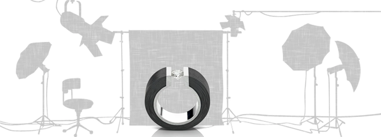
Thank you for your objective and detailed feedback on my photo. I really do appreciate your effort to critique this shot. It is my first time to have a feedback from a professional photographer. This beer is one of the 3 beverage shots I did in school and didn't had the chance to do it again. I am working as an in house product photographer in a jewelry company for 4 years now and took the short course for product photography as a refresher and thinking that I might have missed something because I am all self taught since I started taking photos of product. First, I agree with you on the light painting to be very hot and really overpowered the label. I used a black paper for the background and yeah, I really noticed that texture while I was shooting and didn't have time to replace it because of the submission deadline. If I have a chance, I would love to shoot more beverage photos and learn from your advice. Overall, I really do think that this photo needs a lot of improvement. I will learn from this. I have not uploaded my recent work for quite some time now because of confidentiality matters. Meanwhile, you can check some of my product shoots here: 500px.com/pichancruz. Again, thank you for your honest feedback and encouragement. Have a nice day Carlos! :)
You have cool work, share it over here, there's a cool community over here.
There's a good reason for personal work, and it really helps with client work, so I would tell you to do more of it, and seek feedback with a mentor or here at fstoppers.
Regards
Will take your advice. Thank you Carlos! Have a nice day! :)