I just want to introduce myself and start learning about this topic - This is my first product Photography.
Hey I'm Camilo Villa, from Colombia. I've been shooting architectural photography and learning for 4 months, and yesterday I did my first PRODUCT photography. I will like to hear some feedback from you guys, I know there is a huge learning curve ahead for me and I really appreciate any comments to improve. Thanks.


9 Comments
Hi Camilo, welcome to the community. we will glady try to help you out. So, could you tell us what the product is, and what were you trying to accomplish in you photo?
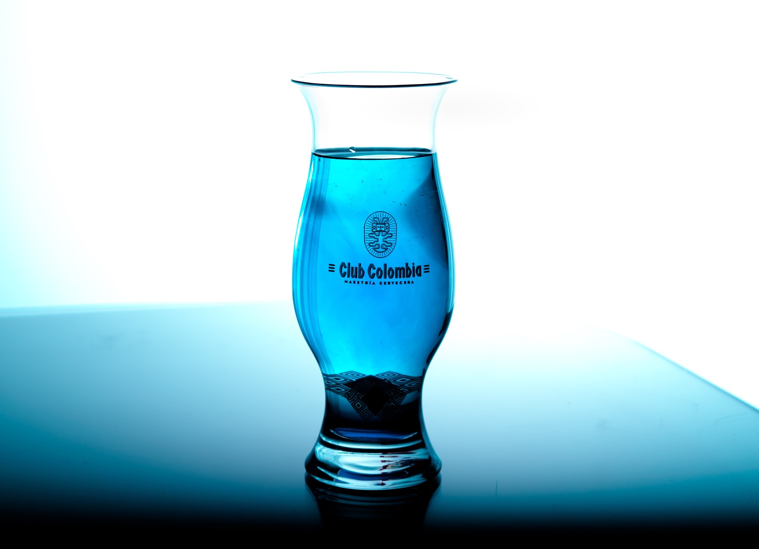
Thanks a lot Carlos for welcoming me, I was just trying to get the fundamentals of product photography. It is just water with blue coloring, imaging it is "the blue beer". I was trying to acomplish a nice look and the dream of this "blue beer".
This is my second Photo. I just want to know if i'm in the right path, and which tips can some of you share with me. Thanks. Really excited to join this group.
Hi Camilo, just before going into the technical, if you're going to communicate something, this has to look like that you are trying to communicate. Point being, if it's beer, you need it to look like beer, even if it isn't and it's blue, it needs foam and carbonation to look like it. Now, that's a detail, since you are trying to better your technique and the concept is incidental.
Currently the only light you have is the background light, which is good but not enough. also the light in the liquid is a little flat, if you bring the background light closer to the background, you'll see this will create a gradation in the liquid, which creates volume to your glass.
The logo in the glass is too dark, you need a front light to bring it up, and the glass you can gain by having a softbox on one side or two on each side. This will bring volume to the glass and light your logo.
I don't really like your horizon line not straight and showing a corner, still prefer a straight line unless you have a specific reason for it not being straight. Finally, your composition could work better vertical for taller objects, but this mainly depends on the photo's use, so not really a problem.
Carlos thanks a lot. I realized a lot of the mistakes I made, and what I must improve. I really preciate you took the time to analyze the pic and gave me such a great feedback. I will have all those things in mind for the next shots. I know my technique needs a lot of work, and i'm really excited to make part of this great group. Thanks.
Best regards,
Camilo H Villa.
I'm glad. Hope you keep working and posting the results here. We'll continue to help wherever we can. Best.
Thanks a lot Carlos. I'm sharing with you now the new pic I did last weekend. All feedback is welcomed.
I like the volume inside both center and left glasses, really nice. background is good. Foam is nice, but you can let it crest a little more. Only thing I would say you need is some volume to the glass shape, something you could easily do with a bounce card to the side, you have enough light from the background. Other options would be a softbox/striplight direct or behind a diffuser.
One thing I still have a question, the logo in the glasses is black or gold, or other color? Some light on the front would make this clear, and add some volume/texture to it. But I would say you're doing really good work.
Thanks again Carlos. I will have that in mind for the next shot. I will try the bouncing card.
Well the logo is gold, so I will listen to you and try to lighten it. Seriously I appreciate your feedback, hope I'm getting better.