Namacho Sake
Product shot....I was going for minimalist but strking. C&C welcome-
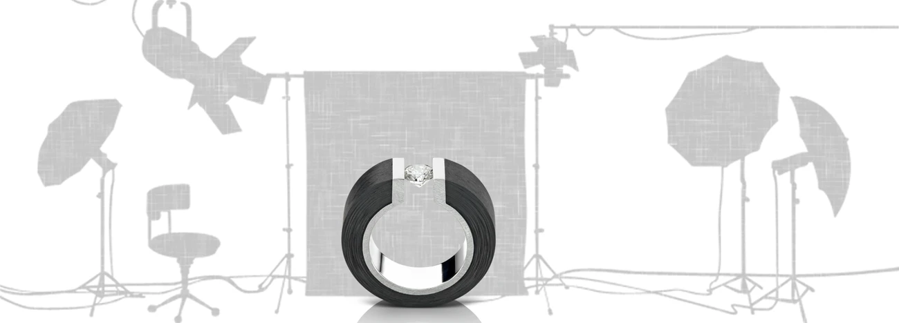
Product shot....I was going for minimalist but strking. C&C welcome-
For iPhone users - a new version of Bluristic has dropped (v1.8) which offers new features and significant improvements in stability & useability.
I am interested in learning Macro/Closeup photography and understanding that Focus Bracketing is a good part of the process, I thought I would give focus stacking a try.


Another visit to our garden using a vintage lens (Canon FD 50mm f/1.4) on my Canon R5. NOTE: With this lens the minimum focusing distance is 18" at which point you have 1/4" depth of field.
Was down in Austin for a bit on a work trip. I've always heard how beautiful the skyline is from the river.
Was a little let down by the clouds, but what can I do!
My two favourite images from my recent night time adventure in Tenerife. Foregrounds and skies were shot separately and blended in PS.


4 Comments
Hi Thadd,
This is a pretty good image. I think there are some refinements that could take it up a tick. I think it is important to identify weather your light for an image is Narrative or not. If it is purely to look cool on the subject, or tell a story. In this case the background light seems a bit like a stage light. Thats fine, but if thats what you are going for I might throw a bit more of a kicker from the angle of the blue spot to motivate it.
Additionally, the composition makes it seem like it was designed for copy/text on the image, but since you are posting as a stand alone product shot, I might re consider having more or less negative space. also, lowering the camera angle a bit, might make the bottle feel a touch more heroic. Imagine the bottle being a high power ceo or something, You likely would shoot up at her/him to make them seem a bit more important.
The quality of light on the bottle is pretty good, but the logo, needs to be clipped out and adjusted so it isn't quite as washed out by the reflection, and I think you could put a spot of light on the top logo to make it stand out a bit.
Keep working at it. The bones are here, but when you do a minimalist photograph, the smallest details matter that much more.
Here are some people you could look at to emulate.
http://www.norimichi.com/overview/66jxex1onpxgxxz42d0ycmtq7pnmtl
https://www.schafrick.com/
Carlton-
Thank you for your comments! Very helpful to get other viewpoints, and advice on issues I'd not considered..
One thing I always struggle with is getting a light on the label. It always creates an unwanted reflection . Is editing in post the solution? Anyone got a suggestion or two?
Hey Thadd,
On a bottle like this, it may require some unwanted post. There are a couple of Robb Grimm tutorials that deal with this issue. One on beer and one where he photographs a sanpalegrino. The easiest way without special equipment would be to use a hard light from up high so that the reflection doesn't show up. Maybe try a snoot w/grid. Rob uses a varispot from vistec. He also uses a polarizing gel in combination with a linear polarizing filter on another image.
Excellent! Good direction to pursue!