Stone IPA
Trying to "perfect" product work. C&C welcome. I'd like comments around lighting and it's overall presentation.
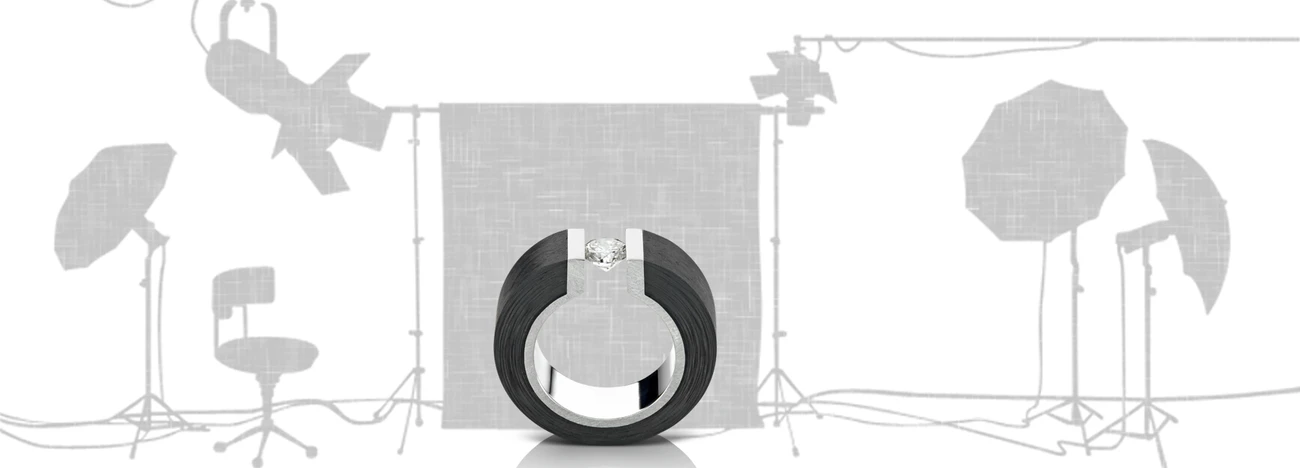
Trying to "perfect" product work. C&C welcome. I'd like comments around lighting and it's overall presentation.
For iPhone users - a new version of Bluristic has dropped (v1.8) which offers new features and significant improvements in stability & useability.
I am interested in learning Macro/Closeup photography and understanding that Focus Bracketing is a good part of the process, I thought I would give focus stacking a try.


Another visit to our garden using a vintage lens (Canon FD 50mm f/1.4) on my Canon R5. NOTE: With this lens the minimum focusing distance is 18" at which point you have 1/4" depth of field.
Was down in Austin for a bit on a work trip. I've always heard how beautiful the skyline is from the river.
Was a little let down by the clouds, but what can I do!
My two favourite images from my recent night time adventure in Tenerife. Foregrounds and skies were shot separately and blended in PS.


1 Comment
Hi Thadd,
i like a lot of your image but i think, some aspects can be improved. First, i like the lighting of the bottle, the gradient of the lights. I like the color of the background and the lighting of the label, even if it´s a little bit too dark at the IPA writing. In the right gradient is a black line from the top to the button and i cannot find out from where it´s coming. For me, it´s distracting. I like the dynamic angle of the bottle but the bottle does not have enough space. And you placed droplets at the bottle but it´s not fresh enough, I get a feeling of freshnesh, but not enough.
Greetings,
Matthias