Too simple?
Tell me everything bad about this.

Tell me everything bad about this.
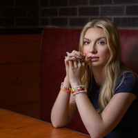
Recently, I taught an Off Camera Flash class. Paige was my model for the class. We were outdoors but it started to rain. Luckily, a nearby restaurant let us conduct the class in their dining room.


Recently, I taught an Off Camera Flash class. Paige was my model for the class. We were outdoors but it started to rain. Luckily, a nearby restaurant let us conduct the class in their dining room.
Recently, I taught an Off Camera Flash class. Paige was my model for the class. We were outdoors but it started to rain. Luckily, a nearby restaurant let us conduct the class in their dining room.


3 Comments
Hey!
I try to look at images and follow my eyes to recognize where the attention of the image is. I think for me it is on the edge of the black surface. Maybe because it is the strongest contrast between bottle (black), edge (gray) (surface (black again).
Also the 20 is pretty bright and looks a little like "-20%" but that's the labels fault. You could still bring the white down and give more attention to the logo, maybe with a light or just more contrast.
But this is very nitpicking, overall it is a very clean image.
Congrats!
Would appreciate if you could also rate one of my photographs!
Great shot! There are a couple things I would do different but it’s really nit picking. Only other shooters would notice. A client would be pretty thrilled with this.
I would come up a little higher. I don’t like not seeing the bottom of the bottle. The other is the rim light on camera right, it doesn’t fall all the way to the bottom. At first I wished it was the same as the left side then I saw the name on the left and the nice highlight on the top right and decided it was perfect. The eye naturally flowed.
Great shot!
Looks good. Personally I would crop closer as it feels like there's possibly too much space at the moment. A graphic designer could use it for copy for an ad of course, but presented on its own the bottle seems quite small in the frame. I assume the bottle is matt? If so, no problem. I like the heroic angle and the dark base pushes my eye up the frame to the bottle. There is some banding in the background when viewed large. This may just be online compression artefacts. If not, bung a noise layer over it to help break it up a bit. Good job