Moody flat lay
F14
1/160
ISO 100
Lighting: strobe for key, speedlite for fill
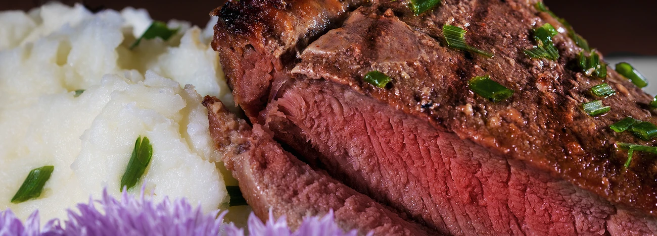
CC is welcome, my first thought was it might be underexposed, however it's a dark photograph . Please share your thoughts

F14
1/160
ISO 100
Lighting: strobe for key, speedlite for fill
CC is welcome, my first thought was it might be underexposed, however it's a dark photograph . Please share your thoughts
A few shots from the winter of 2025. The last one was inside of the Acropolis Museum. (Unfortunately, I could get everyone to walk exactly where I wanted them to. hahaha)


For iPhone users - a new version of Bluristic has dropped (v1.8) which offers new features and significant improvements in stability & useability.
I am interested in learning Macro/Closeup photography and understanding that Focus Bracketing is a good part of the process, I thought I would give focus stacking a try.
Another visit to our garden using a vintage lens (Canon FD 50mm f/1.4) on my Canon R5. NOTE: With this lens the minimum focusing distance is 18" at which point you have 1/4" depth of field.


8 Comments
Kudos for being open to feedback.
The first thing that struck me is that low contrast light in combination with a monochromatic color palette doesn't usually translate very well. Especially when the light is warm because the result is muddy.
You can add dynamic contrast here to give it some "bite." (sorry) Or you could create a new whitepoint off the plates (which will appear slightly blue to the eye) then raise the saturation slightly on the chocolate. (warm)
If you really like the monochromatic look how about re-shooting it with some mint leaves or something to expand the palette?
Whatever you decide this may be a great lesson in shooting that you take into your next session?
Thanks for your reply Daniel,
I have to admit, it took me some time to understand your point. I think I get it. However the cream (white) contrasts with chocolate, would increasing the highlights give it a pop and interest?
Yes. The image currently is pretty flat. (IMO) it needs some contrasty edges to draw in the eye. It also is very yellow-green which may not be what you intended.
I hesitate to color correct other folks work but here is a quick CC only for comparison.
Thanks again Daniel, It looks better already! You are right yellow - green is not working here. Blue works for some reason, do you mind explaining the theory behind this ( Im not good with colors )
Thank you for putting time into demonstrating your point, I really appreciate it!
In Daylight (5500-6000°Kelvin) the "whites" we see are ever so slightly blue. Many people tend to associate cool highlights as a neutral color correction.
If you want to warm it up you add Red and Yellow. You added Green and Yellow which is a combination normally used in cinema, not food photography.
I also think your monitor might not be calibrated. I use a closed loop calibration for my monitor so the image I shared doesn't look very blue. It probably looks blue to you after sitting with the yellow-green version for so long.
Here are a couple tricks to use…
1. Use the eye dropper in CMYK mode and place it above a neutral highlight like the plate. If the CMY numbers are not balanced then you have a color cast no matter what your eye sees.They should be within a couple digits of each other.
2. After completing a color correction go away for a couple hours or a day. When you come back your eye will be fresh and it will be easier to see color casts and other problems.
Cheers,
Daniel
Again thank you for everything Daniel, you are very good👍
You are welcome and please share your next effort with us. It will be exciting to see how you incorporate what you have learned.
Sure! will do 👍