
What would you change?
Hi, what do you think about the colors and details in this shot by the before and after images?
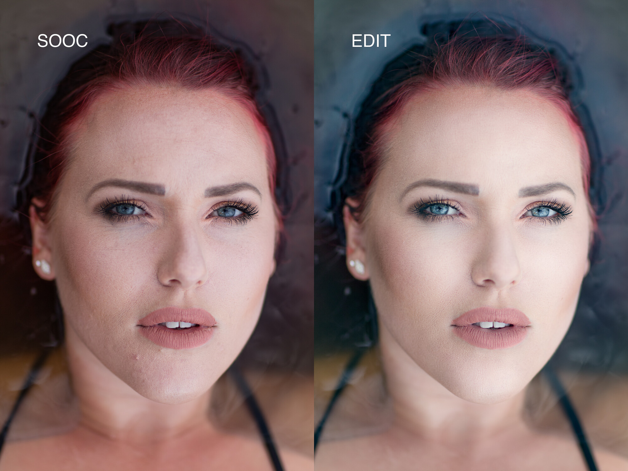
Hi, what do you think about the colors and details in this shot by the before and after images?

Would anybody know why I keep getting an error when uploading a photograph that is well under 21 MB?


I was in Staines car park, and this row of trees just looked absolutely luscious in the sunshine.
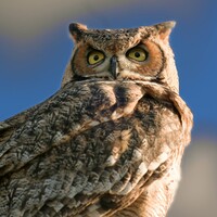
Great horned owl. It could be a cross with a Eurasian owl because I know they've got a couple, and I am no bird expert.
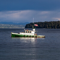
Sitting at anchor. The weather is starting to change, the sky is cloudy with big puffy clouds


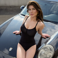
As we were planning our shoot, Iria said she needed a swimwear look. I wanted lifestyle with my car. We compromised. I think it turned out great. Hope you like it.
7 Comments
Colors and retouch seems pretty ok here, I do like magenta being removed I also don't like it and it gets everywhere on Canon cameras :/ What I would change is that after cleaning up skin, it gets bit flat in general. It has more depth in SOOC and after edit it looks bit flat. However I have the same problem usually on mine edits, so I wouldn't say it's a trival thing to do. Additionaly one small thing that bothers me is a line between face and hair, it looks more saturated/darker and transition there is unnatural. Apart from this it's a good edit, well done.
He probably raised the shadows or/and blacks and that's what makes it seem flat. I
I thnk the editing is perfect
Good skin color. But the hairs must be red or not. Try to increase the red tone and perhaps also blue for the water.
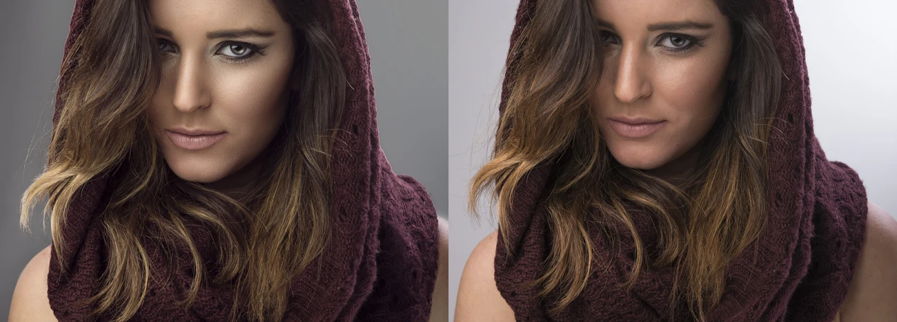
I deleted my old comment because I didn't explain it well. I edited it and changed:
-color cast in the water
-blown out highlights on the face ( I guess you tried to remove the redness by increasing the exposure??)
-sharpened and brightened eyes
-removed redness in the face as much as possible ( in order to get the face white you'd have to dodge and burn every pore which would take the at least 2 hours)
-smoothened pores with an inverted highpass layer
I toned the image with a classical fashion look (blue in the shadows, yellows in the highlights/mid tones)
I hope that helps.
Hey! Sorry for some delay! Thanks for the comments Pawel, yea ill try next time. Yes, I have pulled out shadows and decreased the contrast a little in the edit so that probably why it a little flatter. the magenta is always fun to work with xD
Gian, yea when you say it I'll see it too! Thanks :)
Justabeginner: Ye il like the most of your edit! its get a lot sharper look to the better contrast but ill like your edit just a little lighter but that just me! Sharpen the eyes too much is a way I feel it looks bad but with the right amount yes of course.
This edit I have done has some but just slightly blue in the shadows and yellow in the highlight. this edit is just done in 15 minutes if all remember correct.
Thanks for the comment Il try on the next image to make a better one! :D
LOOKS VERY NICE - CHIN BLEND IS A LITTLE FLAT