Trying some color grading options...
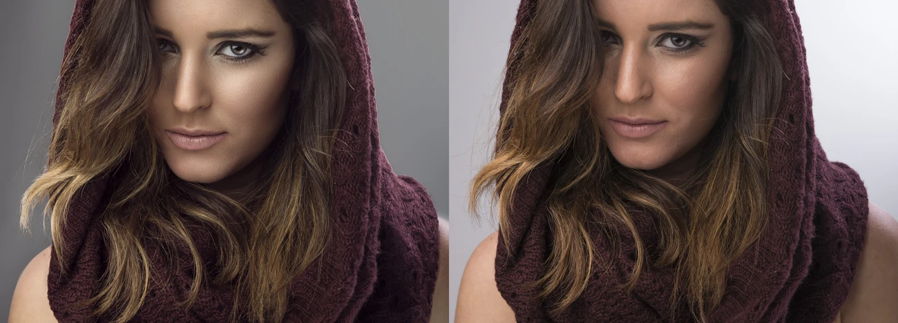
I have been playing with color grading some and I'm getting the hang of the different controls Photoshop offers... I'm just looking for a critique and advice on the edits. I know the photo is kind of goofy, it was a misfire but I thought it was funny...so ignore that... first photo was out of camera, we one was Lightroom adjusted and the third was photoshopped


7 Comments
The grading is so subtle it comes off looking like a white balance mistake (to me). If I were you, I would be just a bit more bold with it and introduce complementary or Analogous color schemes. It looks like the second image just has a lite green cast and the third a blue one. (But the monitor I am viewing them on is not the most reliable) I found this video tutorial very helpful, personally. Happy editing! https://www.youtube.com/watch?v=KPAViswQvCg
I've seen this video... I didn't really like his end result in the example but you're right... When I look at the color graded images I posted it bothers me how off the skin tones are... I'm trying to figure out how to imitate Mark Seligers processing he uses from time to time...
These two photos from his VF shoot have a very subtle grade where the shadows are slightly cooled and the highlights are slightly warmed...
His lighting is so on point too.
I tried this edit this morning. I went a little bolder with the edits than the last set and tried to bring the highlight up. And agreed, Mark Seliger is fantastic at portrait edits. I'm brand new to the idea of portraits so I'm just figuring out how to light and process and his work has always stood out to me so... i kind of wanted to deconstruct it and figure it out.
This last one is is awesome, maybe a bit more brownish tone in the skin, but it is so much closer to his work. Nice job on these edits!
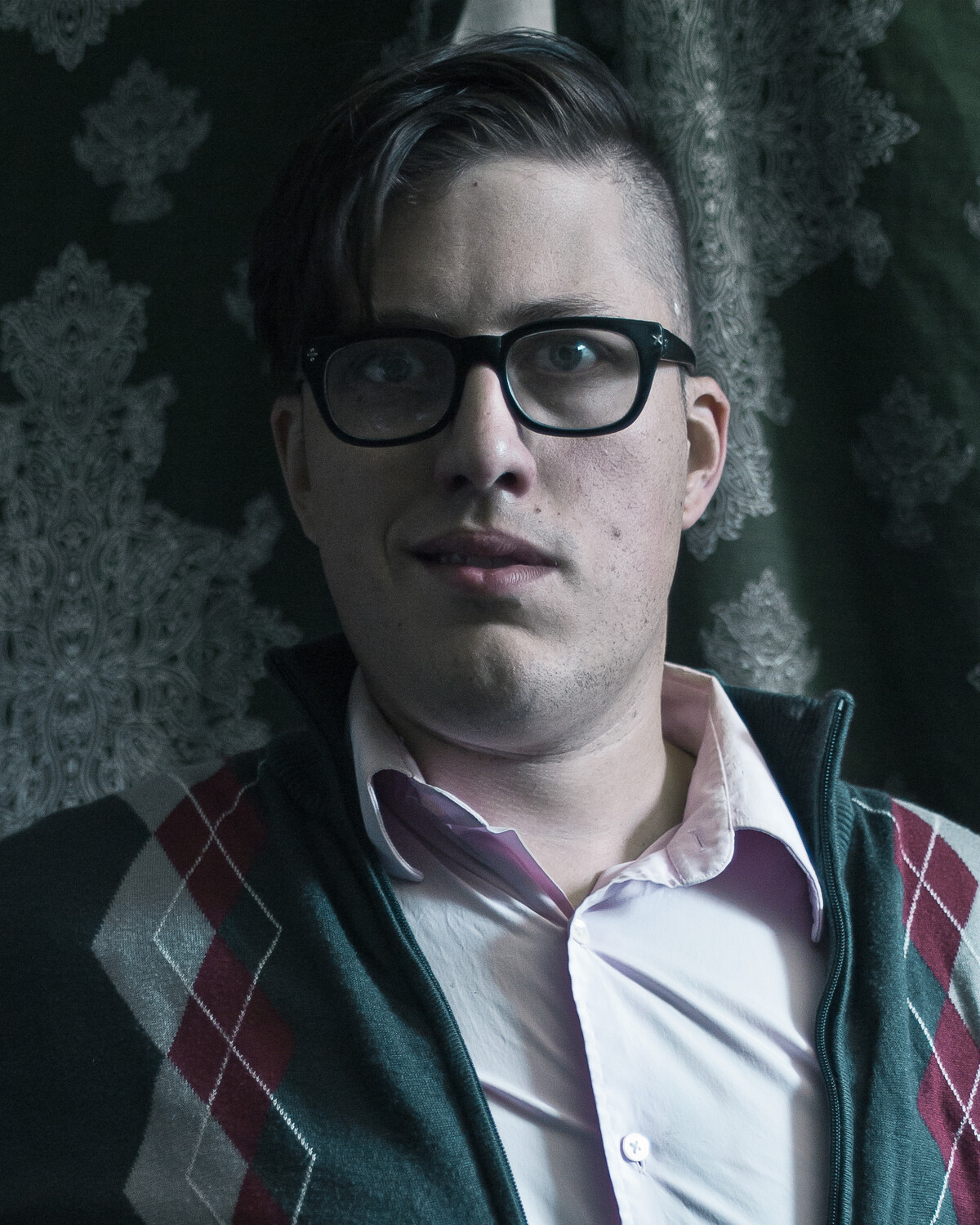
Try looking at Phlearn's video here: https://youtu.be/aaMfMZEFetc He shows how to get the exact opposite color for your shadows and highlights, and how to specifically target those areas. It's what I've been using for a while now (even made an action for it), and I really like it. Here's a before & after of that method.
That's a great tutorial. I've been experimenting on my own to find ways to reduce color cast with later mask but didn't try this way... I did one more edit out of this set. I haven't done this with any clients yet... Has anyone had negative feedback with these color graded portraits?