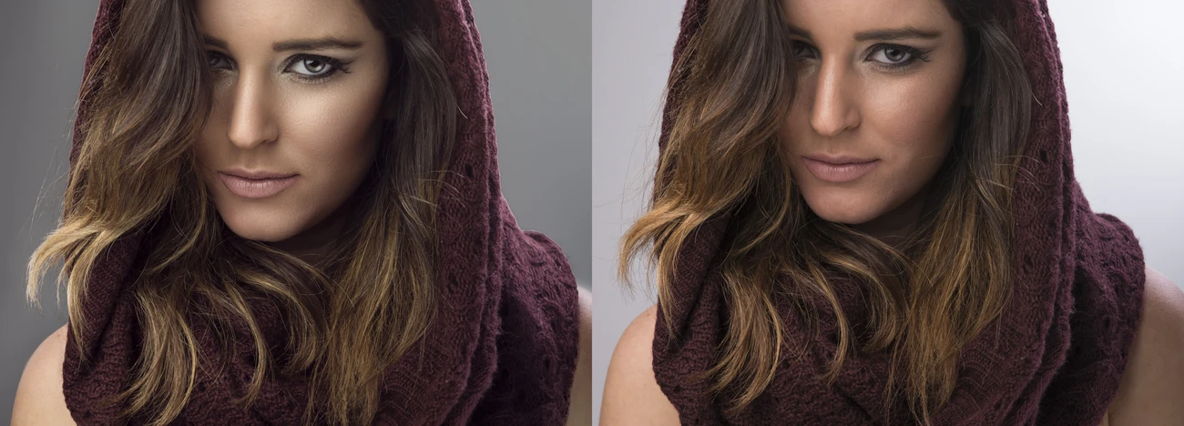
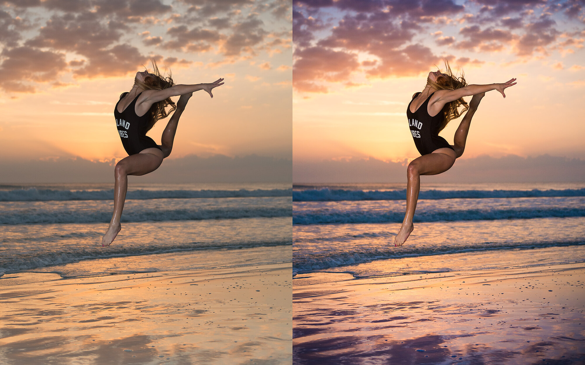
Before & after of a gymnast at sunrise. Feel free to critique!
Shot at New Smyrna Beach in Florida - we got lucky with a great sunrise. Lit with a Flashpoint Xplor shot into a 60" Softlighter camera left.
Nikon D800 | Nikkor 24-70@48mm | 1/1600s | ƒ2.8 | ISO800
I did a basic edit to the background, adding in cooler temps to make her stand out more. Then I did an edit for her, with a slightly warmer WB (maybe +250) than the background. Then just some minor retouching to finish it off. Let me know what you think - the left is the original RAW photo.


7 Comments
Looks *exactly* right to me.
look great
Wouldn't change a thing
I think you really nailed it. You processed it enough to add the "pop" but not so much it looks forced.
Your post shoot edits are nicely balanced but if Im going to be critical,.. you need a better original shot to work from. The weather is uncontrollable but waiting for a better shot from the model is possible. She needs to pull her shoulders down, relax her hands and arms, pointe her feet and pull her abdominals up. Perhaps a slightly different angle could have been taken so her back leg doesnt look like its joined to her buttock at the knee, there is a missed opportunity to get her hair fanning out and unless you are attempting to advertise something - no logos or printed clothing.
Im going to agree with the others concerning your editing choices but as a photographer you need to control the content more.
Processing is definitely an improvement. I tend to agree with Na, the model's pose could use some additional separation.
you might also try dodging around the left food to get it to stand out a bit more.
The background is roughly the same luminosity as the subject, you might try dropping background contrast to make the subject stand our a bit more - move up the pedestal maybe +7 and drop the white point, tweak to taste?
I think the shot is really nicely processed, subtle and natural. I think an alternative crop would improve it though. Of course, it is a very personal thing and there is no right or wrong but I would lose some space on the right and from the bottom giving her some flying room and losing some of the non-silky bumpy beach on the bottom. I find a centre focus point wishy-washy without strong symmetry in the pic.