Need real Critics
Hi, I want real critics about my work.Everyone is welcome for suggestions and tip.
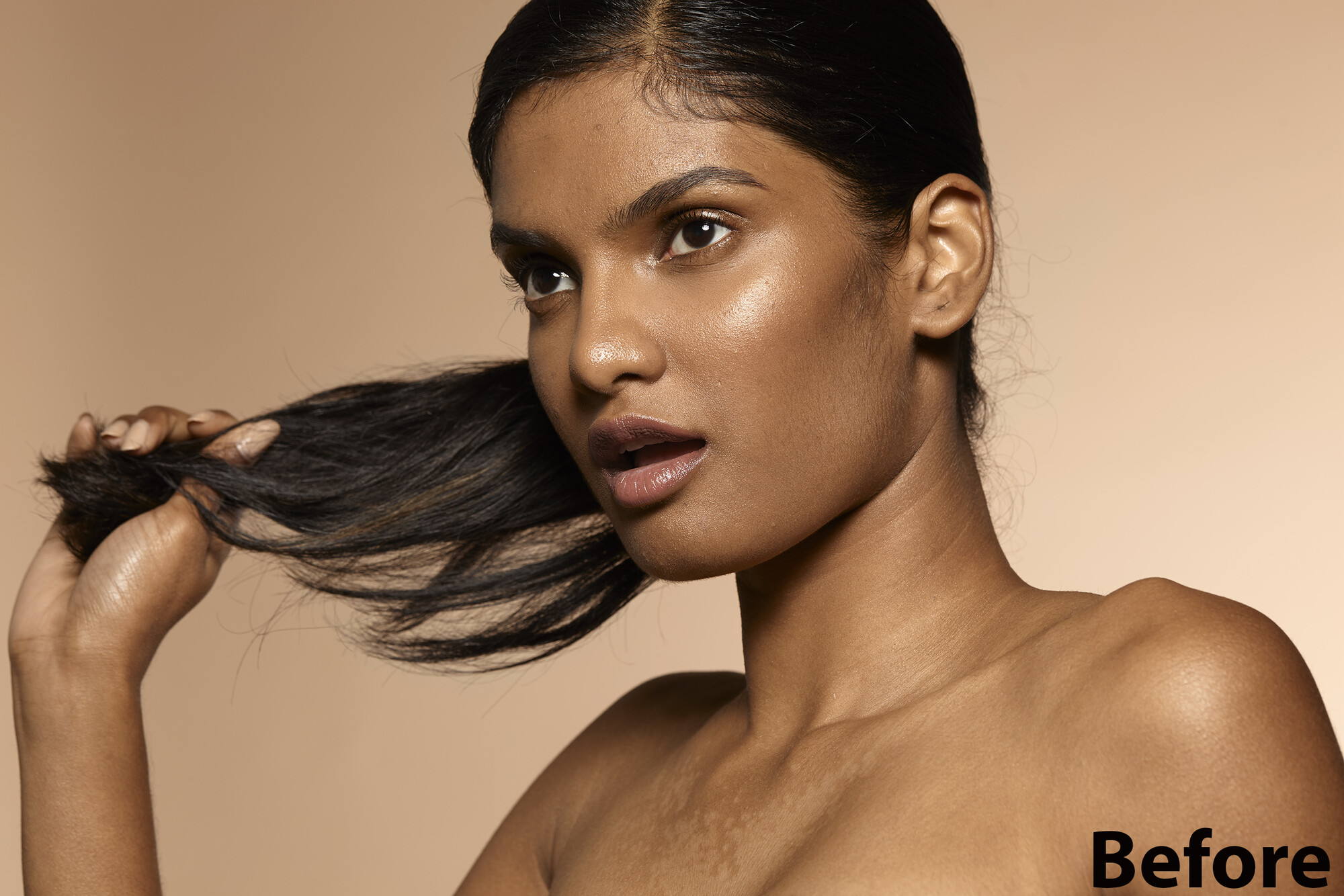
Image from: Jennifer Mcintyre-NINA-PRIYA

Hi, I want real critics about my work.Everyone is welcome for suggestions and tip.
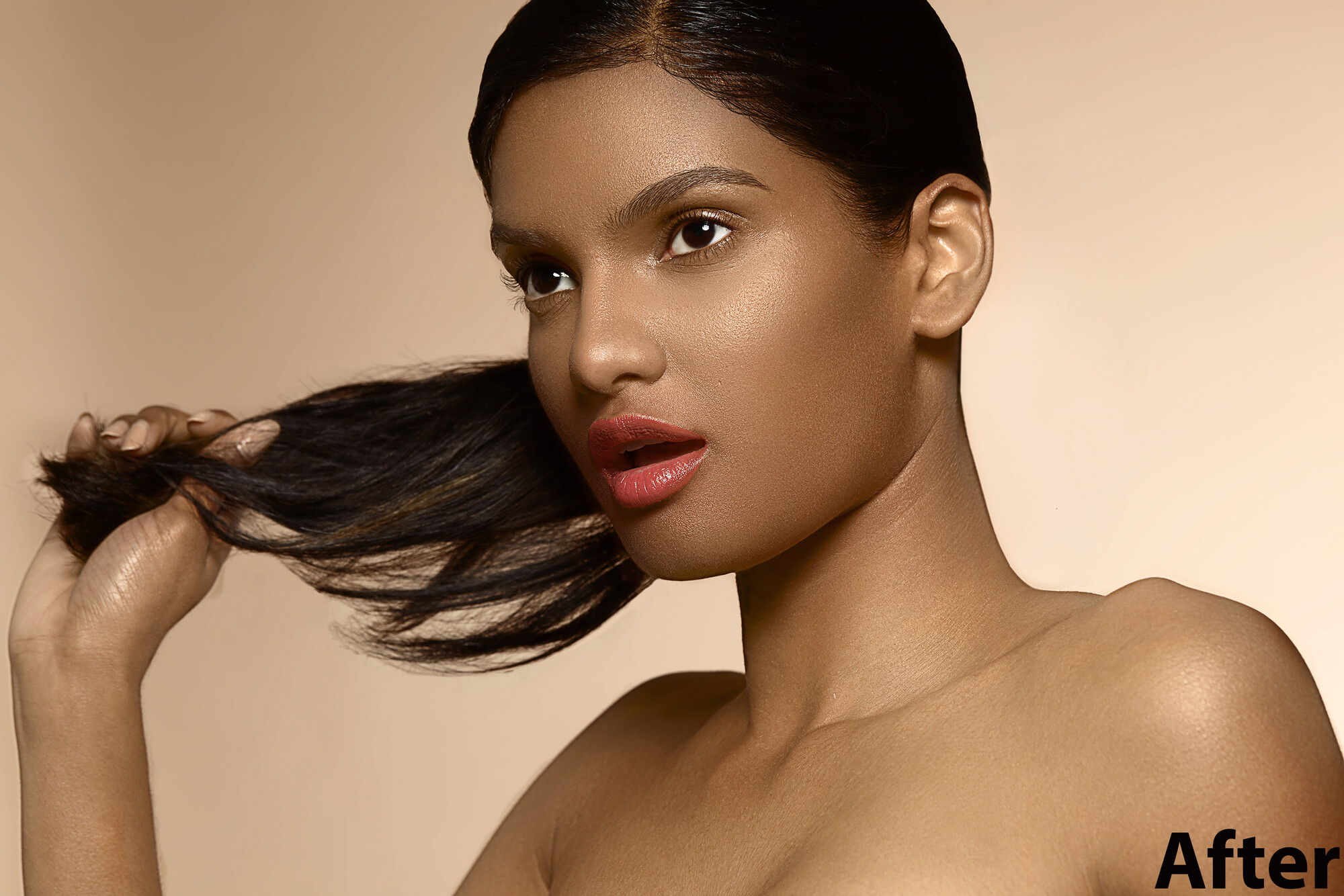
Image from: Jennifer Mcintyre-NINA-PRIYA
I thought I would try out my 50 year old lenses: Canon FD 50mm f/1.5 SSC and Canon FD 28mm f/2.8 on my Canon R5 with the use of the appropriate adapter.


These photos were taken just outside of a small town in central Portugal.


I really enjoy creating something different with drones. I've had the Mavic now for about four weeks and I absolutely love it.


Client came and needed headshots immediately. Set up a single Broncolor Para 133 in the dining room. Delivered 20 pics. Setup, Shoot, Edit and delivered within 30 minutes.


13 Comments
You need to post larger images if you want really useful feedback. Post one for before and one for after, each the maximum size fstoppers allows.
But judging from this.. The top image looks like it's a screen grab from Second Life. So if it's the after, you should really change what you are doing. (Sorry.)
First of all thanks to David Mawson for Writing. here I update image. Now I would really like an opinion of your about my work. But I don't get what you try to say "The top image looks like it's a screen grab from Second Life".
Second Life is a computer game. I'd saying that the After looks like not very great computer graphics. The skin looks like matt plastic. And the shading now gives the forehead and cheeks an unnatural shape.
You might try this
https://www.oleg-ti.com/?mod=content&id=4
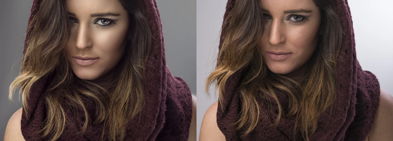
Thanks again David to make me realize that I really took so far. Now I corrected my mistake in the third image. I hop you may Like now.
That's looking better but still super great. What technique are you using?
Just too much...taken too far, the "after" image looks completely fake, like an artist's painting or drawing. Good luck, finding a balance is tough.
Thanks, Joseph giving you valuable time I made some correction you can check the third image and really look for further advice.
Definitely better. There is no right answer, as it obviously depends on what you are going for. It seems magazines often push the boundaries to the edge of fake. The "after advice" picture is more realistic and does nto takes less away from the model's natural beauty.
I'm not sure I agree this is that far off. I really like the "after advice" image and I'm not sure what is changed. These "after" shots only look extreme in comparison to the original. This is what advertising retouching looks like.
Thanks, Lee.
You've done a good job at preserving texture in the skin but I still think you've arrived at an image that looks too manipulated. The two things that I notice are the lip color you've added and the perfection of the hairline.
What sticks out to me is the lip color looks fake, try toning it down a bit, and the edge of her hair in the back seems too sharp. I would also put back the original fly-aways and strands of hair that are falling from her hand. Both after's look far too edited in that area.
Thanks Robert for critics.