Standing Tall
This is a shot of the vocalist of a band who I took promo shots of the other day. Asking for as much constructive criticism as possible. Thanks for looking!

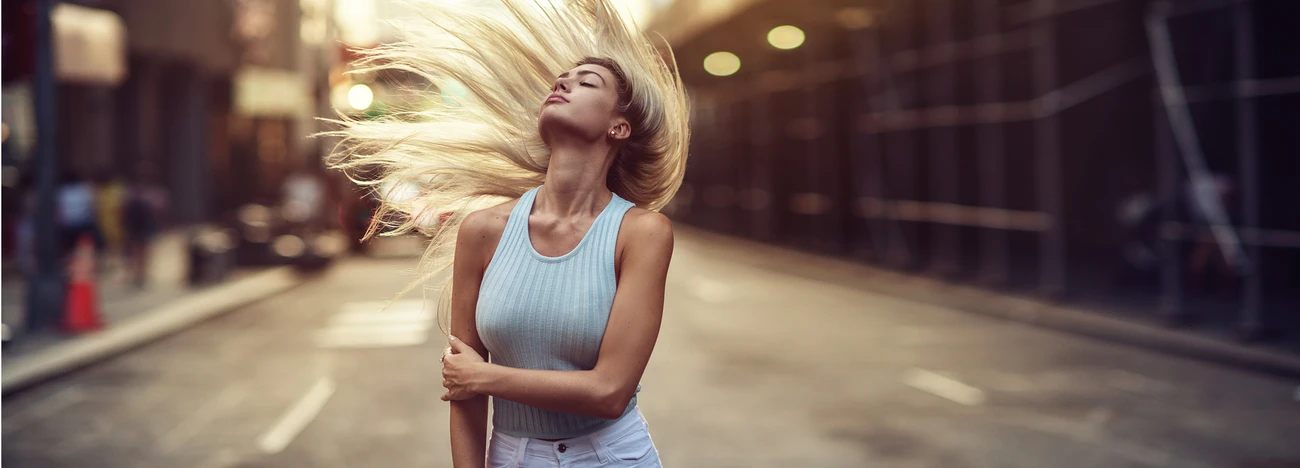
This is a shot of the vocalist of a band who I took promo shots of the other day. Asking for as much constructive criticism as possible. Thanks for looking!
A few shots from the winter of 2025. The last one was inside of the Acropolis Museum. (Unfortunately, I could get everyone to walk exactly where I wanted them to. hahaha)


For iPhone users - a new version of Bluristic has dropped (v1.8) which offers new features and significant improvements in stability & useability.
I am interested in learning Macro/Closeup photography and understanding that Focus Bracketing is a good part of the process, I thought I would give focus stacking a try.
Another visit to our garden using a vintage lens (Canon FD 50mm f/1.4) on my Canon R5. NOTE: With this lens the minimum focusing distance is 18" at which point you have 1/4" depth of field.
Was down in Austin for a bit on a work trip. I've always heard how beautiful the skyline is from the river.
Was a little let down by the clouds, but what can I do!


8 Comments
The first thing that comes to mind when looking at the photo is that you should avoid sharp objects sticking out of your subject's head, such as branches. One way to have the lessen the impact of the branches sticking out is to have some separation from the background using depth of field.
Composition wise, you need to have more space in front of the subject, as he seems to be looking outside the frame. His head is closer to the left side of the frame and gives the feeling that he is looking into a wall. Also either include his feet or cut a little higher up on his leg, avoiding joints such as his ankles.
I uploaded a slightly modified copy of your image to show what i mean.
Hey, thanks for the reply and for showing me what you meant for me to do. Really appreciate that. I'm curious, aside from cropping, how you edited the photo to give a shallower depth of field. Thanks!
To get the shallow depth of field effect in Photoshop you need to have a good selection of your subject first. After you did that, you create a new alpha channel that you then use under the lens blur dialogue to point to what you want to blur. The alpha channel can be as detailed as you want it. You can spend as much time on it as you want in order to get a more realistic effect. What i did in that example was a really quick and dirty pen tool selection and then i added a gradient in the alpha channel around the subject (white at his feet to black higher up). If you want to be more accurate you will assign different shades going darker the further away your objects get. Darker is blurrier. Hope that helps you get the idea.
But before you start editing the depth of field in Photoshop, try to think what you could do differently to get a shallower depth in camera.
Best of luck!
Especially when going with a lack of color or limited colors, a busy background does not help your subject.
Thank you for your comment, both here and on my other photos. Very educational, and I appreciate that.
Could I get your opinion on this one? I've only been shooting for a few weeks, so I'm reslly trying to get as much feedback and gain as much knowledge as I can.
There are good things and bad things going on in this one. As opposed to the one above, the background is cleaner, the pattern on it is not distracting. The issue with it is that it does not offer very much contrast with the man's hair.
Composition wise, you need to understand the rule of thirds in order highlight better the points of interest in your images. Without going in very much detail (there are plenty of resources online on this subject), you should have offset his face more to the left at about 1/3 of the image. Your camera probably has a grid you may want to activate until you get the feel for it. Usually if you are not aiming for perfect symmetry or you do not have a good reason to do it, you will not center your subject in the frame. Also when dealing with people, too much headroom is not preferred and better avoided so you can either zoom and eliminate more of it, or move closer with your feet. Either way works just fine. Be careful what you have going on at the edges of your picture such as the door frame on the right. Either include more or eliminate completely. I think this Image would have been better if shot in landscape rather than portrait, showing a little more of the surroundings (probably to his right).
Last but definitely not least, when shooting a person you NEED to have the eyes or at least the eye closer to the camera IN FOCUS. Do not be afraid to bump up the ISO in order to get a better shutter speed. Especially in black and white images, a little grain will not hurt anyone, but lack of focus or shaky hands will.
Good luck!
Yeah, the focus was the first thing that jumped out at me. I think the contrast is fine, at least on my monitor, The highlights in his hair separate him from the background. His eye line is on the top 3rd of the image, so you are good there, and there is nothing wrong with centering your subject. The board on the left (door frame, or porch post?) is the largest mass of bright color in the photo. That bothers me.