How can I improve my family portraits?
I just got out of the Army where I spent most of my time doing event photography. The one thing people always said was that they liked the portraits I took. I however, fully understand that I have a long way to go before I can reach what can be considered a 'Professional' level as a photographer.
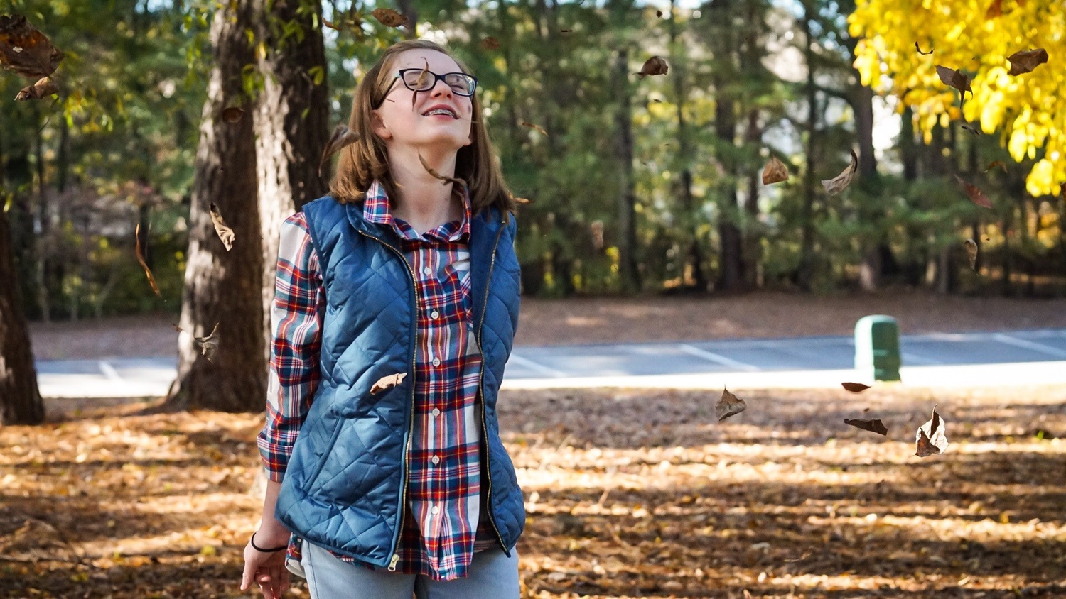
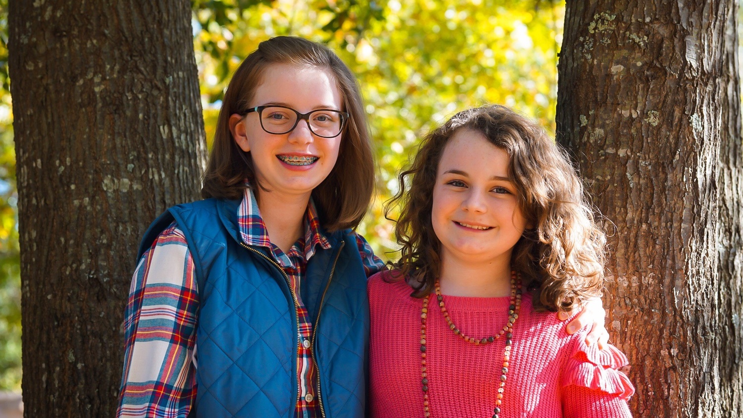
The pictures attached to this post are of a clients children. I am wondering what I can improve on future photo shoots. Thanks in advance for any advice or criticism.


10 Comments
I like the colors, but for me the light is completly wrong, direction and intensity
I was definitely really focused on the colors of the shots. I guess you could say I might have been a little too focused. Thank you for bringing this to my attention!
here's some of my suggestions for improvement if you were to redo them. overall I think these are the sorts of photos that parents should be happy to have of their kids.
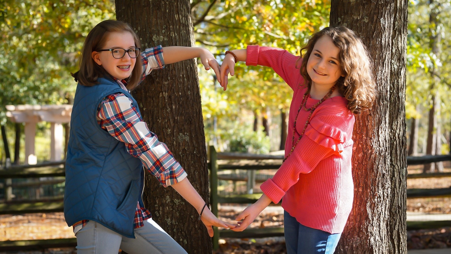
first photo - the trees not lining up with the kids is a little distracting, and for the top of the heart maybe instead of the limp wrists try for a downward hand hold of some sort
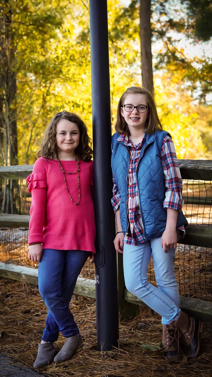
second photo - the pole seems to be dividing them. maybe have them back to back with it or somewhere else
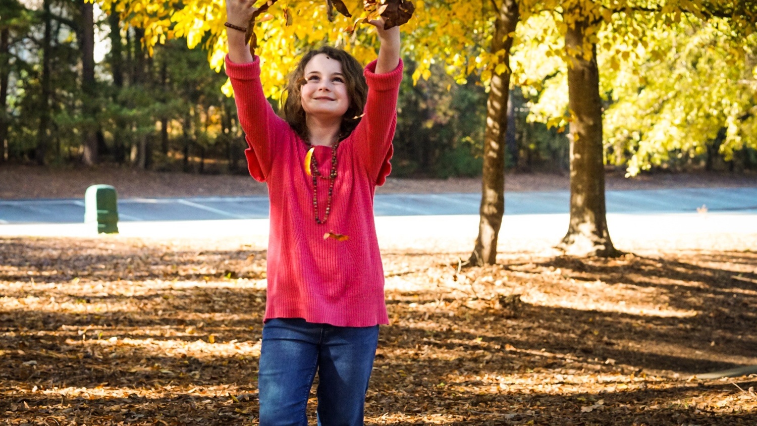
third and fourth - cool idea, just maybe change where limbs are cropped. on 4 the leaves on her face and neck look a bit weird. photoshop or positioning can make the electric box go away
fifth photo - adjust the skin tones to be less orange and maybe a little brighter
Thank you so much! Those are some incredible suggestions. You mentioned things I would have had trouble noticing myself during this shoot. I am going to refine my future images by trying to keep those suggestions in mind during upcoming shoots!
Hi Thomas, my first impression is the background could have been utilized more effectively. I think the first photo could have benefited by placing the girls farther in front of the tree and let the shallow depth of field melt the background away. For the heart pose, I think it would have been less distracting using a simpler background with less trees/lines. Bear in mind, the background is just as important and photos 3 and 4 has a green trash can in the background? I would have PS that out or better yet, avoid that in camera in the future.
Spacing is important in family photos. Even a small gap in body positioning from family members detach the overall mood. You almost have to amplify the proximity of individuals to capture the togetherness and positioning them properly goes without saying. Think of triangle when positioning individuals or staggering the heads to give a photo more balanced look. Here's an excellent article as well: https://digital-photography-school.com/10-tips-for-creating-great-famil…
Hope you don't mind taking advice from a Marine. ;-)
Hey Thomas.
If I had to offer one suggestion it would be to think about what roll you want the background to play. If it a story element then feature it and let your subjects interact with it.
If the BG is not a key element then position it and or your subjects so that they don't fight each other. You can use DOF, colour, and light to help control or manipulate the BG to help you get the most out of a location.
Keep on exploring and keep us updated on how it's going.
I'm not a great portrait maker but I agree with others about the background. It's always a hard thing for beginner to have in mind because we focus on the subject. I try to have this workflow in my mind when shooting portraits: check subject, check background, check corners.
What I definitely like here is that the girls are acting naturally and even though they are looking at the camera, they don't seem to be bothered by it. Interaction with the models - for good or bad - shows and can ruin the shot. Looks like you don't have that problem, so kudos! :)
Longer lens and a flash would have helped significantly. These are still pretty solid images though.
A flash in a small softbox or octobox was needed. Natural light alone is rarely enough. It needs that little bit of 'hot sauce'.
There are many things that go into great portraiture. Often it is little things that separate good from great. One fix that I would do is revise the crops. The cropping begins with "what is the subject - what is the emphasis point for the photo?". In #1 it's tough because of the posing asymmetry. I'd come in from the right to the tree and come pretty tight to blue vest's left edge. In #2 about 25% of the frame is background above their heads. I'd come down a bunch and I might either leave the legs alone or crop up to slightly above or slightly below the knee (but not at the knee). It comes down to "are the legs important?". In #3, the picture is kinda blown by the cutoff hands. However, I'd crop inside the telephone box and just outside the near right tree such that the subject moves to 1/3 from the left. Rule of 1/3rds is not inviolate but it isn't a bad place to start. Same idea for #4 as #3. In #5, i'd crop just outside the lower width of their arms to create a tree-bark framing. Experiment to see what grabs you.