Please help me improve!
Hey! I am new to Fstoppers and also new to this group (obvi).
I would love to get some feedback and opinions on my most recent photo shoot if you have time and energy. What is bad/good? What would you do different? Hit me!
I have been watching a lot of review-videos from Fstoppers on Youtube and I find all the comments really constructive and I learn alot. I would love to have some critique on my own photos.


6 Comments
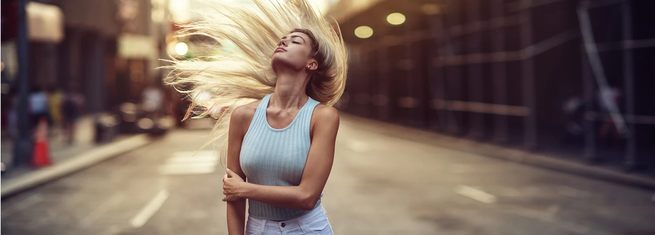
Overall less headroom. The images have the feel that you shot horizontal then cropped into a vertical portrait.
Great feedback! Thank you!
The color tones and lighting are really nice. In the first image your model has a slightly odd expression and a very round hunched shoulder that somehow draws the eye almost as much as her face; shooting down on her doesn't really help with that. And I agree with the other comment, less headroom. Either get more of the horizon or get rid of it entirely, the small sliver at the top is distracting. I like the third image a lot, but I wish that you had been more level with her instead of shooting downward again. Because of the monotone in this image, the bit of horizon at the top is nice instead of distracting. The second image is pretty cool, although I can't decide if I like the expression on her face or not. Hope this helps.
Thank you so much for all the comments! They are really great and I take them all to heart.
Hi,
I agree with both above. I really think the last one is the best of the three, great eye contact and with just a little less headroom it would be a great image!
Thank you so much! Really great feedback!