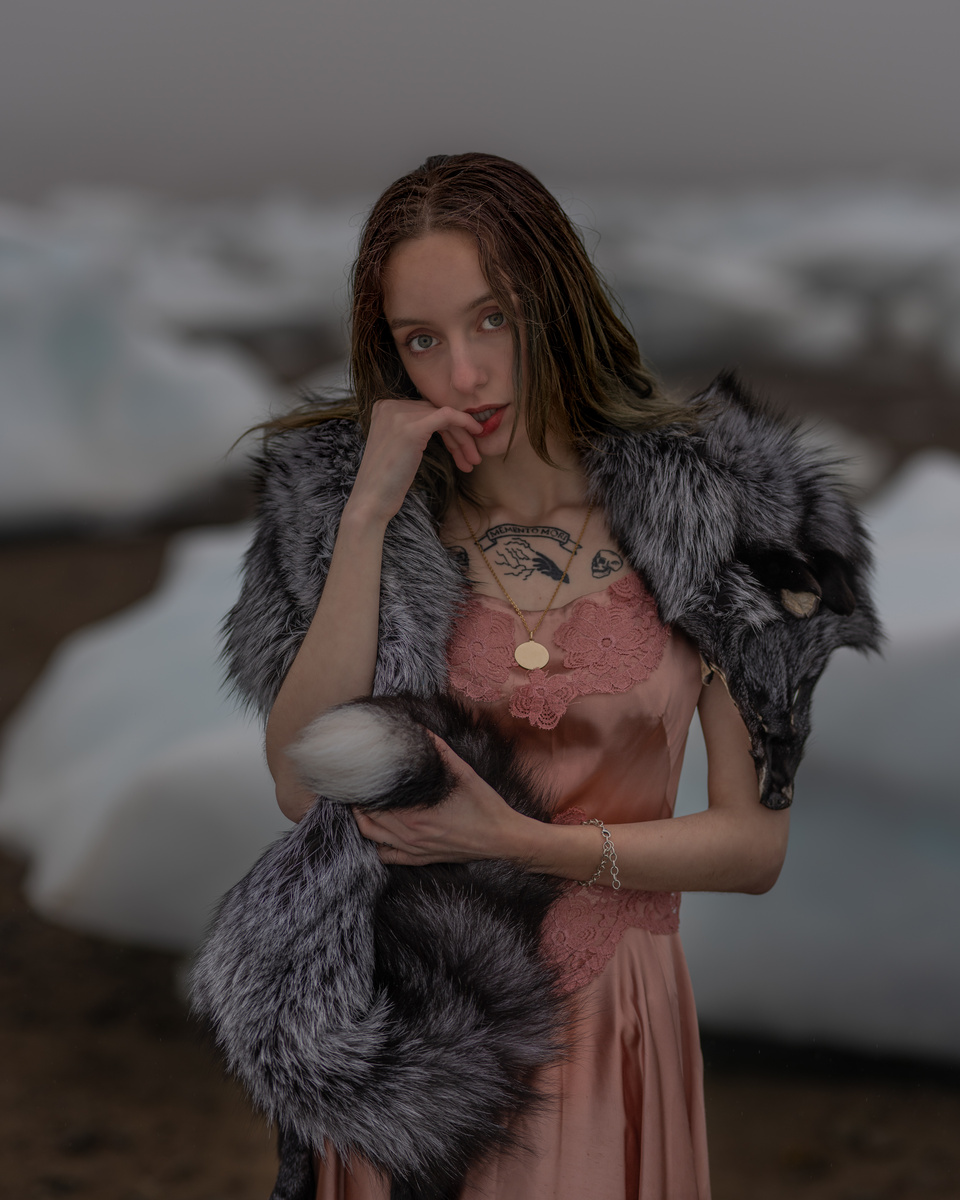
Critique Please
Looking to get a critique of the following set. Still new to doing portraits. Done about 10-12 now and looking for feedback to improve. Thanks in advance.
Model: Megan Grossi
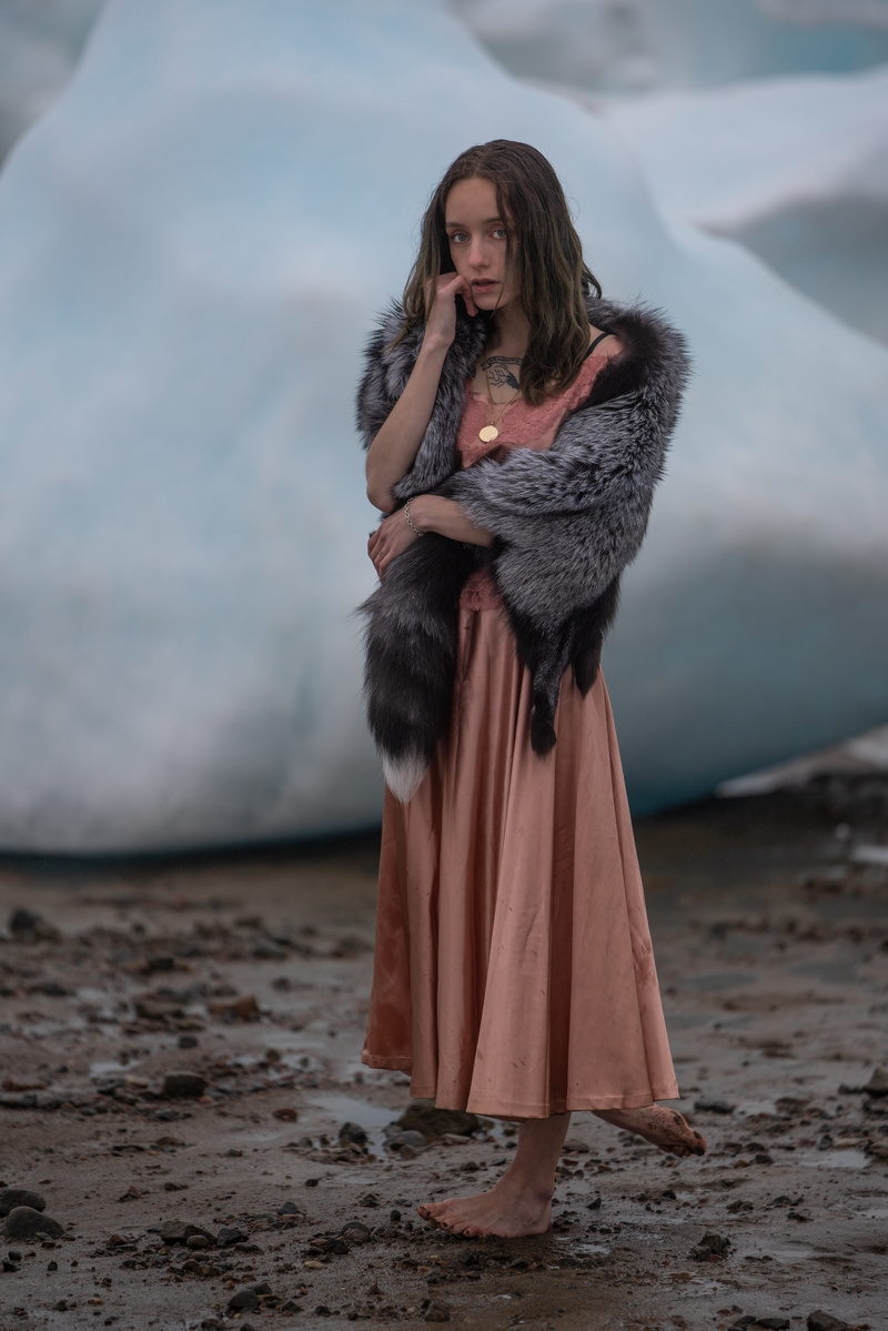
Photo 1
Sony A7RIII w/ 70-200 2.8
1/1250
f2.8
ISO250
Photo 2
Sony A7RIII w/ 70-200 2.8
1/1250
f2.8
ISO250
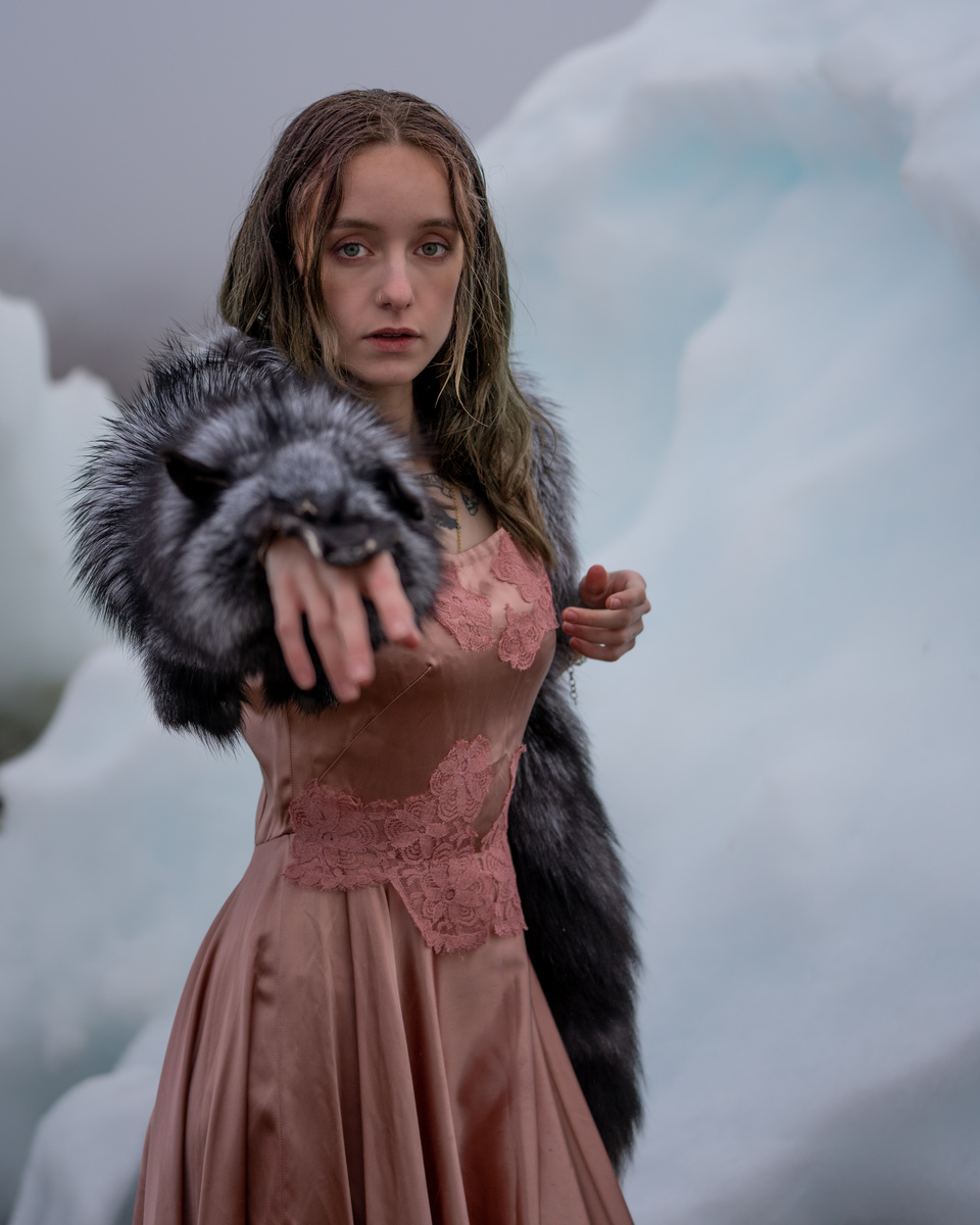
Photo 3
Sony A7RIII w/ Sigma 85mm 1.4
1/800
f2
ISO100
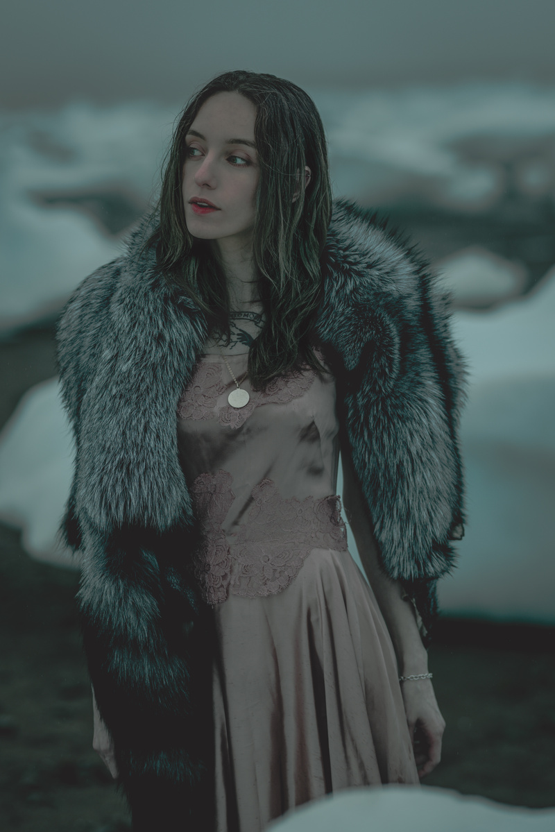
Photo 4
Sony A7RIII w/Sigma 85mm 1.4
1/800
f2
ISO100


12 Comments
IMHO it's too dark and flat. Looks like you wanted to avoid overexposed ice behind the girl, so you moved highlights and light down. My advice is to isolate girl (photoshop) or use flash to proper expose the subject.
Location is very good, girl is mysteriouse. All you want is to show it correctly. Keep working, concept got potential! :)
Thank you.
Very interesting clothes and a lady. Adding some light to her face would be awesome.
Skin tones in the 3rd image, IMHO, look too artificial and desaturated.
Thank you
I agree with Tom & Sergey; don't have anything to add, but figured I'd "second."
First photo, focus missed the eyes and feet are awkward. Left foot flat, weight on ball, right behind with the heel lifted gives the same sense of motion. I like the composition here and in the second photograph. That one is direct. Both have a great color pallet.
Everything is cold in the third photo, so the subject doesn't stand out. No contrast between the subject and environment; lost blue in the ice. Do you have an edit in line with the previous two?
Thank you for your feedback. I am not sure what you mean by "do you have an edit in line" ? Can you please explain. Thanks.
An edit similar to the first two photographs. The third has a strong shift to blue/green, it's very different from the others in the set.
Crazy location. Just wish the model stood out more with good lighting on her. She tends to fade into her background.
Thank you for your feedback. 2nd photo is lighted with a Aputure 120dII at 65% power. The rest have no lighting.
Just need to add some fill (key light) to make the model "pop".
#2 and #4 are best for the subject standing out from the background. I agree with critique on #3 and the color cast. Charles had excellent point on #1. I like #4 the best for posing and composition.