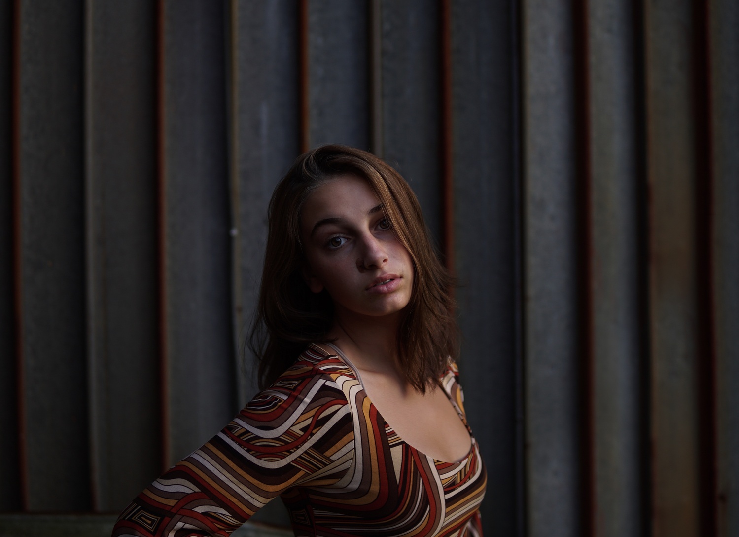
first portrait shot. Please critique
I’m just getting into portrait photography and this is one of my first. I think it looks good technically, but what do you guys think?
I’m just getting into portrait photography and this is one of my first. I think it looks good technically, but what do you guys think?
I thought I would try out my 50 year old lenses: Canon FD 50mm f/1.5 SSC and Canon FD 28mm f/2.8 on my Canon R5 with the use of the appropriate adapter.


These photos were taken just outside of a small town in central Portugal.


I really enjoy creating something different with drones. I've had the Mavic now for about four weeks and I absolutely love it.


This is a water reservoir for the city of Curitiba, Brazil


9 Comments
NICE
Hi Sonny!
Good first shot. I like the vision and direction. A few things to think about for the next one:
1) Light on the subject's eyes. This is a tough one that a lot of peers and myself are always working to hit --- how to get dramatic lighting and still get catchlight on the subject's eyes. In your photo, they're in the shadows (and one that could be hit by the light is blocked by the subject's hair).This can be achieved by using a grid on your light to give the light more direction, while maneuvering it to give your subject's eyes more "life" while still preserving the mood it looks like you're going for.
2) Sculpting. I would suggest having her reverse her orientation to your light. It would solve much of problem number one (potentially), while adding shadows and sculpting some of her curves.
3) Rim light. I would consider a rim light to separate her further from the background. This can be achieved by snooting a speedlite (or any light source), pointing squarely at the back of her head.
4) Fill. Finally, while I see you're going for a mood, I would give it a little more fill, or brighten the image up entirely so the viewer has more of an idea of what's going on.
In my opinion, this is a good photo. Only giving my "what I might try"s because you asked! :-) Keep it up!!
Thanks for the feedback!!!
1 - Recompose this shot with the model's head not so centered. There is too much space at the top of the photo.
2 - Do something with her right arm; it needs anchoring, ideally on the something she is leaning upon.
3 - Experiment with model's poses - head tilted back is passive, head tilted forward is assertive.
4 - More light on her face, less on her bosom. Remember, light draws the viewer's eye and defines the subject.
5 - Typically, you will want to light the open side of the model's face. This is the side of which we see more, the side where her hair is parted.
6 - And as James said in his prior comments, let's see her eyes. They are, after all, the windows to the soul.
I like the mood of the shot. It matches her facial expression. May i suggest cropping it tighter to give more emphasis on the her and less on the wall. Bring her eye up closer to the upper third of the frame. Cool toning!
For a more moody portrait this is a pretty great photo.
Not going to leave a well written review like the ones below however I’m going to bring up Three points.
First, the colors well compliment each other
Second, when it came to cropping (or even if this is how it was shot) the elbow is cut off which gives a unflattering hard break to the image. Cutting at mid arm, mid forearm, etc is more flattering. (Added an example below if you don’t mind)
Third, though the background lighting is mood capturing, a little post editing using a brightness tool or a dodge tool on the right side of the face would being a focus on the model more.
Great work!
thanks, love the feedback!!
The feedback people have offered about framing and light is spot on. I attached a quick and dirty edit that shows how impactful creative use of negative space can be.
Pretty good first shot. Nice light, good catch light in the eyes. Maye the crop could be tighter. Nice color contrast between the background and subject's clothes. Could the lines be straightened?
Awesome points from James and Edward. Thanks to them for those remarks.