Hi guys!
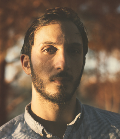
In this photo I went for a dramatic, and somewhat a filmic look. Still I think there is something missing. I raised the blacks to give a washed out look, I also kept the highlights on my face and reduced it in the background to make the focus on the subject.
Please share your ideas on what can be improved or changed.

I think you did a great job! Everyone has their own tastes and opinions, for me, I would have kept the darks a little darker give it a little mystery. Maybe would have moved to a bit where the light could hit the bright side of the face without a shadow on it. But thats just my ideas :) great stuff!
Thanks Ian my friend, really appreciate your feedback. I wanted to get that filmic look, I thought by brightning the blacks I would get that washed out look. Do you think it's working
Note: I also added some grain.
Hi mate, i like this and like the idea, like Ian tho I maybe would have lifted the blacks a little less ... but it still works :)
Thank you mark, really appreciate your reply :)
When you say filmic look do you mean looks like film or "cinematic"?
I meant cinematic as a movie, I thought they were used for the same meaning film and cinematic.
I think it's a great image. really like the split lighting and the washed out blacks. What I miss is the dimension of your eye. Without the catchlight the eyes go flat and you don't get the connection on the emotional level. Hope you don't mind, I put a little catchlight there, raised the shadow area on the face and reduced the hot highlight on the forehead. This way the eye draws the attention.
Thank you Janos! it's already looking better!