First Post ...
Hi everyone, first post over here, so hello to everyone first off and looking forward to seeing some more work and having some fruitful discussions :)
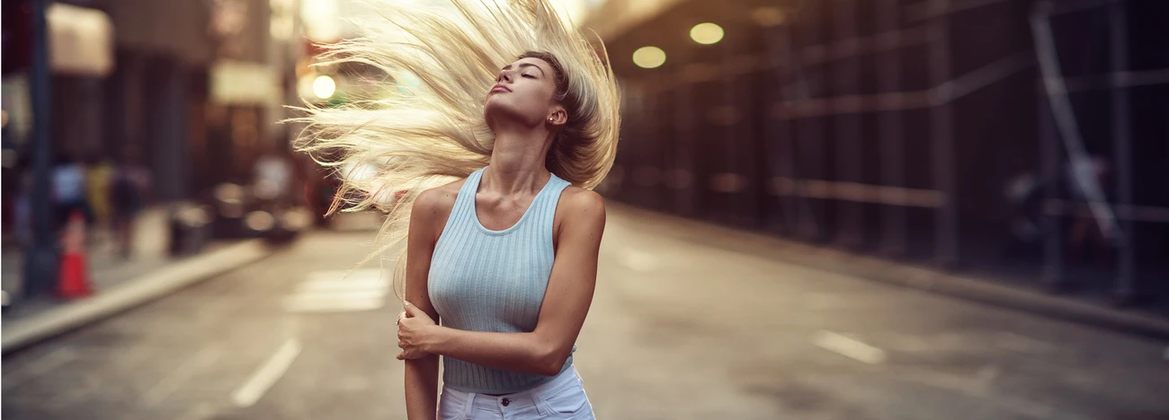
Managed to get my first 'model' portrait shoot since January done and I was a little rusty to be fair however I think they turned out OK. However what I never seem to get anywhere is any constructive criticism or ways I could improve, just pointless double taps .. if you know what I mean, So any thoughts, feedback or pointers will be gratefully received.
Thanks for taking the time to have a look :)
Mark


4 Comments
Hi Mark! I’m by no means an experienced portrait photographer so take my 2 cents with a grain of salt. I can’t fault exposure, I like the compositions on these two, overall decent images and I like the use of what I assume is the sun to create that bit of rim lighting. My only critiques would be: just a slight lack of ability to see the models eyes - not needing eye contact but I think it might help get a better connection to the viewer if I could see her eyes a bit better. The other I’m not sure I like the clothing choice as while it’s smart/casual and gives off a “professional working woman” vibe, I think it’s a little loose which may have made it tricky for you to show shape to the model? Tricky though as that might have not been your choice.
Thanks simon, yeh clothing wasn't by choice on this occasion, first time working together. I did do other poses that did have eye contact but I always double most poses with looking at, and looking away, from camera, was just coincidence that i posted two looking away shots, thanks for taking the time to drop some feedback.
No bother mate! Yeah I assumed you would have got a good bit of variety of shots and that was the only thing I could take from these images alone, which in a way is a big positive if that’s all I could pick out!
Beautiful model.
For the first image, I would pay attention to their hands:
1. Her left hand looks tensed. And, try to not have the fingers too separated.
2. For her right hand, her pinky looks a little awkward since the other fingers are curled in. Kind of looks like pinky is longer than her other fingers.
Second image:
1. Too much of her hair and left shoulder is blown out. If it’s just a thin strip, I normally don’t worry about it.
2. I would not have cut off the purse since it’s part of the ensemble.
Pay attention to the color of their hands (and feet, though not applic In this set). They often will have a different color, especially if they have pale skin. They’ll either be more red or magenta. For me, I’d color match ‘em. A simple white balance and/or desaturation should suffice.
Lastly, since these appear to be part of series, I’d try to match the white balance as much as possible. Currently, first image has a colder feel, while the second is warmer. Dead give away is her white (I think :)) sweater. Notice how they are way different.