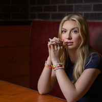
First Senior Shoot ever
I was recently asked to do a senior shoot for a friend, and i gotta say, this is a lucrative part of the business. They loved the final pictures but they might be biased. Critical feedback from fellow photographers would be appreciated. Since shooting this i've done another senior shoot for another friend. I'll be posting those up here in a couple weeks for feedback.


9 Comments
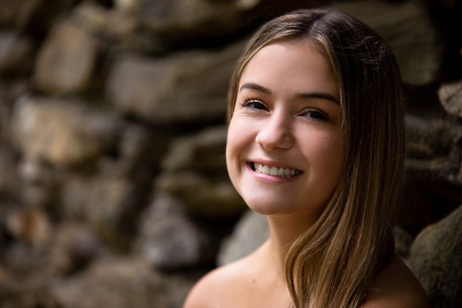
I like the second one best, nice catch lights in the eyes and softened back ground and nothing "growing" out of her head.
This just shows how subjective photography is - I much prefer the first one as it looks more “natural” than the second, is maybe a touch too dark or I would have lifted the shadows on the left of her face slightly, but to me the second one looks too much as though a white flash has been used - something doesn’t look right/natural with having her backlit and a flash from in front. I maybe would have angled the front flash more as it looks to be lacking any contrast or shade on her face. I think a bit too much power from the flash for my taste too. With the third one I feel it’s too underexposed on her face - I’d have maybe turned her more face on, have her completely backlit for some nice rim lighting, and upped the exposure to have her face exposed better, then maybe warm up the backlit element a bit. The expression at the moment is a bit “moody” but the bright backlight a bit happier/warmer, I don’t think that contrast fits for me personally.
This is what I love about photography, it's subjective, I agree in part with your assessment, the first photo does show more texture in her face even with a touch of Rembrandt lighting due to the triangular shaped shadow on her left cheek that's the model's left not ours." but for me the back ground in the first one is a bit busy, maybe pull her out from the rock wall a bit,we don't know what lens or aperture was used. So that being said I do see what you mean about the flat lighting on her face however you can still see shape and dimension on her nose and lips, also the dark triangular shadow in the upper right and the dark area in the left of the photo help "frame" her face.
yeah it's what i love about photography, but also sometimes hate about it at the same time!! ha! as critiques can often be polar opposite from two different people, which when you put yourself out there, can be disheartening if you only get the critique side! I'm certainly trying to be a bit more conscious of this whenever I put work out there, and ultimately, just trying to stick to taking shots that I like - if others like it too then great, if not, well, it's not their photo! ha!
Thank you both, oddly enough i agree with both of you. For #1 and 2, i had a strobe that just over powered the scene and i couldn't get what i was looking for and the clock was ticking on the shoot window, so i went 100% natural light on both of those. The downside was the lack of catchlight and darkness on the left side. I had to pivot quickly because i wasn't able to problem solve fast enough. i guess that's where experience plays. #2 is definitely white washed and i''m having it re-color corrected. The upside is the mother liked all three of these, which i guess is about 80% of the equation :)
Yeah and you’ve mentioned something there that purely as a viewer we aren’t aware of - time restraints. In an ideal world everyone would have all the time in the world to get photos perfect in that moment, but it simply doesn’t work like that in reality. I think as a viewer it’s quite difficult to appreciate those potential challenges and take that into account when offering opinions (which is all they are at the end of the day!). I always like looking at others’ work though and hearing their experiences/thoughts/challenges, so thanks for sharing! 👍
Good shots but a bit underexposed 2 and 3 (hair and breast). Look at the lenses.
sorry overexposed and by the way the first shot her hairs need to be more exposed from the right side.
Even with the time constraints at the shoot location, there’s no reason why you couldn’t have edited in post. If you are going to shoot portraits, it’s not a bad idea to learn some dodge and burn. Especially, if you shoot or having to shoot natural light. You don’t need to get to a retoucher level. Just brighten what needs to be brightened and darken what needs to be darkened.
Other than the exposure issues that’s already in discussion,
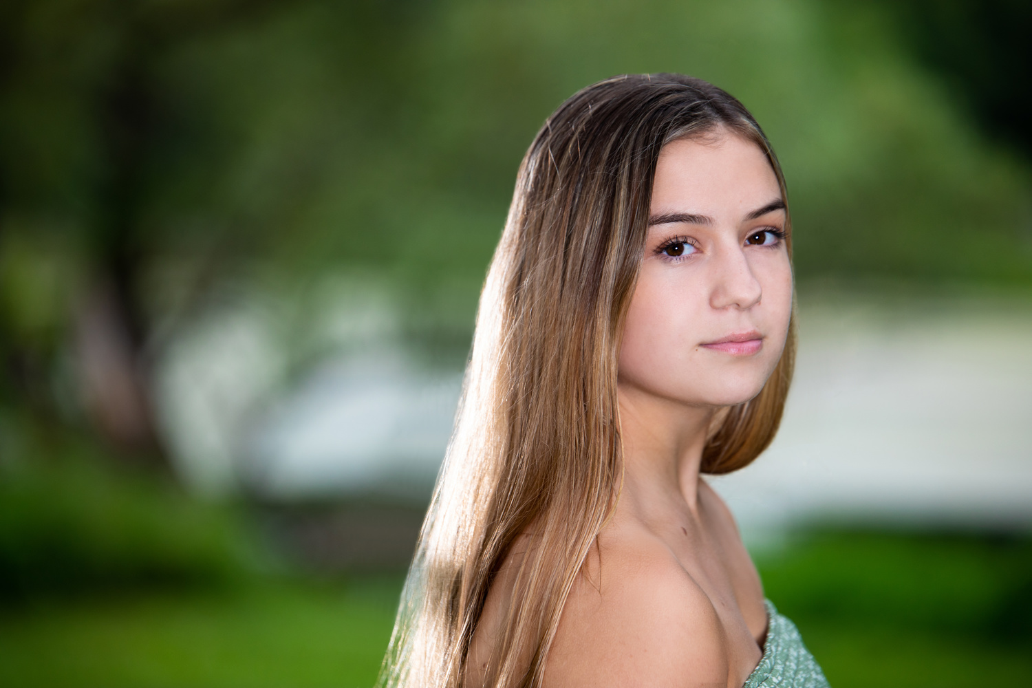
Image #2:
-- There’s too much negative space on the left side of the frame. I would have had the negative space on the right side…the direction she’s facing.
-- Also, I would not frame/crop across the chest. It looks kind of messy when you only see partial clothing. Either frame/crop lower to waist line; or 3/4 (a little above the knee); or similar to #1.
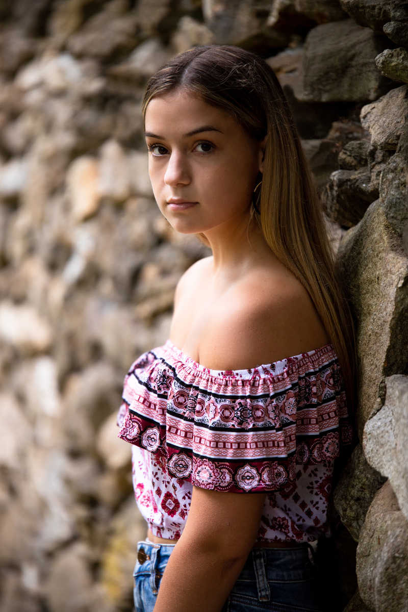
Image #3:
-- Watch out for the hot spots on the nose (glowing). It’s usually a good indicator you need to adjust the subject so either the entire face is in light or in shade. When you do that, pay attention to the rest of the body has similar lighting. You don’t want the face in shade but the body in bright light and vice versa; unless you’re going for some artistic effect.
-- I would try to show the other arm or hand somehow. To me, it looks odd when I only see one arm. It looks off balanced. Maybe I’m off balanced. :)
Lastly, not to sound like an overly paranoid worry wart, just in case you weren’t aware, the GPS coordinates are embedded in #1 and #2. It’s probably not a big deal with these ones since you were at a public park. Just something to consider in case you do shoots at clients’ homes.