More Posts in: Portrait Photography
Another junk yard composition from the mid 1970s
Night, on a street from Bucharest
Recently, I taught an Off Camera Flash class. Paige was my model for the class. We were outdoors but it started to rain. Luckily, a nearby restaurant let us conduct the class in their dining room.
Recently, I taught an Off Camera Flash class. Paige was my model for the class. We were outdoors but it started to rain. Luckily, a nearby restaurant let us conduct the class in their dining room.
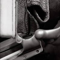
While wandering through a junk yard in Mérida, Mexico, I found this unique composition of a used ... ?


5 Comments
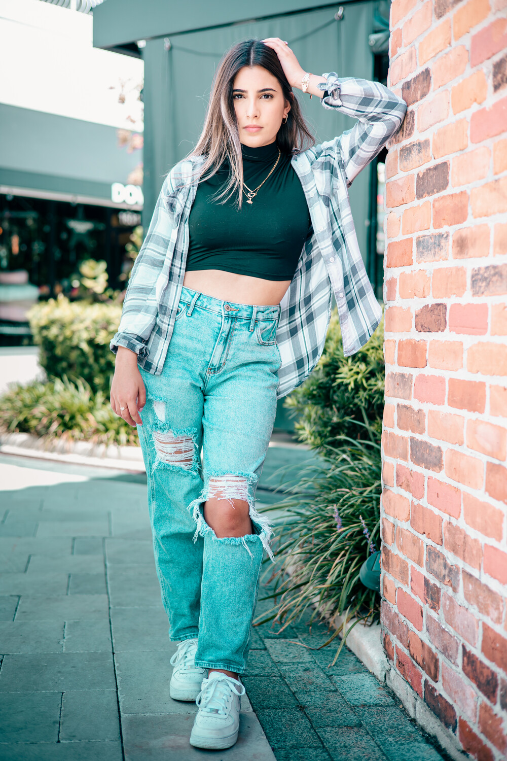
The lighting and color toning look decent, maybe a little hot but that's ok. These are nice portraits of her but overall remind me more of senior pictures rather than shots for a fashion model's portfolio. The styling looks decent and says "teen", but it also kind of shortens her a bit which isn't really what agencies want for their models. If you want to start doing model portfolio shoots, have a look at agencies' boards to see what kinds of shots they tend to prefer and work towards that.
Fashion is a weird genre and can be tricky: a model's portfolio needs to showcase her, of course, but also not TOO much, because they're supposed to be hired to showcase something other than themselves lol.... One thing I'd suggest is to add some shots while the model is walking, and also some of them not looking at the camera.
Hope this helps!
Thank you so much for this feedback. It's really appreciated!
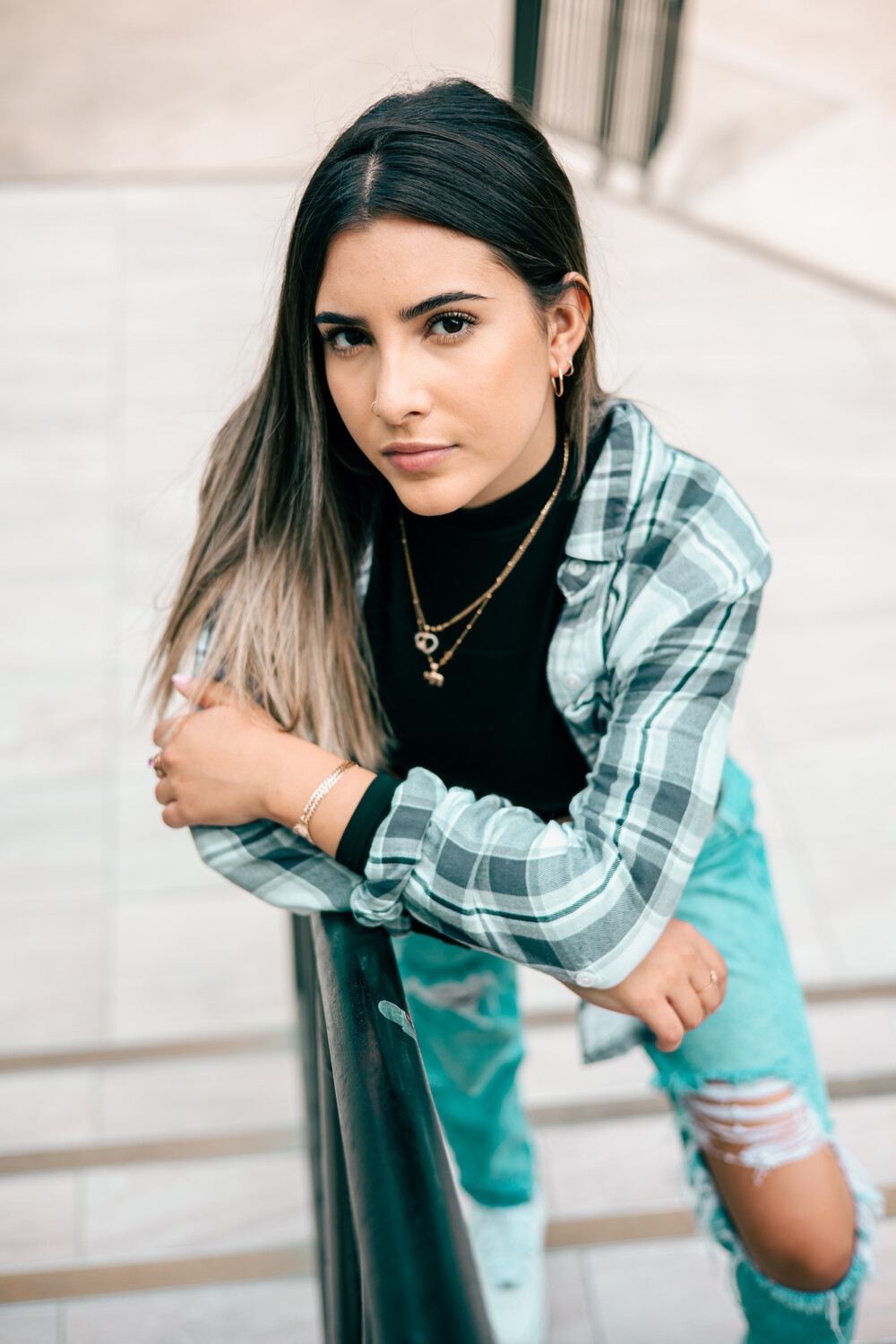
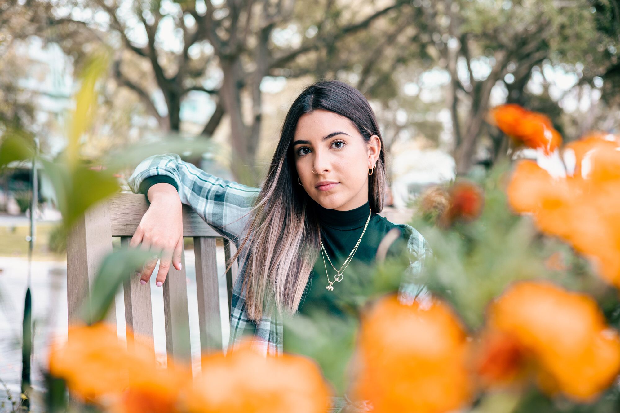
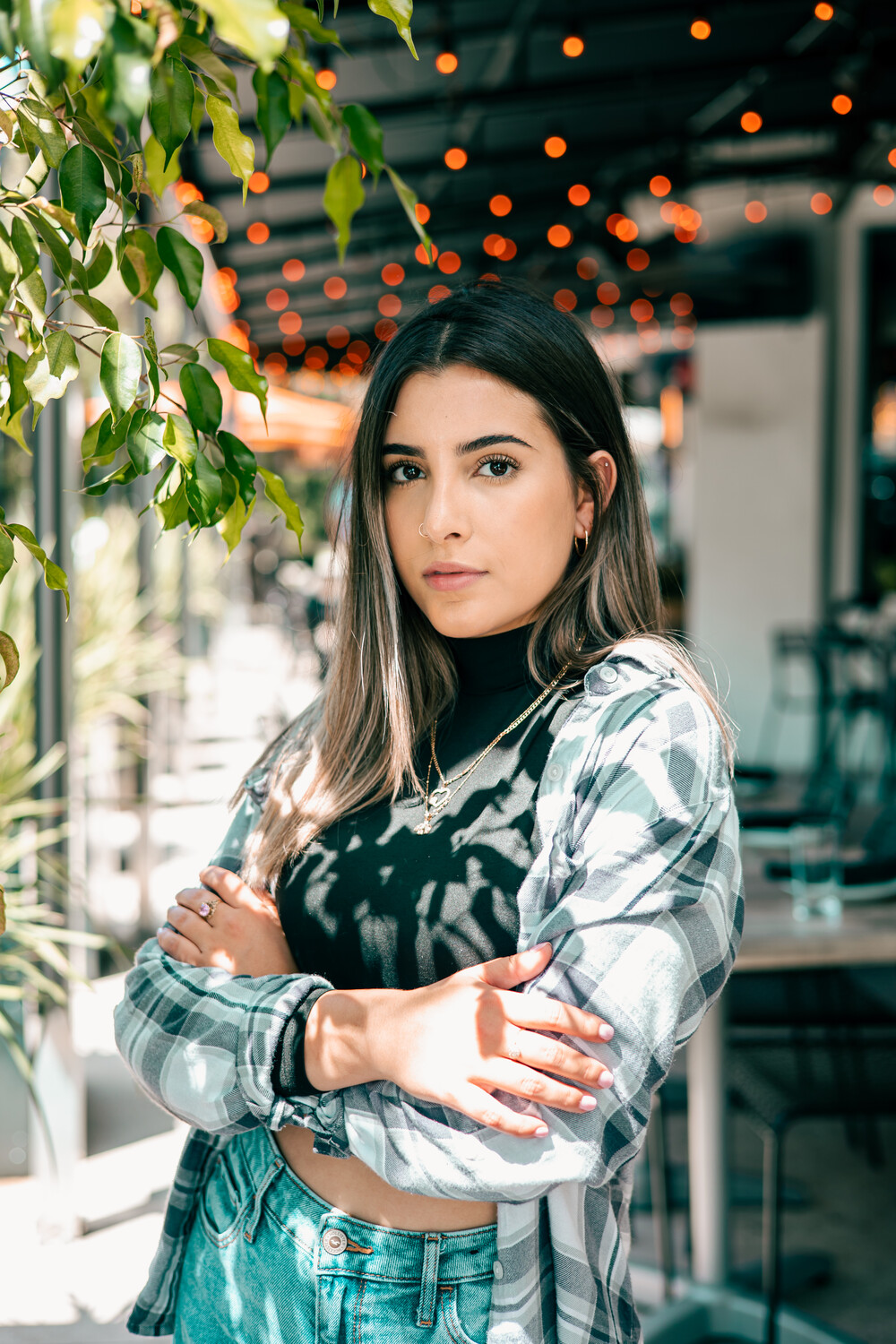
From a technical standpoint, the first photo was shot with too short of a lens, her head appears slightly larger than proper proportion. The second photo has the typical "feet too big" due to the lens choice and angle.
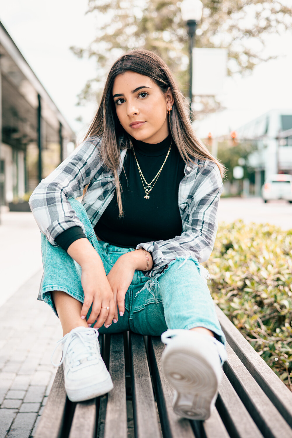
Third photo, same as second, but less pronounced.
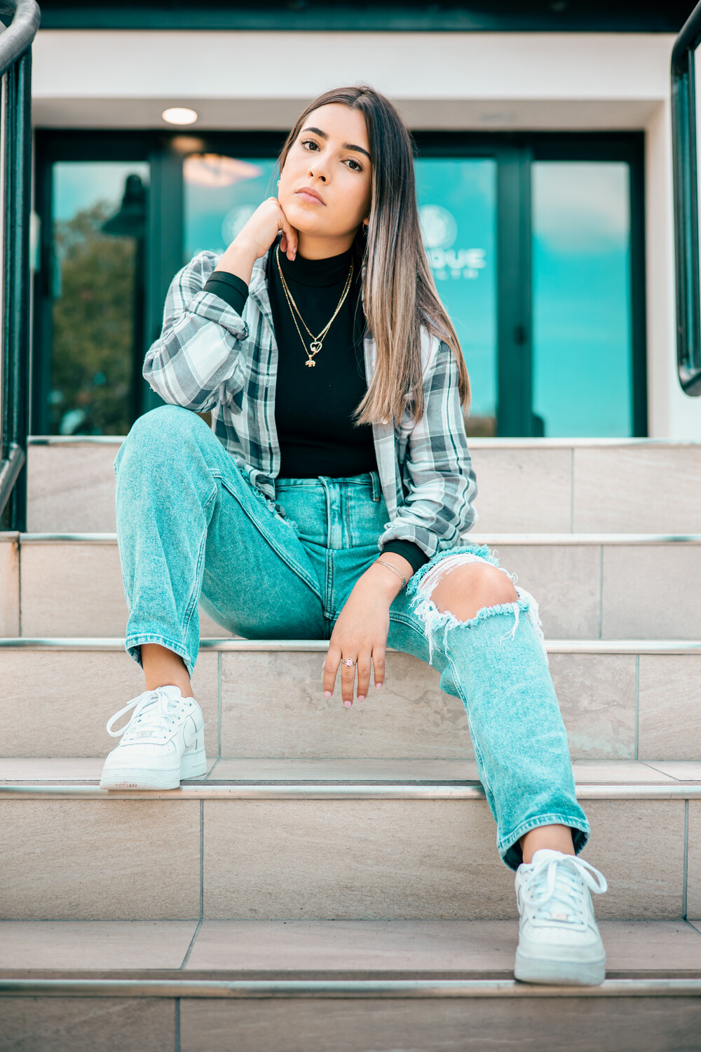
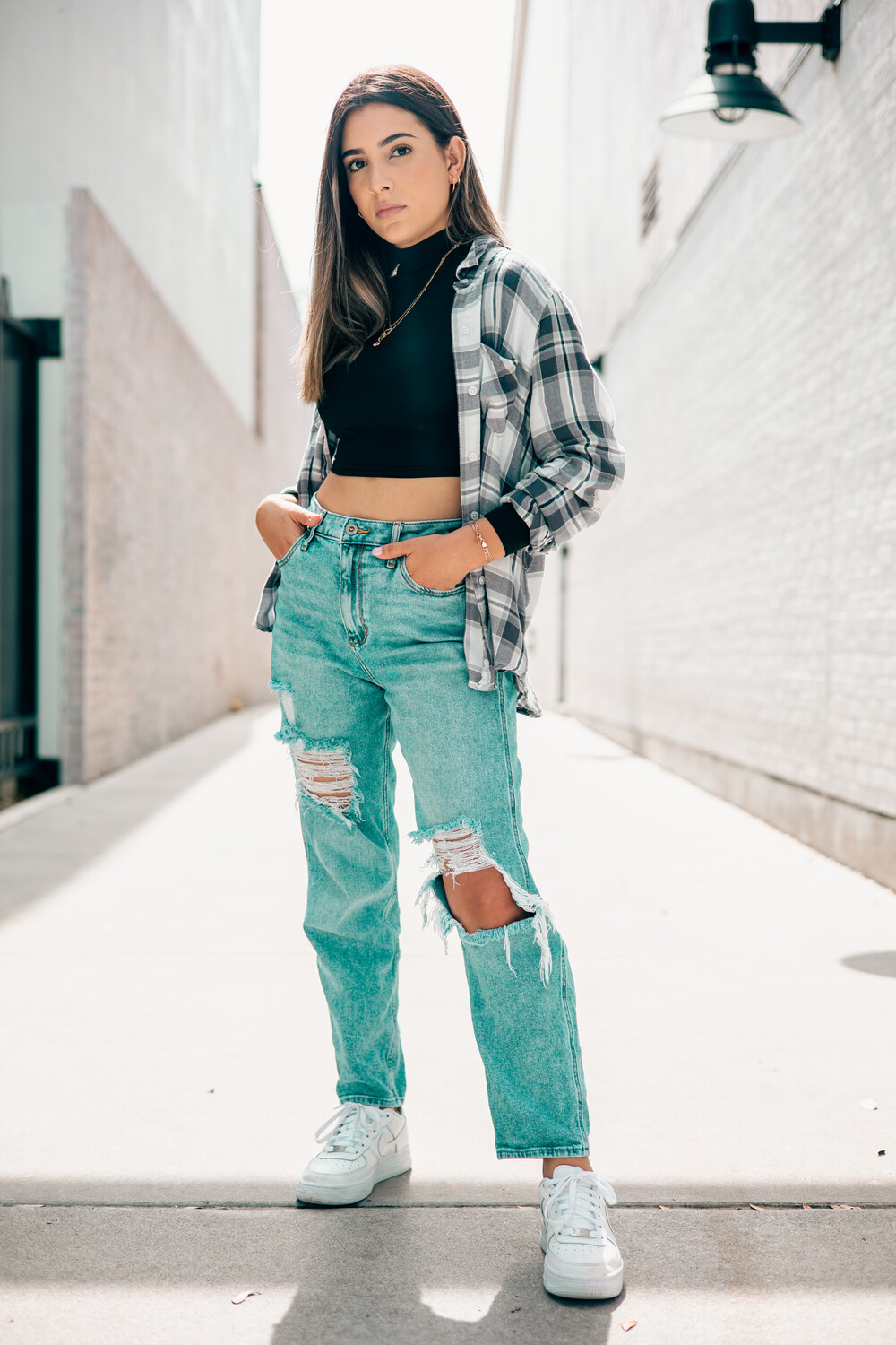
4th photo, the foreground is overpowering (same wide angle lens issue)
5th photo, the leaves are competing with her eyes, a different angle or someway to eliminate their interference.
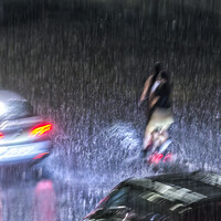
6th photo, go back at night and put her under that street light, then move far away with a telephoto and play with different exposures, also try it with her wearing a hat and maybe a couple different props, lots of potential there
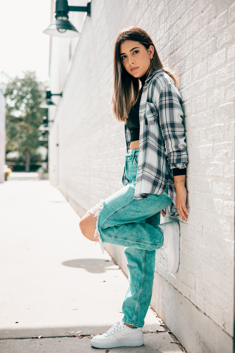
7th photo, Move away from the wall and to your left to eliminate the background at the end of the wall.
8th photo, bad background.
Lots of potential, a little better observation of the little details that detract will go a long ways.
I think an 85mm would have given much better results since they all shared the same wide angle distortion issues.
Thank you so much for the feedback! I used a 50mm the whole time. I'm planning on getting an 85mm Prime very soon. I do appreciate the criticism and will be taking it into consideration.
Notice in #6 the surroundings are the same as #7 but a different viewpoint,
#6 works because she is centered between the buildings, they form a frame and the frame closes in behind her, drawing the eye towards her.
Also #6 works because she is obscuring the clutter in #7