
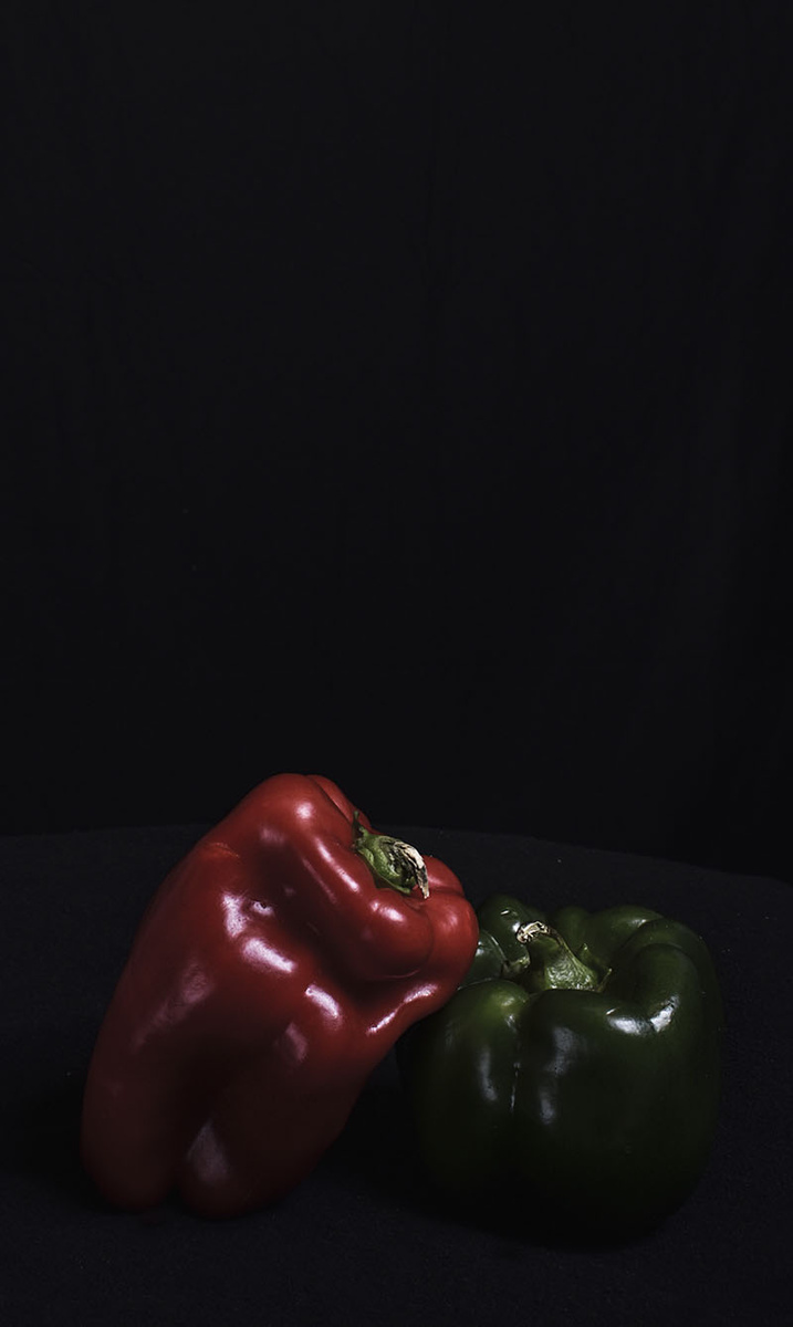
Composition and lighting
I know this group isn't very active. Maybe we can change that and inspire folks to post in this genre more often. Here is am image I made a few days ago of some peppers--there is a story behind them. I can post the link to my Instagram if you care to know it but suffice to say it was an image that at the time symbolized to me partnership and how people can compliment each other well despite the initial obvious contrast.


1 Comment
Thanks for sharing your work with us Larisa. Indeed it has been a little inactive, but we're still around here when needed.
With your explanation, I was wondering if there's any significance on the different heights of the peppers, one overpowering the other, and the green pepper being less present, almost disappearing on the background, than the red one? Or am I reading too much into it?
Still, I would say because the green pepper is darker than the red, it doesn't have the same presence, and being smaller doesn't help either, going by your description that might not be what you were going for.
I think I would´ve prefer not to have the fill card, and just have the direct light up top and let the shadows go to black, or the fill be more present, depends on what you're going for. A rim light would help separate the peppers from the background, specially the green one.
I was also wondering about the negative space, what was your thought with it?