Critique this set?
Images from a series I'm working on. Always looking for ways to improve techniques in consistency, balance, colors that seem off, etc..
Thanks!
Zach


Images from a series I'm working on. Always looking for ways to improve techniques in consistency, balance, colors that seem off, etc..
Thanks!
Zach
A few shots from the winter of 2025. The last one was inside of the Acropolis Museum. (Unfortunately, I could get everyone to walk exactly where I wanted them to. hahaha)


For iPhone users - a new version of Bluristic has dropped (v1.8) which offers new features and significant improvements in stability & useability.
I am interested in learning Macro/Closeup photography and understanding that Focus Bracketing is a good part of the process, I thought I would give focus stacking a try.
Another visit to our garden using a vintage lens (Canon FD 50mm f/1.4) on my Canon R5. NOTE: With this lens the minimum focusing distance is 18" at which point you have 1/4" depth of field.


11 Comments
Hi Zach, thanks for sharing! Unfortunately I don't have time to give any in-depth advice at the moment, but I can share a few quick tips from looking over these.
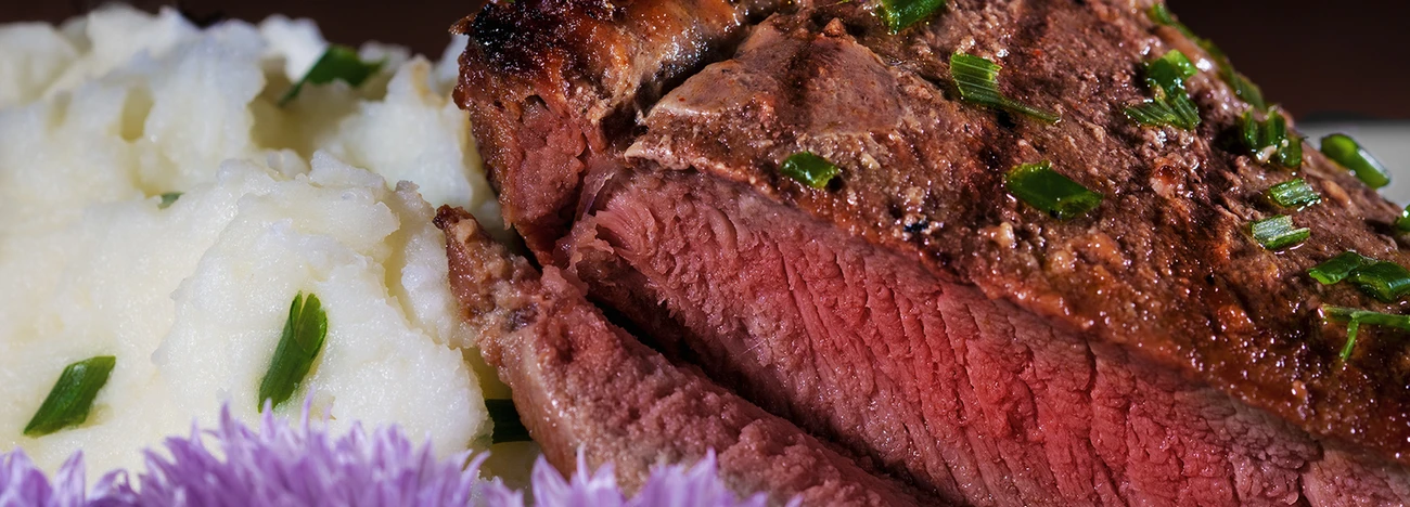
One thing that probably could be worked on a bit is the angles and framing. Sometimes cutting parts of the plate out of the frame works, like in the photo of the toasted sandwich with a side of pickles. However, other times it doesn't - like in the shot directly above it, the pastry with red sauce. It comes down to balance - it can work when you cut in on both sides, but if one side is still fully in the frame it doesn't even out. As for the angles, you tend to use different tilts and perspectives in each shot. Generally you're going to want to keep it fairly level so the plate doesn't look like the food would slide off. Sometimes a tilt is effective to make it look dynamic, but generally that works best for taller items like beverages and stacks of food items - I think your best angle is in the shot of the pastry with red sauce, it just needs to have more room on the left.
One final suggestion would be to look out for hotspots and direct reflections. In the first photo especially you can see that slice of cucumber is picking up the light, and the less toasted edges of the bread are quite bright as well. Altering the angle of the cucumber, and possibly flagging the light might help avoid bright spots that pull the eye away from the main subject.
Hopefully this is helpful, if any of that doesn't make sense let me know and I'll try to explain a bit better when I have a moment. I like how you incorporate the environment in some of the shots, and would love to see even more use of props and environment to accent the food.
Hey Lauchlan! I really appreciate the feedback. As for the one you are referring to- Bread bowl, Tomato Bisque. My other image consideration was this one is attached. Much less dead space going on, has that balance the other may be missing. Cheddar pieces in the bread itself. Hard to make the cheese pop like I really wanted.
Again, I really appreciate the thoughts and advice!
Hi Zach!,
You mentioned that these are part of a series you are working on, are they for a restaurant client (plated), possibly to build your portfolio and their image bank?
I will not echo some of the great suggestions made by others, but would like to understand the intended use of the completed images.
Cheers!
Hey James! So In Eugene,Oregon where I reside we have a business called Food for lane county. They are doing something called "The Grilled Cheese Experience" For 15 days local restaurants ) are featuring their own unique twists on the classic grilled cheese ••• Feb 1st - Feb 15th. $1 - $2 from each item sold will benefit FOOD for Lane County.
Last year was the first year of it. When I heard about it they had zero images to represent the food featured in the fundraiser. This year they asked me back to do it again.
Thanks!!
Wow! This looks like an awesome event Zach! Sounds (and looks), like you might be shooting at one or more different restaurants over the course of 15 days?
If you could incorporate some off camera flash, smaller softbox or one of the more recent LED adjustable light panels (Neewer has some small/affordable LED panels), and some bounce/fill, you could perhaps create some consistent lighting across the venues for a known subject?
Bread, (specifically browns in bread), can be a challenge, and then there's cheese! A little experimentation ahead of time with a brief travel kit that is easy to set up at each restaurant, will give you several ways to control the impact of light/shadow to each restaurant's take on the classic (and perhaps a potential new restaurant client!).
What a great experience and a wonderful benefit, really happy for your opportunity Zach, very cool.
James
These are generally good. I like the composition of 6 best since it clearly shows the sandwich and ingredients. Overall color and composition is good. Some images could be better if they where cut sharper, the bread was aligned carefully, and the insides did not spill out sloppily. Since the floor in any place is dirty, I would never include it in a food photo.
I shouldn't look at stuff like this before lunch...who is doing the prep/styling for these shots? I used to shoot a lot food for magazines and the styling talent of chefs was usually pretty good. They didn't do the tricks that some stylists do but knew the best way to present their food.
Some of these are weak in the styling dept.
The first few showed a lot of toast surface and not a lot of what's between the bread, although if that's the way they make them you can't really change it, just make it look better. Others are just too sloppy.
I am not too sure about the angle, maybe a few looking down views would add something.
The lighting is 'ok' better than some but it needs a little more going on as it's kind of middle of the road, maybe some shaft of light or hard reflection, something in the bg to add atmosphere....try moving your light around to the side or rear to show texture.
One thing that can help quite a bit, especially with the sandwiches; lose the plate. Go with a more natural fresh look and put it on a cutting board. One other thing I notice immediately is the lack of background elements. Using raw ingredients, or a second dish behind the first can go a really long way to filling the frame with things that make you go yummm. There are color cards you can use to help balance true color on set. It's only one extra pic for each set up and it can save you time in post. Also try to minimize plates when you HAVE to use them. People want to see food, not porcelain. Good looking sammies, keep at it.
Really good advice! Food photography is a lot harder than it looks. I'm still working on it. These shots are generally solid, but would pop, I think, with slightly better composition.
Hey everyone! I'm so encouraged by the feed back. So many great points made. Including the mention of keeping the floor out of the shot, less plate, straighter shots, accent pieces and the other things i'm still processing in my notes.
I wanted to give a better break down of the project as a whole.
I had from about Jan 18th-February 1st to complete the set. The goal was to shoot them all in a way that they could be recognized easily on a small screen such as instagram, or other phone/grid applications. At the same time give all 18 restaurants a fighting chance to sell their best! This was the reason behind the simple composition (lacking accent pieces). I'll admit in hindsight that my vision for the shot styles was pretty squirrely at first. Looking through the images I posted for critique, I'm seeing that now. . Something that did find itself however by about the 6th shoot or so. Learning more and more to balance my 1-2 strobes with the ambient. Color balance cards have been helpful! I'm going to post the final set I went with. Thank you all for the input
-Zach
ps-gallery http://www.itwillmakeyouhungry.com/#!/portfolio/G0000LhQSJa4MQyU/I0000R…
Hey Zach,
Great shots! If you are worried about color consistency get a color checker http://xritephoto.com/ I know it might seem expensive for a piece of cardboard with colors on it but it is well worth the money. Before I take my final shot or after I have taken it and move on to the next I take a shot with the color checker in the scene. In Lightroom I can take a white balance reading and copy it to my final. BTW this is always my final step in post production that way if my monitor is not calibrated correctly I can just take a reading and trust that it is correct.
When shooting in a restaurant I like to improve on the lighting there not create my own. All the light in the images appear to come from a softbox positioned camera right or left with a silver bounce card. I am not saying dont do that I am saying that in a restaurant to want to sell the ambiance as well as the food.
EXAMPLE: (attached) I shot recently in a restaurant that had a full wall of windows but it was a really cloudy day and the light was really flat and boring. I put a light outside and shot light through the window mixed with the ambient light for fill to create the feel of the restaurant on a sunny afternoon. That is really the only thing you images might be missing.
Keep up the good work!
-Nathan
http://www.nathanpedigophotography.com/