Please Critique!
Hello! could you please critique this photo and or spend a few moments to rate it?
If you comment on my photo I will gladly return the favor and give you feedback on yours as well.
Thanks in advance
Hello! could you please critique this photo and or spend a few moments to rate it?
If you comment on my photo I will gladly return the favor and give you feedback on yours as well.
Thanks in advance
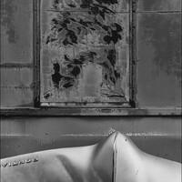
Evening just after sunset at Taliesin West. Scottsdale, Arizona. View of the dining room & bell tower.
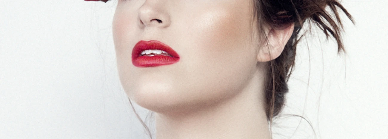
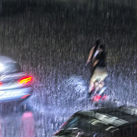
Recently, I taught an Off Camera Flash class. Paige was my model for the class. We were outdoors but it started to rain. Luckily, a nearby restaurant let us conduct the class in their dining room.


Recently, I taught an Off Camera Flash class. Paige was my model for the class. We were outdoors but it started to rain. Luckily, a nearby restaurant let us conduct the class in their dining room.


7 Comments
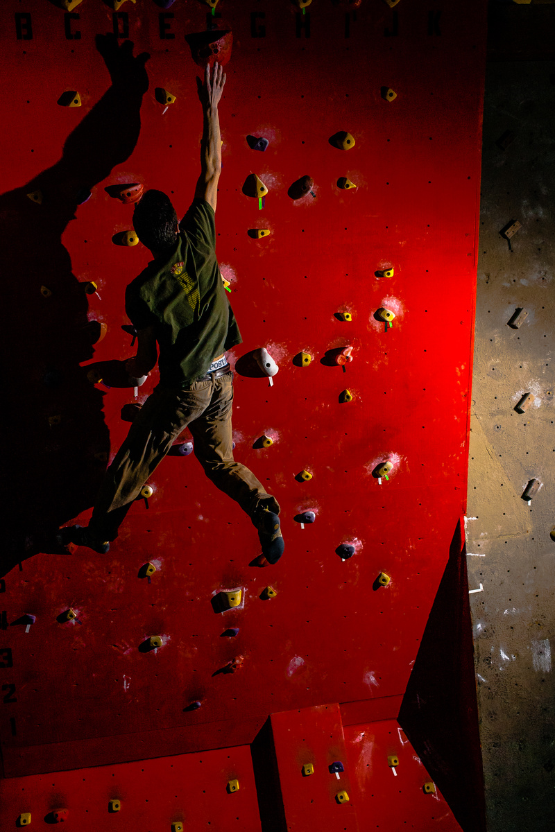
I would ask what the mood is that you are going for. Is the all that space on the bottom and right of the character necessary. We assume that he's high up but we have no reference to the ground or any scale.
That said I would have pushed way in and made my subject take up more of the image and try to put a fill in on the left side just to show a bit more of what the arm is doing. Also I would have tried to get the light above him is that was possible. To me it comes off as if someone opened a door on the floor and a man is just in a rock gym.
Thanks Adam. The empty space is because this was commissioned work to be used as an ad, so there needs to be space for text
Ahh that makes sense, maybe put lorem ipsum in there for us to see.
I was unsure what you meant by that, so i looked it up. Am i correct in saying that it is just random dummy text?
Not sure what this is an ad about? Is it for a rock climbing gym? Rocking climbing shoes? Rock climbing classes, clothes, etc...
Any reason for such hard lighting? If it was an ad for a rock climbing gym, I feel like I would want more light and it to seem more lively and energetic. Not sure if i'd want to work out there if that's the normal lighting, seems a bit gloomy?
I'm just not sure about the lighting or composition on this one.
Also wanted to take a guess since hes free climbing he's not too far off the ground, and more of doing training for bouldering?
Very interesting, the image definitely draws my attention. I love the shadow and the red. The composition is great but I think the bottom needs to be cut off.
Thank you!