First Hike
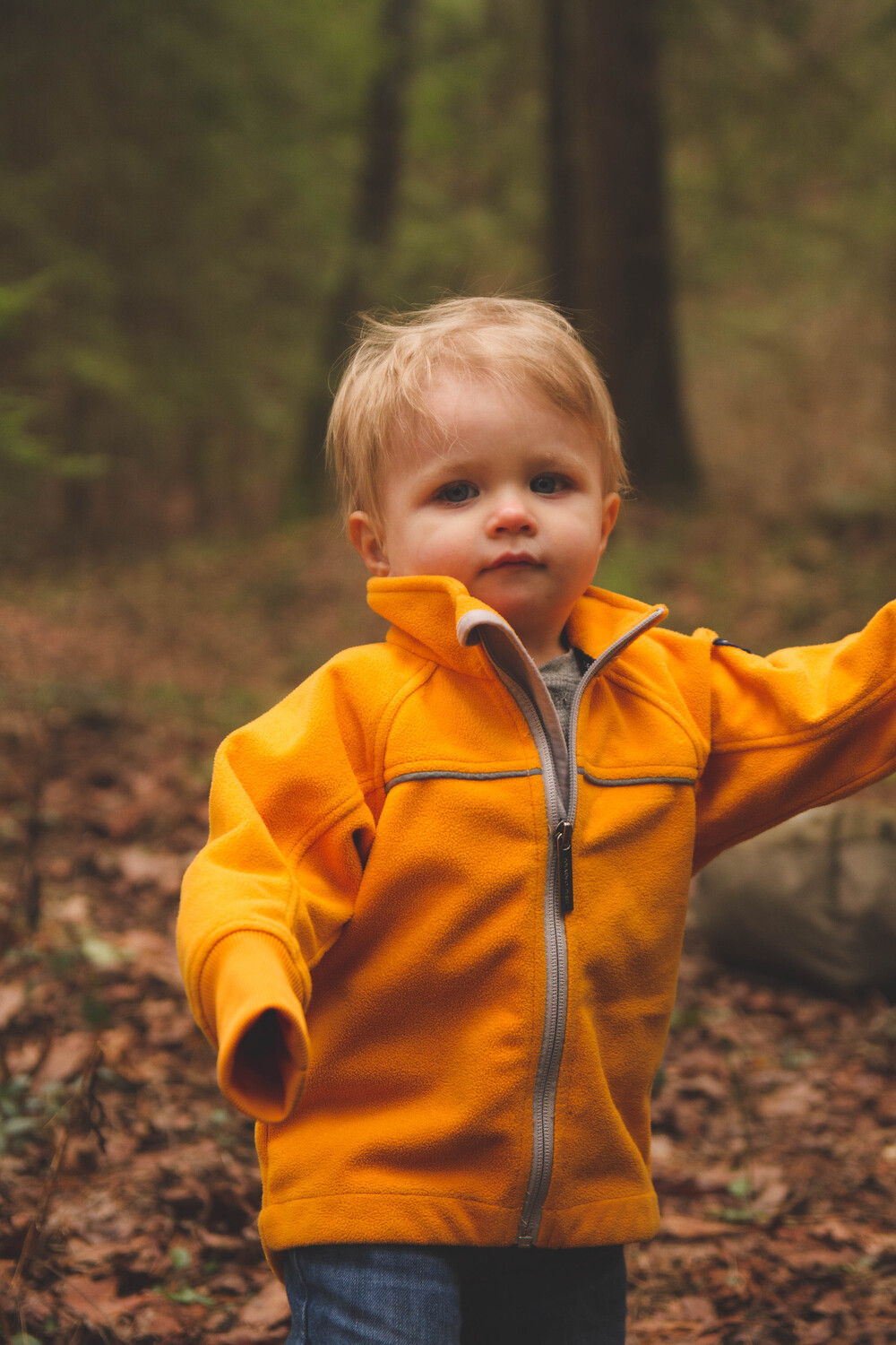
Here is a recent shot I took of my son on his first hike. I would love feedback on this photo from a child portrait standpoint.
Here is a recent shot I took of my son on his first hike. I would love feedback on this photo from a child portrait standpoint.
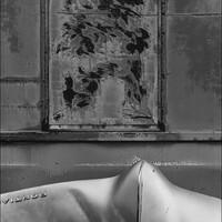
Evening just after sunset at Taliesin West. Scottsdale, Arizona. View of the dining room & bell tower.
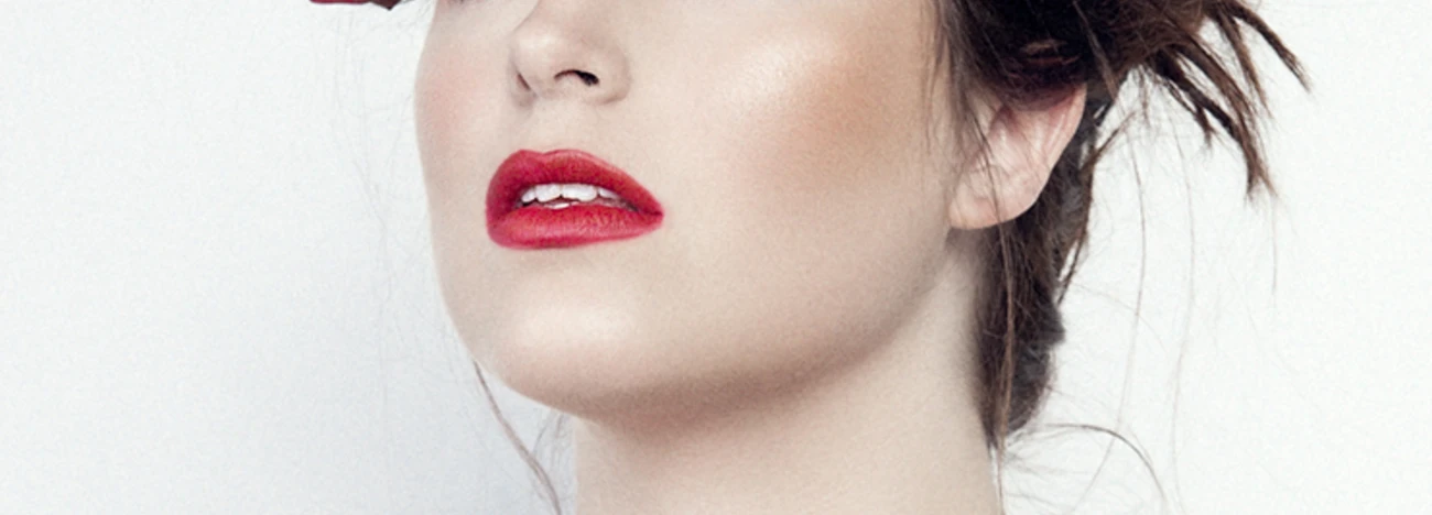
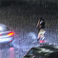
Recently, I taught an Off Camera Flash class. Paige was my model for the class. We were outdoors but it started to rain. Luckily, a nearby restaurant let us conduct the class in their dining room.


Recently, I taught an Off Camera Flash class. Paige was my model for the class. We were outdoors but it started to rain. Luckily, a nearby restaurant let us conduct the class in their dining room.


2 Comments
Hi Matt,
Being a beginner myself and having only just joined Fstoppers, it feels a little awkward but for what it's worth herewith a few things I noticed.
In terms of the composition, it seems to me the tree in the background is distracting the viewer from your son's face, the same goes for the rock under his left arm and also for the line that separates the soil from the trees behind you son's head. Perhaps the background above you son's shoulders could have been even more out of focus to have one's gaze rest on your son's face. The focus appears to be very much on your son's nose, whereas it would perhaps be better on the eyes. The absence of the right hand is very prominent and somewhat distracting and it is not obvious, at least to me, what the action is.
In terms of light, it seems a little dark overall. The shadows are rather soft, which is probably preferable for a child portrait, though perhaps too dark for the trousers resulting in loss of detail. Maybe the light is a little too uniform for the background, and while that makes the main subject stand out, it creates a very flat feel of the picture but perhaps not enough so as the background is not blurred enough. It seems to me that the eyes and other facial features are too much in the shadows, and it is not easy for instance to determine the colour of the eyes.
In terms of colours, the yellow of the jacket is very bright and saturated compared to the remainder which makes the skin appear quite pale, and then results, in my mind, in your son's face blending-in too much with the colour of the leaves. This almost give a feeling of a disembodied jacket and is probably distracting attention away from your son's face.
Again, I'm not a seasoned photographer at all and these comments merely reflect my uninformed view of the picture.
If you'd like to compare with other children portaits, please have a look at for instance 500px:
https://500px.com/search?q=children&submit=Submit&type=photos
Let me know whether this was helpful.
Hi Matt,
Composition is a bit distracting- those tree trunks aren't adding anything to the photo. The crop also seems distracting, since his arm is cropped almost right at the elbow. It makes the eye venture out of the photo.
Lighting- This is REALLY dark for a child portrait. There's no light in his eyes, no catchlights, and you almost lose part of the pants. Typical child portraiture usually uses a 1 to 2 stop ratio unless there's a specific look or concept you're going for. The lighting also doesn't make him stand out from the background, making the image look and feel very flat.
Expression- Maybe to get him to smile- tell a joke or something. Get him to have fun.
Posing- again, the arm leading out of the photograph is really distracting.