2 Stars?
Hey all, I recently posted this image to my profile and the first vote on it was 2 stars. I thought it was at least a solid image. I'd really appreciate some feedback and see where I could have improved this shot.
Thank you
Hey all, I recently posted this image to my profile and the first vote on it was 2 stars. I thought it was at least a solid image. I'd really appreciate some feedback and see where I could have improved this shot.
Thank you
Evening just after sunset at Taliesin West. Scottsdale, Arizona. View of the dining room & bell tower.
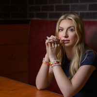
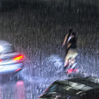
Recently, I taught an Off Camera Flash class. Paige was my model for the class. We were outdoors but it started to rain. Luckily, a nearby restaurant let us conduct the class in their dining room.


Recently, I taught an Off Camera Flash class. Paige was my model for the class. We were outdoors but it started to rain. Luckily, a nearby restaurant let us conduct the class in their dining room.


3 Comments
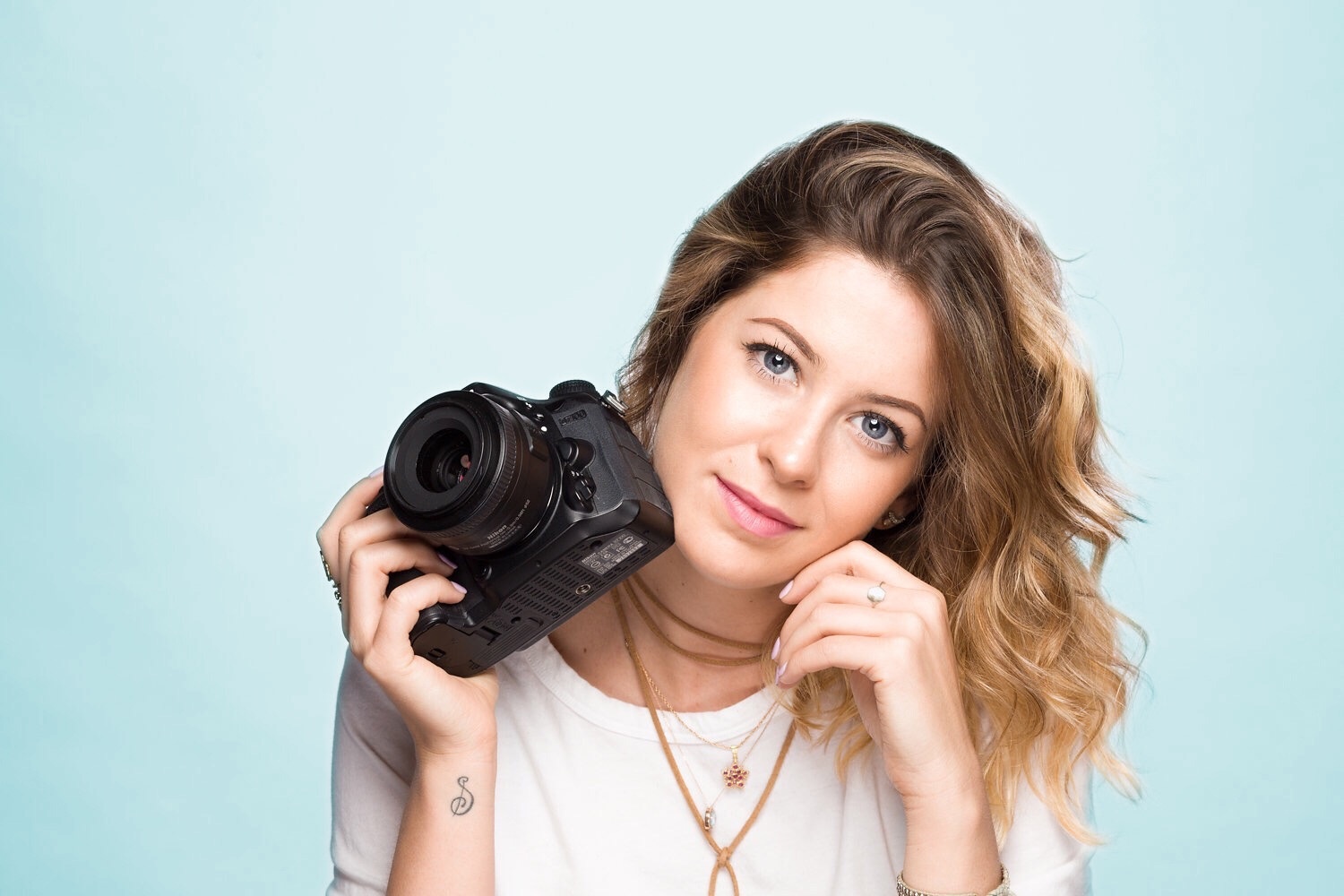
The ring is really eye-catching because it's so bright compared to everything else, but other than that this is a strong image for a portrait portfolio, especially is you do lots of senior portraits. You've got a nice, evenly lit background and the light pattern and angle of the shot works well for this model. You nailed the pose and facial expression- which can sometimes be the hardest part of the portrait! Good Job!
Thank you for the feedback! That ring was a real bear. Probably should have just removed it in post. Now when I look at the image months later I realize that all of the jewelry makes the image too busy and distracts from her face. Thank you for pointing out things I also did correct and not just the negative. It's so easy to point out the bad and forget to critique the good. I think we can learn from both. Your time is much appreciated!
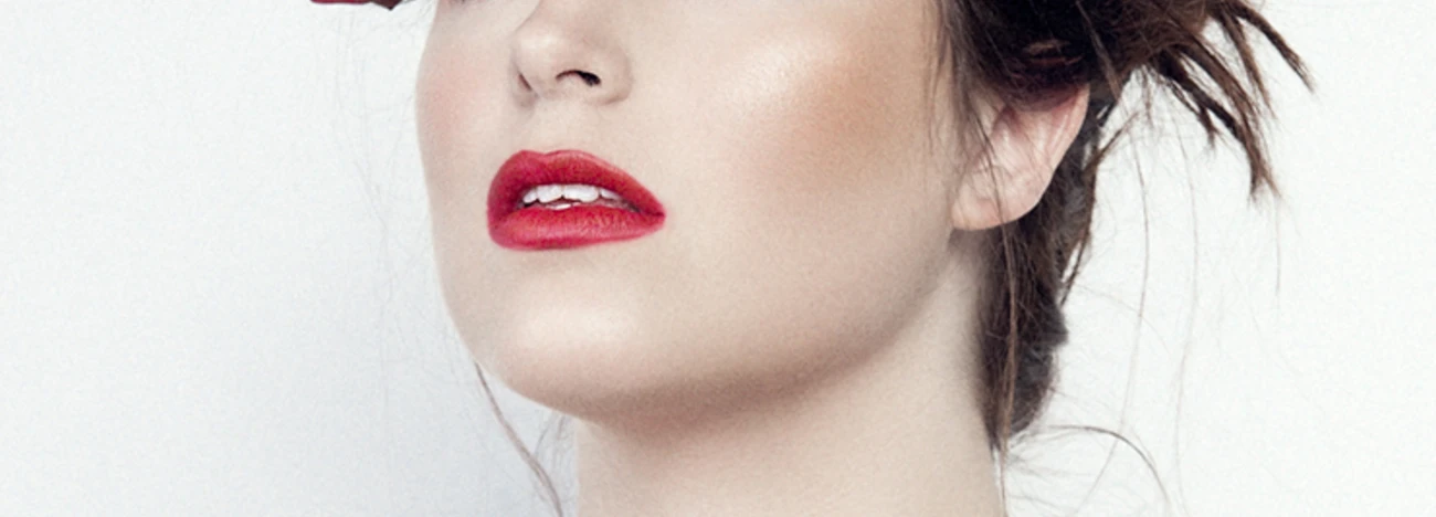
First step, the composition: if you have well respected the rule of thirds(positiion of thr eyes of the model) your photo would be more dynamic if you rotate it a few degrees conter clockwise. The 2 forearms/arms look static and would have been better if you had her move her right arm towards the center of her body.
Second: I'm sure you could decrease the exposition a little bit in post, the highlights are almost blown-up and a little vignetting centered on the upper part of the face could concentrate the attention on the eyes which are essential for a photographer. Finally a little touch of dodge and burn on the camera would probably add some punch to the final result