Another 2 stars!
Hey Fstoppers,
So I've been doing photography for around 8 months, and seem to be getting really mixed reviews. One image I posted recently achieved 2 star status, but I didn't think it was that bad. Other stuff has been 4 stars, and some unrated.
I would so appreciate some kind of feedback (images below) on what I'm doing right, and doing wrong so that I can make some meaningful progress. By 12 months I don't want to be producing 2 star images!
Thanks in advance :)


5 Comments
Hey Nick,
I think your work here is quite nicely done. Unfortunately the fstoppers star rating is fundamentally flawed as its anonymousand so has some people who are a overly critical and award very low (possibly to boost their own ego). Dont take a low star rating as an indication of the quality of your work. I've had a wedding image that has won an award and is on display at my local print lab receive a 1 star rating on here, one star is supposed to be a snapshot standard with no editing, but this was a carefully composed, backlit shot of a groom writing his vows. it's sad but maybe posting a specific image for deeper crit might be more beneficial than relying on the star system.
Thanks Rob for your response, I found it very helpful. I would hate to think there are people in the Fstoppers community are overly critical, we are all here to improve, learn, engage and enjoy! Sounds crazy you got a 1 star rating for an award winning photo. Perhaps those who rate 1/2 stars ought to leave some sensible feedback. Anyway, thanks again, love your work btw.
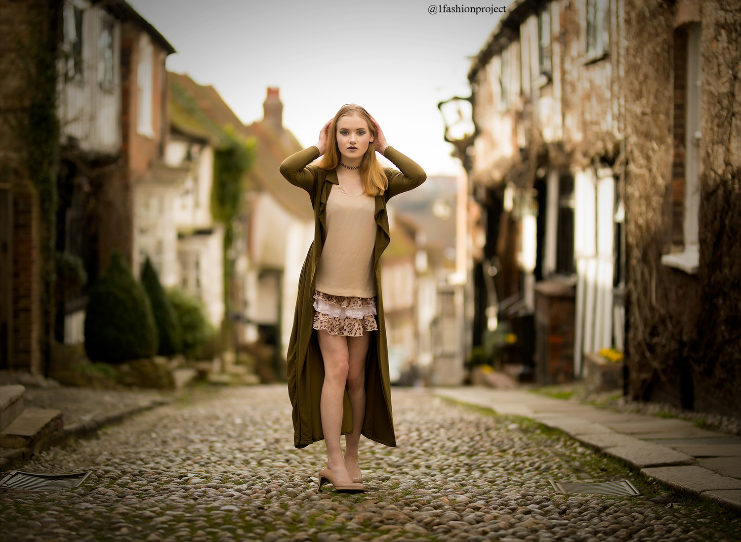
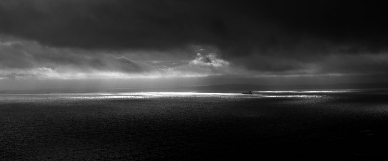
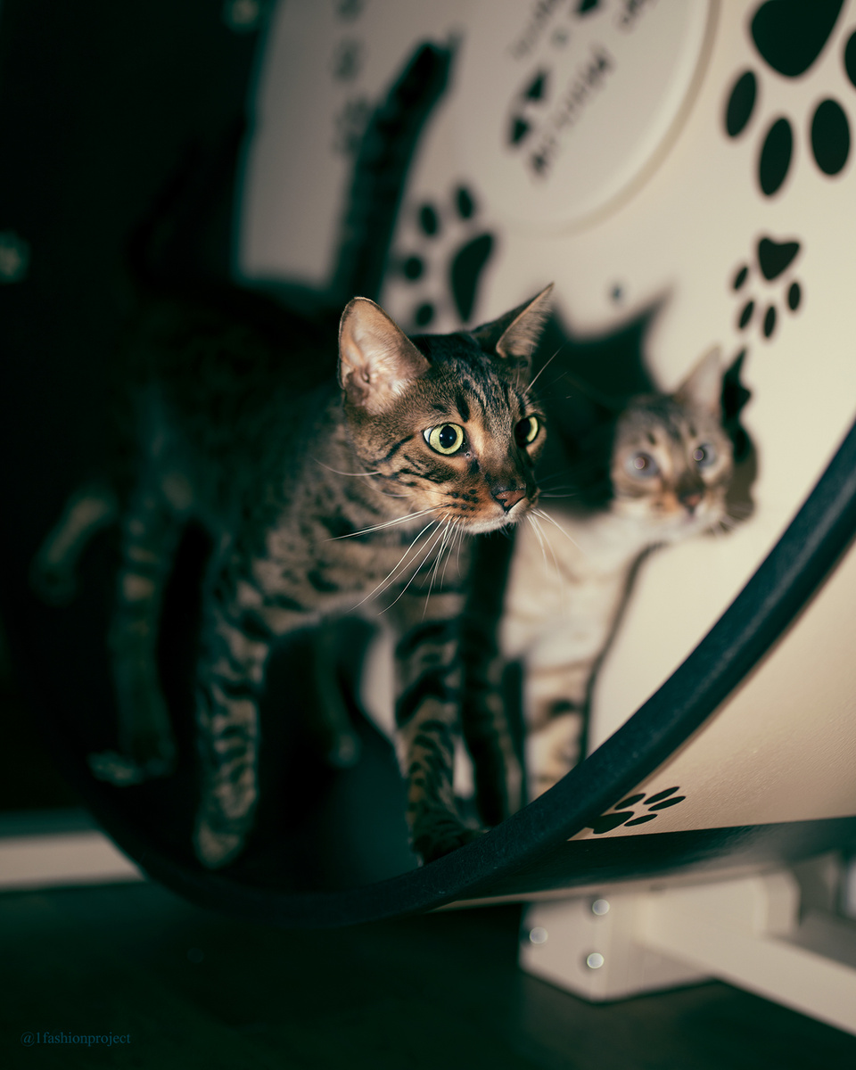
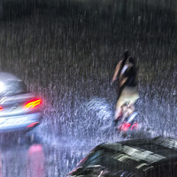
Yeah. To me, these are really good pictures (despite the first one being a little bit inferior) and I can't believe them to be 2 star images. Personally I would like to give the 1st and 3rd photos 3.5 each and the 2nd one 4.5. (Unfortunately, I am unable to do so.)
The 2nd one really delivers a mood and the light across the middle gives a stunning effect to the photo and more importantly, the ship.
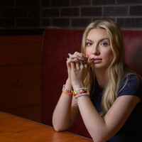
Hi Nick, my thinking for what it's worth..., Your seascape is awesome.I would have moved the horison down slightly so you see more sky than sea but it is a beautiful image. I don't quite get the cat image - but it isnt a bad photo. The girl in the street is great. I love the depth of field and the contrast on the cobbles. The lady could do with some skin tone work on the legs but hey..I am not a very good editor so I am talking purely from my own eye. Personally I would have composed the image with her slightly frame left. That way the street curves away behind her in a more obvious manner. Lastly, if there was a bit of bright colour in her outfit then the eye would be drawn straight to her. Beautiful location :) I agree with Rob by the way.
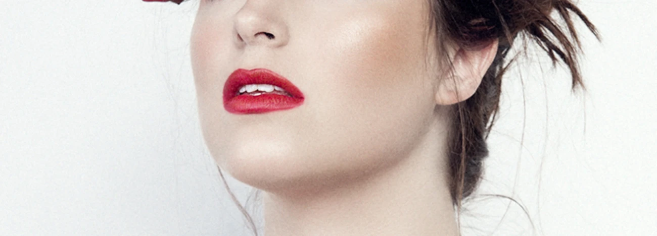
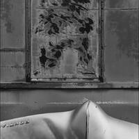
The first and third shots are clear 2 star images to me. The first shot of the girl feels very uncomfortable and it looks like her shoe is falling off and her hands on her head feel forced. The location and lighting are great though. The third shot of the cat is bordering on a 1 star for me. It feels like a snapshot.
The second should is super interesting to me. I could see that shot printed huge and sold as a fine art piece. The type of fine art I like is subdued and doesn't call much attention to itself and that shot is simple but has incredible mood. Keep it up!