Feedback wanted
Hey fellas! I'm relatively new to photography and I just started talking it serious the last 6-7 months. Please check out some of my last eat photos and let me know what you think!

Hey fellas! I'm relatively new to photography and I just started talking it serious the last 6-7 months. Please check out some of my last eat photos and let me know what you think!
Evening just after sunset at Taliesin West. Scottsdale, Arizona. View of the dining room & bell tower.
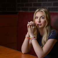
Recently, I taught an Off Camera Flash class. Paige was my model for the class. We were outdoors but it started to rain. Luckily, a nearby restaurant let us conduct the class in their dining room.


Recently, I taught an Off Camera Flash class. Paige was my model for the class. We were outdoors but it started to rain. Luckily, a nearby restaurant let us conduct the class in their dining room.


6 Comments
The dog in the first one looks fake- he looks almost plasticy. With pets I like to turn clarity up more than with portraits because it really makes their fur pop. You did great with his eyes and the sky is great!
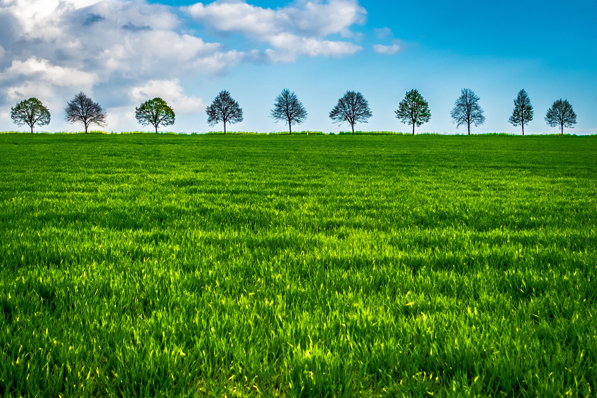
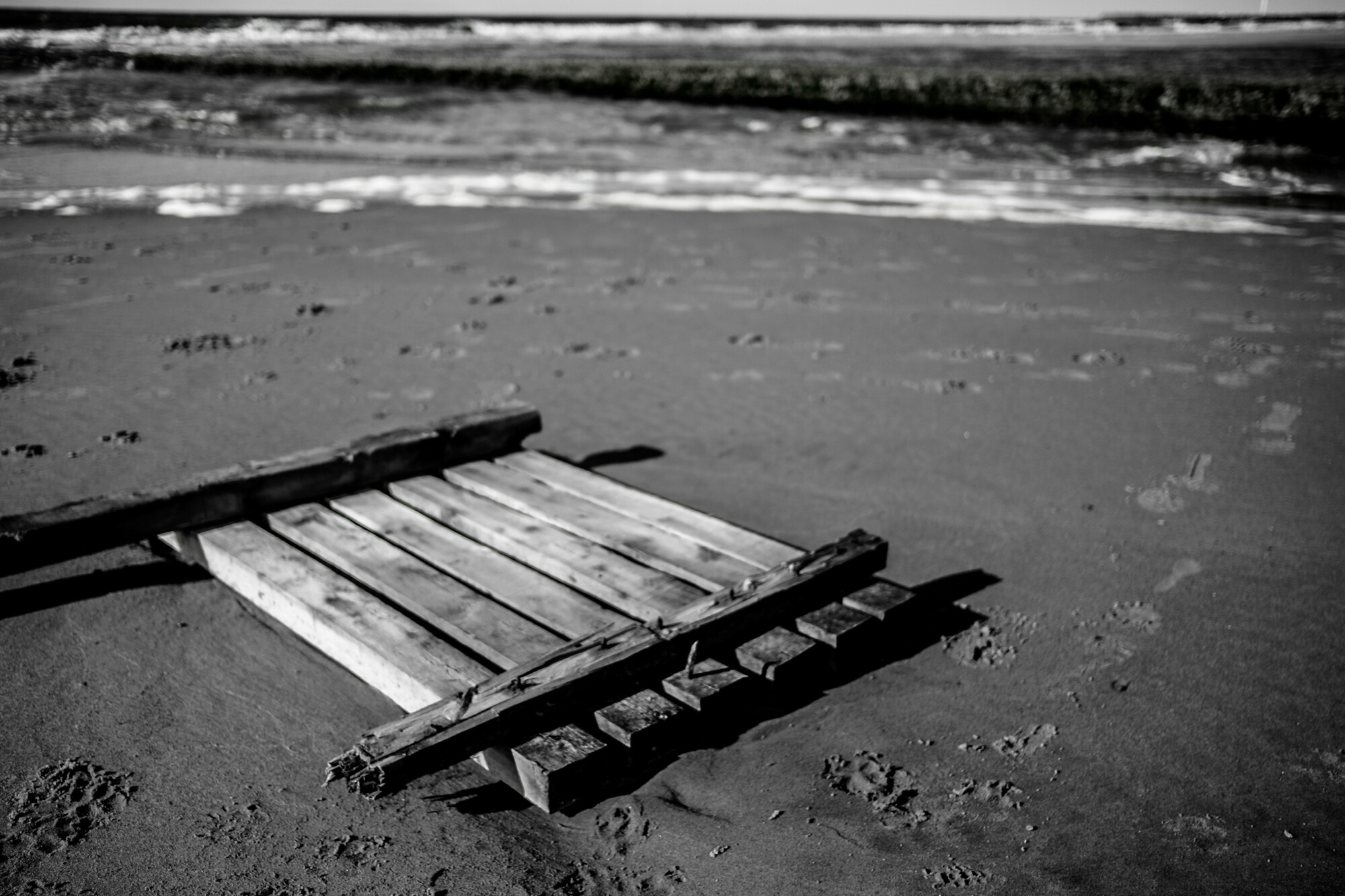
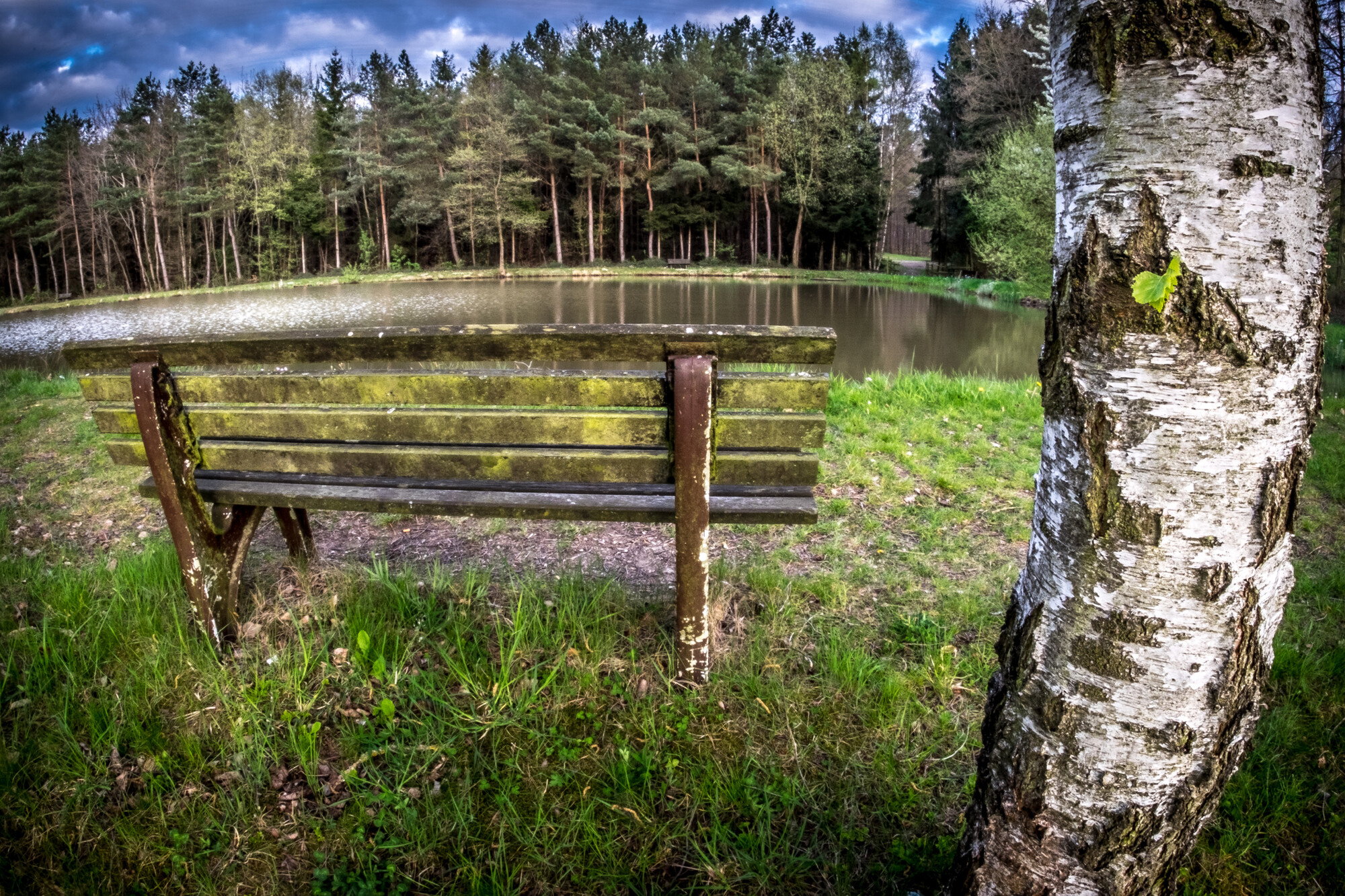
Some nice work here. Three things I would suggest would be to watch out for over editing and looking too fake (particularly the bench and the line of trees), be careful of your black and whites becoming just black and greys (although I think that works in the abstract Tower shot, and ask yourself what the story is in the shot. T take two of your shots here as examples the shot of the trees on the hill and the shot of the bit of wood on the beach. If you were to show these two shots to a random stranger what are you hoping that they see in them? For the trees, my first reaction was "Those trees are well spaced" which leads my mind onto "symmetry is pleasing" and "green vs blue" etc. which opens a whole thought process on block colour in abstract design... all very pleasing. With the wood on the beach my internal conversation was more like "there's wood on a beach", then "Why is there wood on that beach?" to which there's no answer so end of conversation, making this image (for me at least) a much weaker image.
Try to think of what the tagline for each image would be, and then if that's strong enough, try to think of the strongest conversation that could flow from that. Then return to you image and ask yourself (this is the hardest bit) "is this the best image I could have taken to tell this conversation?"
I hope that helps, and just to clarify, I've been shooting professionally now for 8 years and I still take the occasional image that I love, but when I show my partner (a wonderful photographer) she just says "what am I supposed to be looking at?".
Hey Rob. Thank you for the comments! I'm still trying to find my niche! I have a two close mentors that I have been gathering tips from. One is a Photojournalist, he hardly using any post processing but is great with composition. My other friend is a graphic artist/hobbyist photographer and loves shooting HDR and flash... I think I'm trying to fit somewhere in the middle. I will take your feedback and try to better some of my editing.
I bench and trees you commented on are HDR and are quite processed. I had a hard time keeping them from looking too fake. Some people like it some don't.
The tower shot is actually a three part shot, left, middle (the one shown), and right. I think the black and grey worked for what I was going for.. it was super duper rainy/cloudy that day too.
I haven't really thought much about tagline before. Good point!...I'll put that in my brain and ask myself next time I go out to shoot. I mainly just shoot stuff, without actually thinking about what the picture may say. If I like it, I click it.
Thanks a bunch, and I'm glad you took the time to critique these shots!
Numbered 1-10 from the top, the only keeper here is #1. The others are C- to F-. A fast review, and yes I'm an expert;)
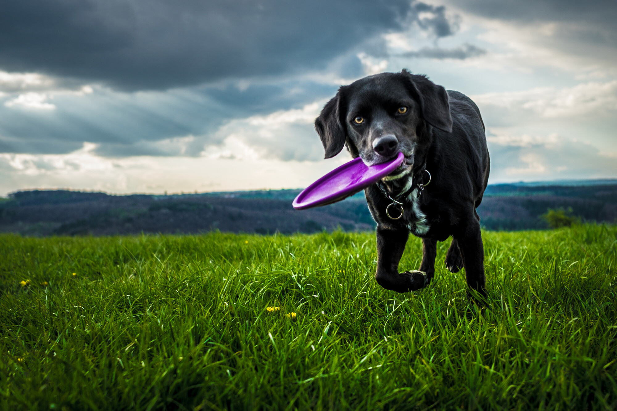
1. Great shot all around, from interest to tones to composition. But because it's set in a body of throw-aways, I can't presume you knew it was waaaaay better than the rest so it might be a lucky submission. Hopefully you realize it's 100x better.
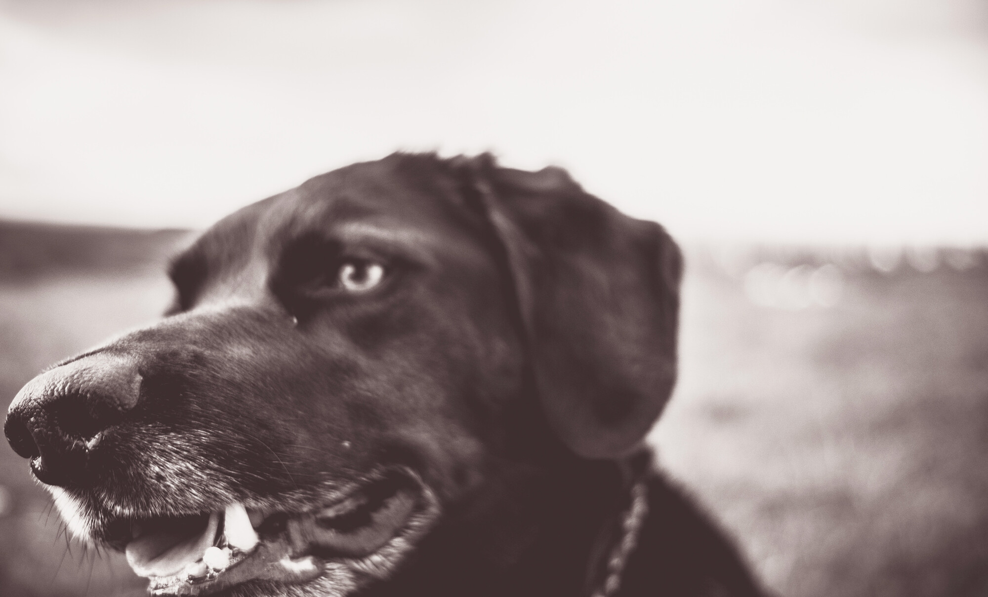
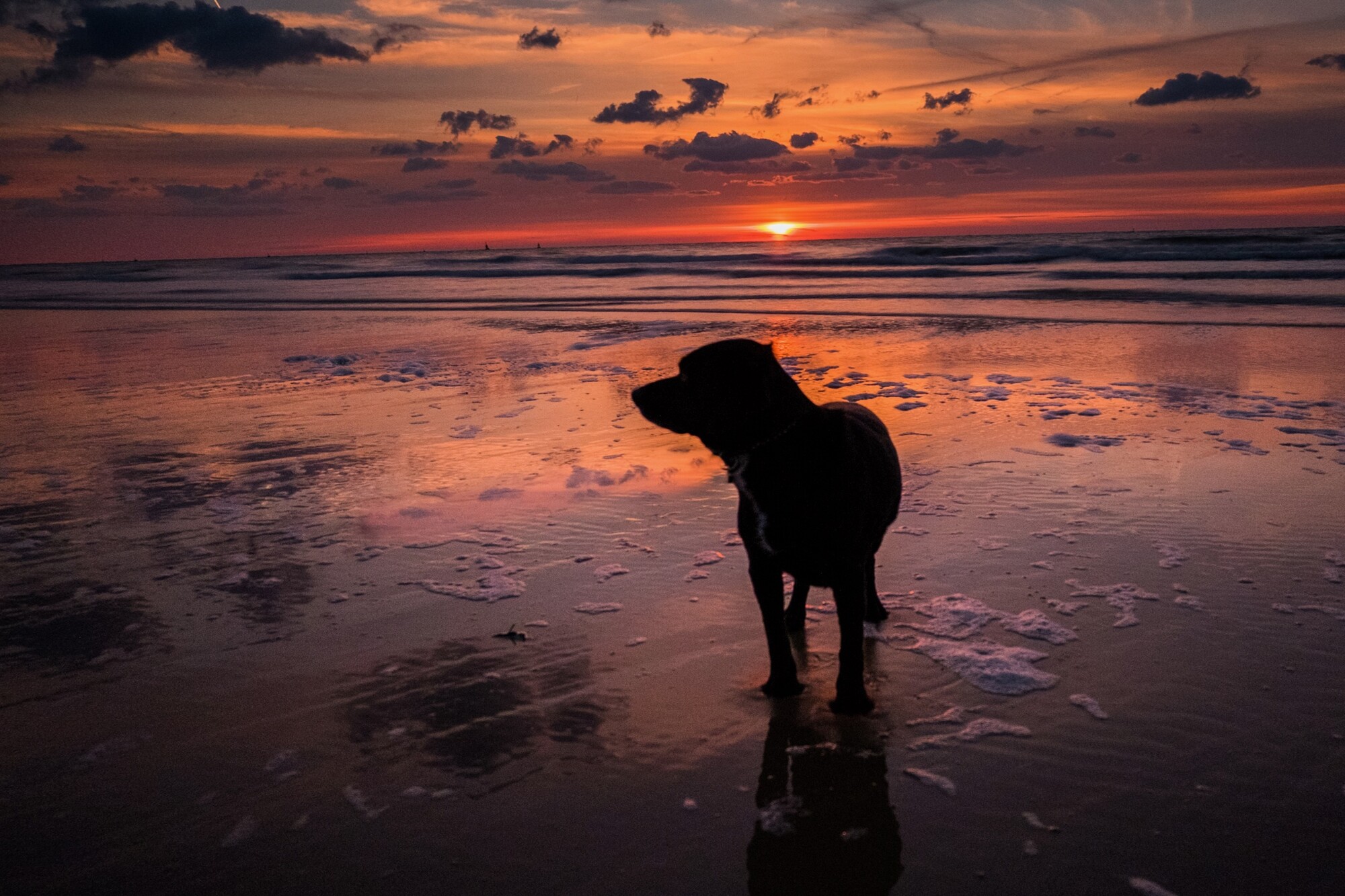
2. (Dog head) Solid fridge door shot, if it's your dog. Nobody else would care or be compelled to look at it twice, but I can tell he's a good boy.
3. (Row of trees) Looks good small, but not full size. It's a standard type landscape shot done endlessly, you always try at a row of trees like this. But this requires fine technique to be right because it is so common. This is poor technique all over especially sharpening, and the smudged out grass at the tree line is a disaster. Evidence of a good eye!
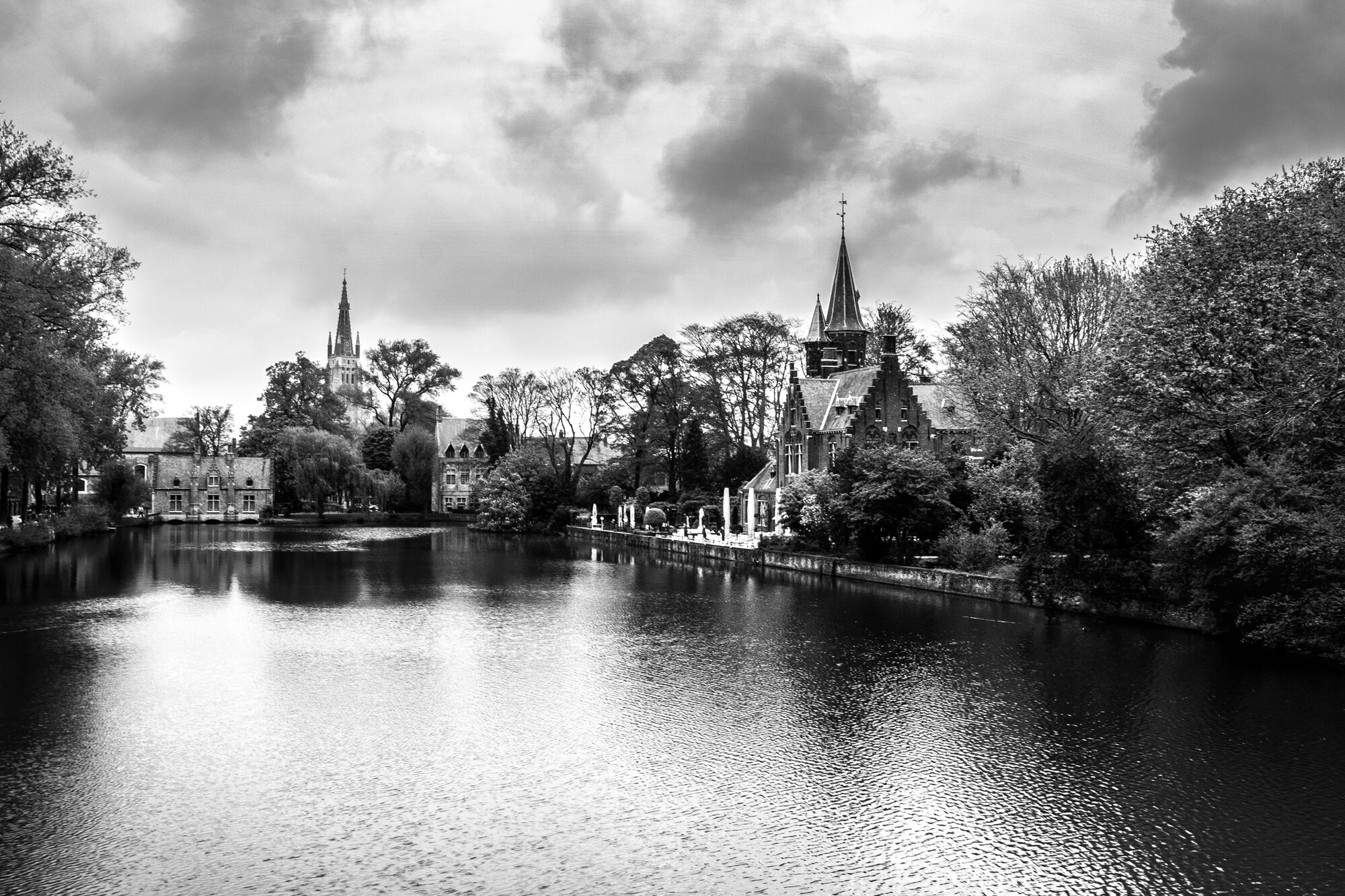
4. (River & Churches) reads like over-developed film (no fine mid tones, blocked up shadows) with an unsharp lens. You have to feel the detail of the trees and textures of the old masonry to do this correctly, not done here.
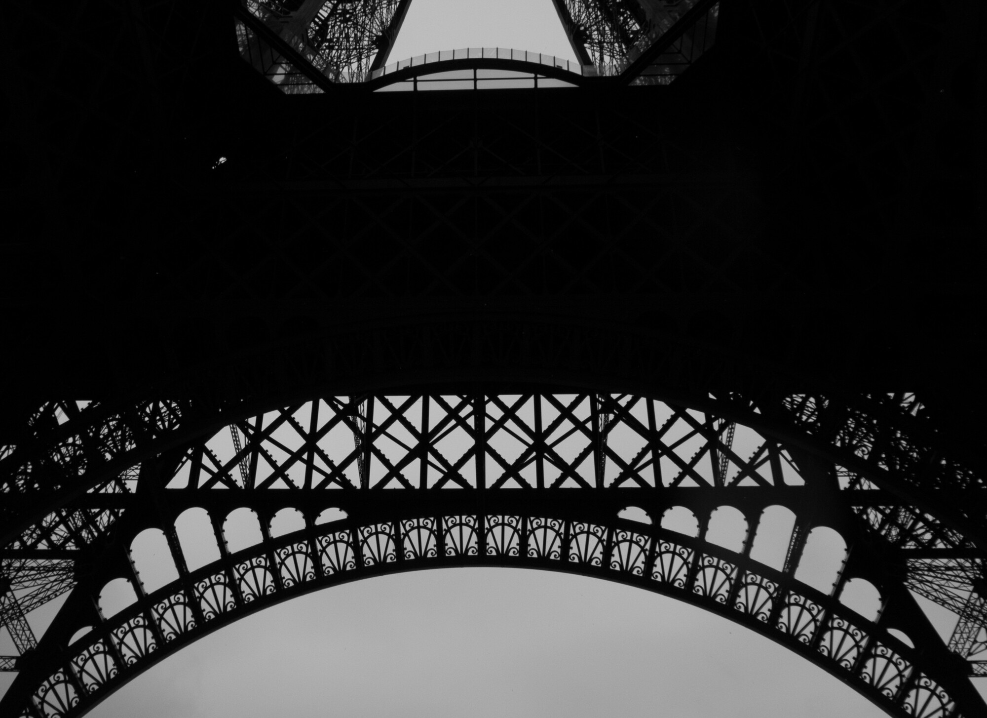
5. (Eiffel Tower) worst of the bunch. Metal grids are supposed to be interesting, but you have to use fine technique (again) and interesting tones to make it work. This is a boring piece of the tower, in limited tones. If the tones were dynamic, that huge black area could be for text, if this were for a magazine cover. Otherwise it's just a big black area your eye cannot enjoy.
6. (Telescope) Yes the shiny tube is compelling to look at, no you can't just jut in from one side and have a completely blurred out city scene in the back and a blown out upper left corner. The stark white blow-out top left is a huge problem even if the scene were sharp, which it is not. So it's just half a wet telescope in an incongruous setting.
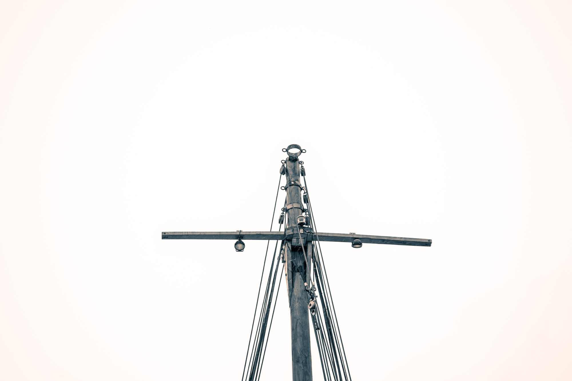
7. (Masthead) I was wrong above, this is the worst of the lot. Not worth commenting on. I know what motivated you, it just seems like a thing to record for it's shape. It's better left alone.
8. (Silhouette dog) This had potential, again especially if it's your dog or a story about a dog etc. If you lift all the upper-mid tones via curves while pinning down the dark around the dog, and keeping the sun from blowing out, you'd have something dynamic enough to be compelling because of the color. The dark dog remains a question, and personally I can't allow a horizon that is tilted without cringing unless it's part of action or imbalance on purpose.
9. (Wood on beach) This fails all over but tones, unless it's photojournalism where it relates to some story like "The Day the Sign Washed Away." Out of focus horizon and mid ground forces the eye to stay in the foreground, and there is nothing there to enjoy looking at. I get the idea, "near - far composition" and you did get a full tone range. But man made wood objects with metal fasteners and footprints mean it's not an enjoyable natural landscape.
10. (Wide angle) Your super-near object is an oh-so-common tree trunk, and it's out of focus (or over sharpened hard to tell which). The main subject (I suppose) is a deadly boring bench so common it's shocking anyone would include it in a landscape, and it's top rail obscures the water in a particularly annoying way. The tones are a crazed mixup like you see with HDR.
~~~~
There you go, there's your feedback. You got one (at least) great photo in only 6 months, that's not bad. Many people never get any.
Now, what you have to understand is that before I wrote, I'd like to have heard YOUR feedback, picture by picture, before I critiqued them. This is because what you intended is everything here. If you met some goals, that matters. If you know you missed some goals, that REALLY matters. I am left to wonder.
85% of photography success is editing out bad shots and never letting anyone see them. We all take boring, bad shots that have huge mistakes. Smart photographers delete them. That top pic, had you shown only it, would have made you look great. All you have to do is keep shooting and only keep the shots as good as that top one. Good luck, your willingness to take hard criticism sets you apart as special, it means that you will do well! I've got 42 years and I still do a lot of deleting!
Wow. This is a quite critical and LONG review. Thank you for spending the time to convey your message with meaning and reasoning. This is the reason I wanted to add some of the photos to this forum, so thank you for that.
I knew the first one was good. but I wanted to see how others view it. I think I did a good job with it and it just so happens to be my newest shot. ...either I got lucky (95%) or I'm starting to catch on!
The others photos are, composition wise, the ones I like. My post processing needs work and I'm doing everything I can to learn -- living in Germany and not speaking the language doesn't give me many person-to-person opportunities to learn.
My goals, right now, are to shoot-shoot-shoot, learning composition techniques and continue to work on getting the right exposure. Thanks again for the criticism and I will consider everything you said here. Do you have a portfolio I may take a look at?
The review was abrupt, typed out very quickly in 15 minutes, so it's rough and simple. It's mean, because I haven't got the time to baby anyone. I expected you to flip out like everyone else here, I believe it's really smart you didn't care that it's not kind, because you should not care, you should only care about the usefulness to you. It's my overview, get others too, but be wary of compliments that are given out of politeness! Politeness is worthless to serious artists.
All over this site people get very angry if you speak critically, pop sites are very bad that way. So your acceptance of my clubbing is a really good sign that you can do well. Stay away from flatterers and seek out critics! A serious fine art professor at a good university with 15 students in a class won't baby anyone, he'll bust balls to try to get the five worst shooters to drop the class, so the good ones can concentrate. This site has some cool stuff, a lot of outstanding T&A, a nice variety, but it's not a fine art study. You may not even care about art per se, I have no idea, but visual analysis applies to any image work; sports, ads, art, record keeping, whatever.
What you want to do is,
1. Study the "vocabulary of visual analysis" via art history books (used on Amazon is great, cheap.) This is job #1! You must be able to describe what you are looking at in proper terminology. Learn to describe architecture, sculpture, painting, forms, styles, eras, etc. That vocabulary will wash over into your photo work and improve your mind to eye connection, plus you will be able to discuss images with experienced artists. This lasts a lifetime and is the foundation of "seeing."
2. Take an intro art history course from a tough professor to see how serious they are about the classic images. It will be the best money you ever spent on imagery. Of if you don't want to pay to take a course, sneak in until they catch you. Meanwhile go ask a professor for the syllabus for an intro art history course, and get the books from a library.
3. Go to museums and look at paintings and other fine art as often as you are able. Visit the art department a local college and check it out. Lots of great interaction with like-minded people in all this, so it will be fun.
No I don't bother sharing my work online with strangers.
PS A nice art site for photos is lenscratch.com (among others.) It has a different artist each day, wide variety, and great links to other sites and resources.
PPS "Shooting shooting shooting more" is not the key, very often less is more. You can get shots by accident, by volume, but working slowly and carefully is more satisfying and you get less junk to edit out.
~~
Ok, so I think that's enough between you & I. No need to reply, I've given you plenty to go on.