
Feedback "Magazin Fake"
Hello team, I am new at Fstopper.
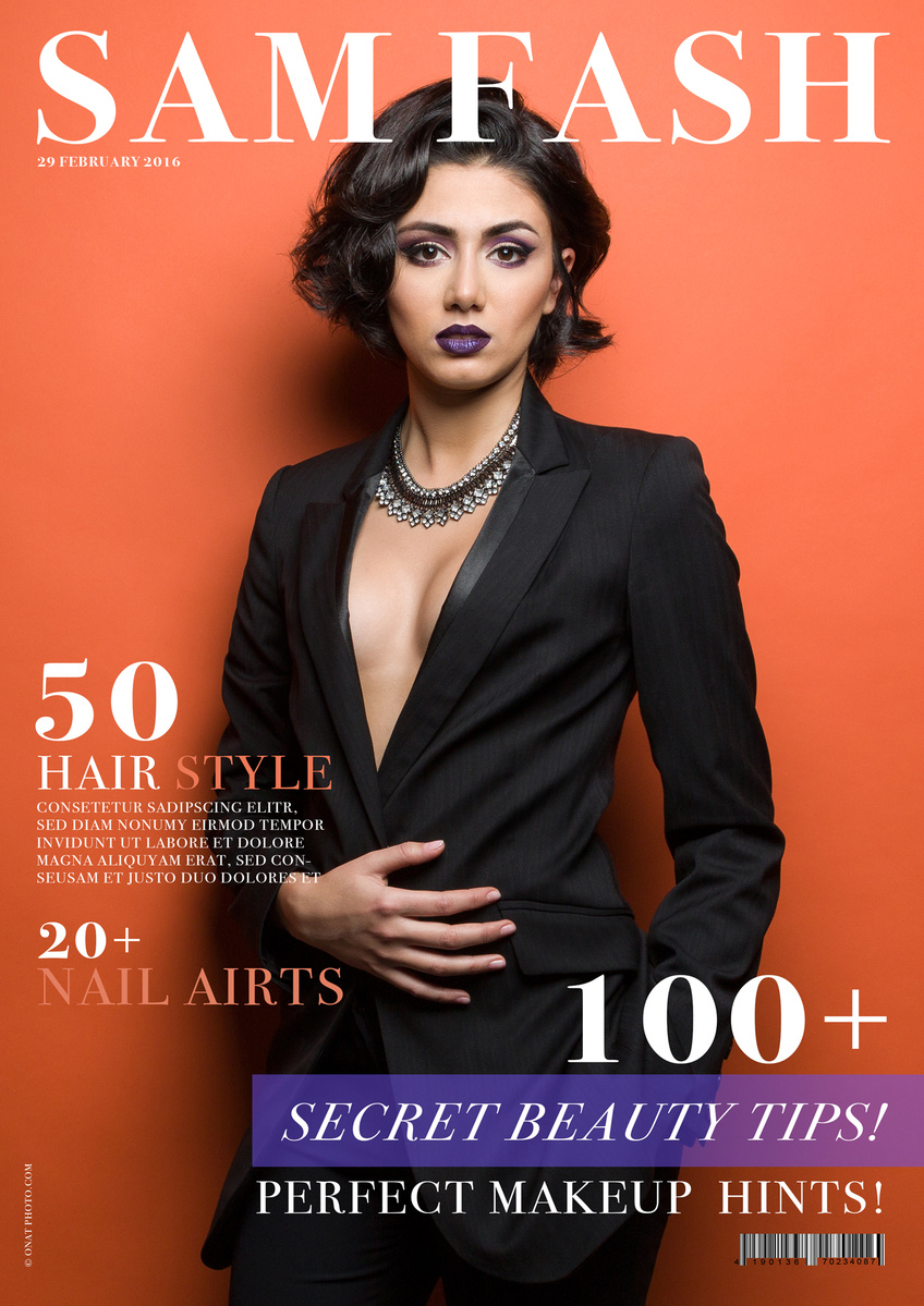
The rookie need a little feedback about the below pic ;-)
Hello team, I am new at Fstopper.
The rookie need a little feedback about the below pic ;-)

One of my favorite waterfalls I've photographed in recent years. deep in the backcountry of Vancouver Island lies this pristine oasis.


Hiking in this beautiful region is like a present.Also standing at high elevation and looking to the king of Austria.The first snow the changing coloursand all the combination with the weather cond

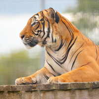
These are a highly endangered species, and the rescue center has this young male tiger, which they hope will breed with their already existing female Malayan tiger.
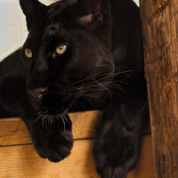
A new arrival at the rescue center. She was very friendly and very flirty, rolling about on her back and meowing, then staring at you as if she might be hungry. A magnificently beautiful animal
2 Comments
Hello Cengizhan. Very nice picture, very well executed. My only criticism is her hand: her fingers are spread apart, which makes the hand look too big and brings too much attention to it I think.
I agree with Pascal about the image itself but as to the faux-cover, I think the fonts are too flat. It looks exactly what it is, fonts atop a photograph. I would create more depth using drop shadowing or create a bevel effect with the font itself. Also, if you look at many magazines, you'll likely see how editors put parts of the font behind the model to simulate depth.
V/R
David
www.aspect-photo.com