
Tracy
From a recent shoot with Tracy.
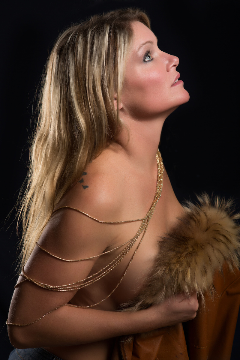
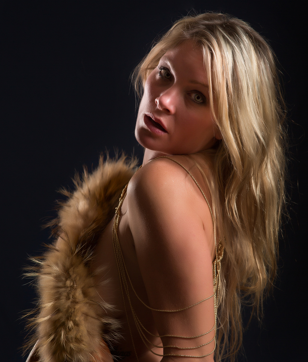
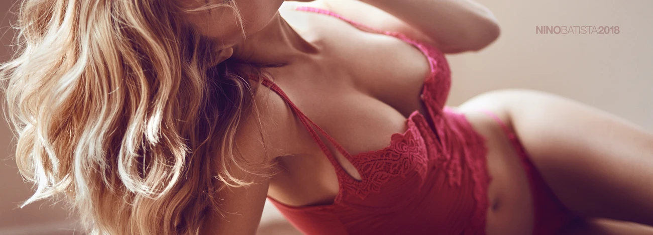
From a recent shoot with Tracy.

One of my favorite waterfalls I've photographed in recent years. deep in the backcountry of Vancouver Island lies this pristine oasis.


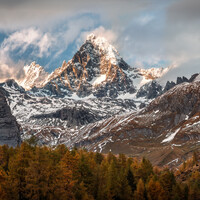
Hiking in this beautiful region is like a present.Also standing at high elevation and looking to the king of Austria.The first snow the changing coloursand all the combination with the weather cond

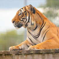
These are a highly endangered species, and the rescue center has this young male tiger, which they hope will breed with their already existing female Malayan tiger.
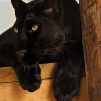
A new arrival at the rescue center. She was very friendly and very flirty, rolling about on her back and meowing, then staring at you as if she might be hungry. A magnificently beautiful animal
6 Comments
Although I've never been known to be a "Glamor Photographer" I do tend to pick up on a person body language. In this instance, Tracy is either uncomfortable with the lighting, the pose or the photographer. This is indicated by the uncomfortable upward stretched head & neck with wide open eyes. In fact, this shot would have been better suited either with her looking down or (without turning her head) looking towards you. Softer lighting would also been suggested.
Thank you for your comment. I looked at your portfolio that's some piece of wood. Actually that was a profile shot with four lights 48" Octbox camera right about 3' away, also a 500 watt sec head with no diffusion right in front of the Octbox. Two difference types of light coming from camera right. Camera left is a kicker light. and a background light that did not fire. If i can help you understand lighting a model just ask.
I don't know much about all the techniques of the lighting,All I can say is I like this photograph. Reminds me of an innocent young woman looking into the eyes of a taller man. In this case, much taller. This brings me into the two things I would change.
First drop the angle of her head just a little and I mean a little. This would give the appearance that the person out of frame was a average size person.
Last I would give more open room on the right. Maybe not along the first third, but just a small amount between the first third and center frame.
This is a nice shot but I'll second what Lee Arthur is saying.
You don't always have to follow the standard compositional rules but having her face right up at the top of the frame and having her look straight into the corner (which is quite close to her face) makes the composition feel cramped. A little more "nose room", a little more negative space above her head and craning her neck just a little less would take this from good to great.
That's the word I was looking for, "Negative Space." Thank you.
Hi Pete, Thank you for your thoughts.