Small space, off-camera flash test.
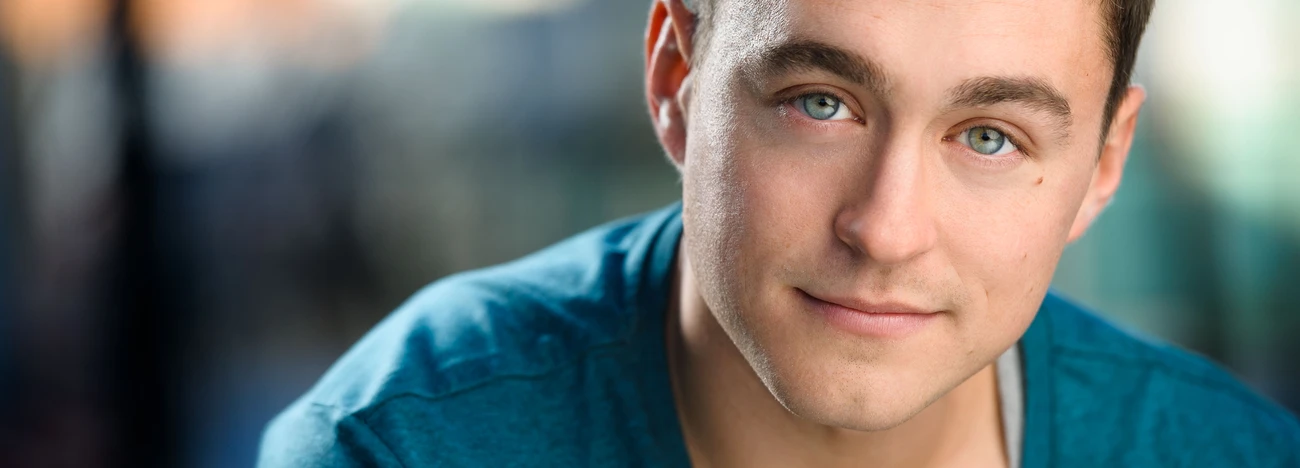
I am working on my overall pacing as a portrait photographer. Framing, lighting, angles, background and quality of light. I have a tendency to approach portraits like weddings where you're quickly trying to capture what's in the moment. Sure you go for quality in live weddings, but ultimately you get your best settings and conditions then go for the shots.
Here I am using two off camera flashes. One at about 1/4th power in a 47in octabox camera left about 2ft from my model somewhat feathered in front of her. The other flash is firing in the corner camera right for environment fill. A large reflector is camera right about 2ft from my model. I'm using a 135mm legacy lens at f4. We're in a very tight kitchen space in front of a window.
Any thoughts would be greatly appreciated!


1 Comment
In my opinion (doesn't amount to much) your composition is off. I would have positioned her off to the left side not the right side as shown in your image, the shot look unbalanced as-is. We read from left to right, therefore when we look at pictures particularly when they are in landscape orientation we tend to do the same.
I'm not sure what camera you are using but you have a blue color cast hitting your subject from the Octobox (I use a Nikon D810 which has a setting to help in mixed lighting), this is likely from the use of mixed lighting. You may want to invest in a few speedlight gels to help counter this effect in the future. Adjusting the tone a bit would probably eliminate this.
You also appear to be angling your camera down on your subject rather than shooting straight on or slightly upward (her eyes are looking up at the camera making her look uncomfortable). In post I would turn the highlights down a bit, add some clarity, vibrancy and deepen the blacks just a touch. Normally I would suggest shooting at f8 but since you indicated it was a very small space, using f4 helped lessen the distraction in the background, which I still feel is a bit distracting. Moving her to the left would've improved this and made the background less noticeable.
Changing these few small things and having her turn her head slightly to her left, and I think you'll see the improvements for yourself in-camera on your next shoot.