Hello, new to photography and headshots! looking for critique/advice
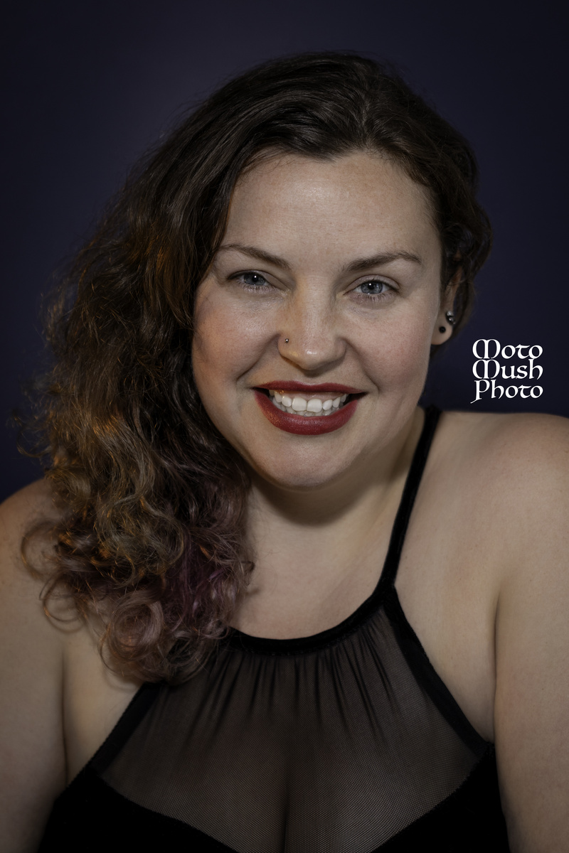
hey everybody! I am a newer member and have been doing photography for about 6 months. this was my first headshot session and since posting I have booked a few more headshot sessions. I am looking for opinions and advice. photos shot with canon sl2 with tamron 70-200 2.8


4 Comments
Welcome! You're off to a decent start for a practice round. The first thing I'd say is that you will want to pay more attention to your lighting, mostly where it's placed in relation to your model. (There are a lot of excellent free tutorials on headshot lighting on YouTube, keep an eye out for any videos of Peter Hurley.)
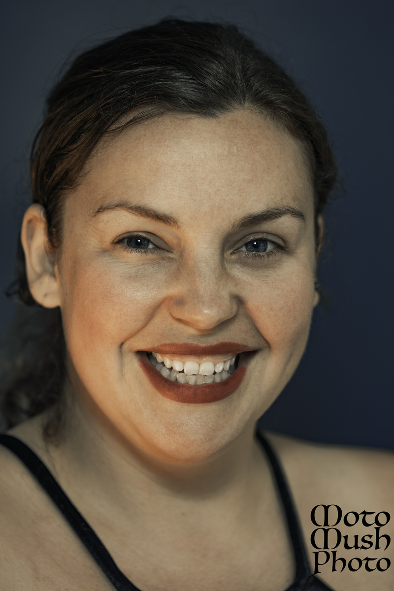
In the second image, for example, there's a very unflattering bright reddish light hitting her from below, which unfortunately doesn't enhance the features of anyone.
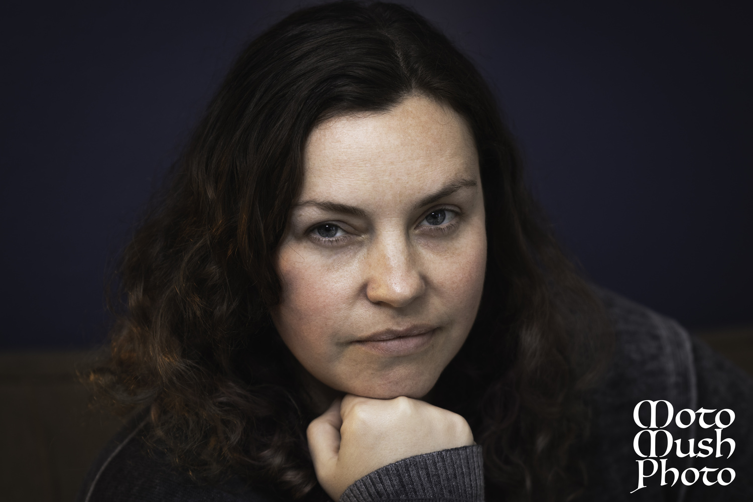
Another thing to pay attention to is posing and expression. In the first image, the chin on the fist is kind of cheesy and dated, and it pushes her chin up, almost squishing her face a bit and compressing her lips. Also in the first image, I'm not sure why, but we are seeing a weird brown line halfway through the background which is distracting. The second image has a really nice natural expression. as does the last.
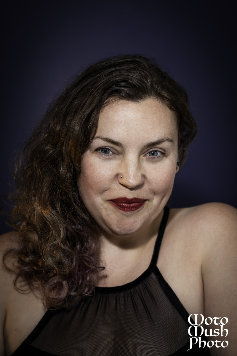
In my opinion, the third image really shouldn't have been selected for editing. She looks like she's about to burst out laughing, but the pursed lips, awkward eyes away from the camera but not far enough, and the lifted shoulder aren't doing her any favors. In the last image, she has lifted shoulders again combined with a too-high camera angle which make her look like she has no neck. Shooting from a slightly lower angle will help with this.
Also, the logo is way distracting - maybe drop the opacity by about 50 to 75% if you absolutely must have it on your images.
Hope this helps.
Thank you! this helps a ton. i definitely need to learn about lighting. it is something i just started playing around with. right now i only have 1 cheap speedlight and a constant hotlight. the speedlight is attached to the camera by a 3 meter cord and doesnt have any power adjustment and the hotlight has a switch to change between 2 bulbs or 4 bulbs lit. then i have 2 umbrellas one soft white and 1 reflector. i put the constant light to the left which i think was a mistake lighting the broad side of her face. and then the reflector umbrella right by her on the right side. the speedlight was off centered left of the camera about 3 ft(this is as far as i can go because my speedlight is attached by cord). i feel like my set up is limited and on top of that my lighting position was not good. in pic 2 the hotlight was on 4 bulbs which was way to much red. i want to ditch the hotlight and get a remote flash setup with 2 flashes but i also want to upgrade to a full frame camera so im trying to figure out where to spend the money first. i am going to start studying proper lighting as well as posing.
As far as the logo i would say it doesnt have to be there. i have been going back and forth as to put it on my images that i post online or not. my thought was to put them on these to post to some local facebook groups and the logo/watermark would help brand my image but im not really at that stage in my photography nor do i know if its actually a benefit. i think for now i will go back to no logo as that is just a name i came up with and is not really attached to anything more than facebook/instagram accounts.
In the first image the brown line is the couch she was sitting on and my angle did not cut it out. i wasnt sure if it was gonna be a distraction or not but im glad you pointed that out. i really dont know any poses as this was a complete test run of photos.
the model is my girlfriend who does theatre as well as stand up comedy. the 3rd image was an idea for her stand up comedy. we did like this image for her comedy page but i like your points of the eyes should be off camera more for this looks. as well as the angle taking away from her neck in 3 and 4. you are absolutely right though 3 was taken right before laughing but we liked this shot better than the laughter shot.
i must say THANK YOU! once again as this was really helpful and in depth. all of your points are spot on and look forward to learning how to improve!
Pretty girlfriend! Could you upload the second one in black and white. I think it's a great shot but as Sennia says the red light is not overly flattering.
Not bad. I use the sl2 myself and I'm aware of what a capable little camera it is. My suggestion to you is that you control the white ballence carefully and watch the shadows. Some of your photos had highlights that were a little to warm. Remember, no matter what you shoot lighting is the most important element. Give it close attention and you'll improve every time you shoot.